Home Sweet Home (Screen)
Swipe to unlock the apps we can’t live without
Everyone’s home screen is different. Some have lots of apps covering the screen, some have neatly-organized folders, some are color-coordinated, some are nearly empty, and some are downright chaotic. The apps you choose to put on your home screen, and the order you choose to put them in, says a lot about you.
So what do our iPhone home screens at Lickability say about us? Take a look below and decide for yourself.
Jillian Meehan
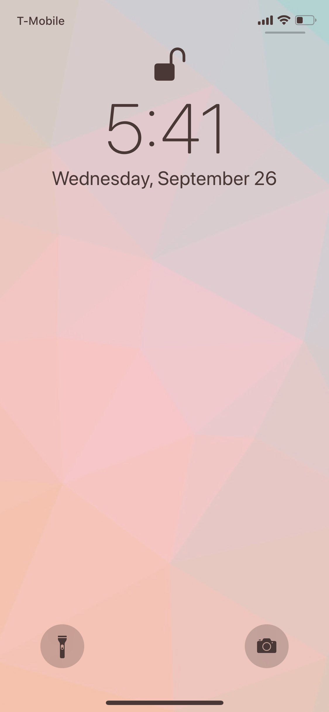
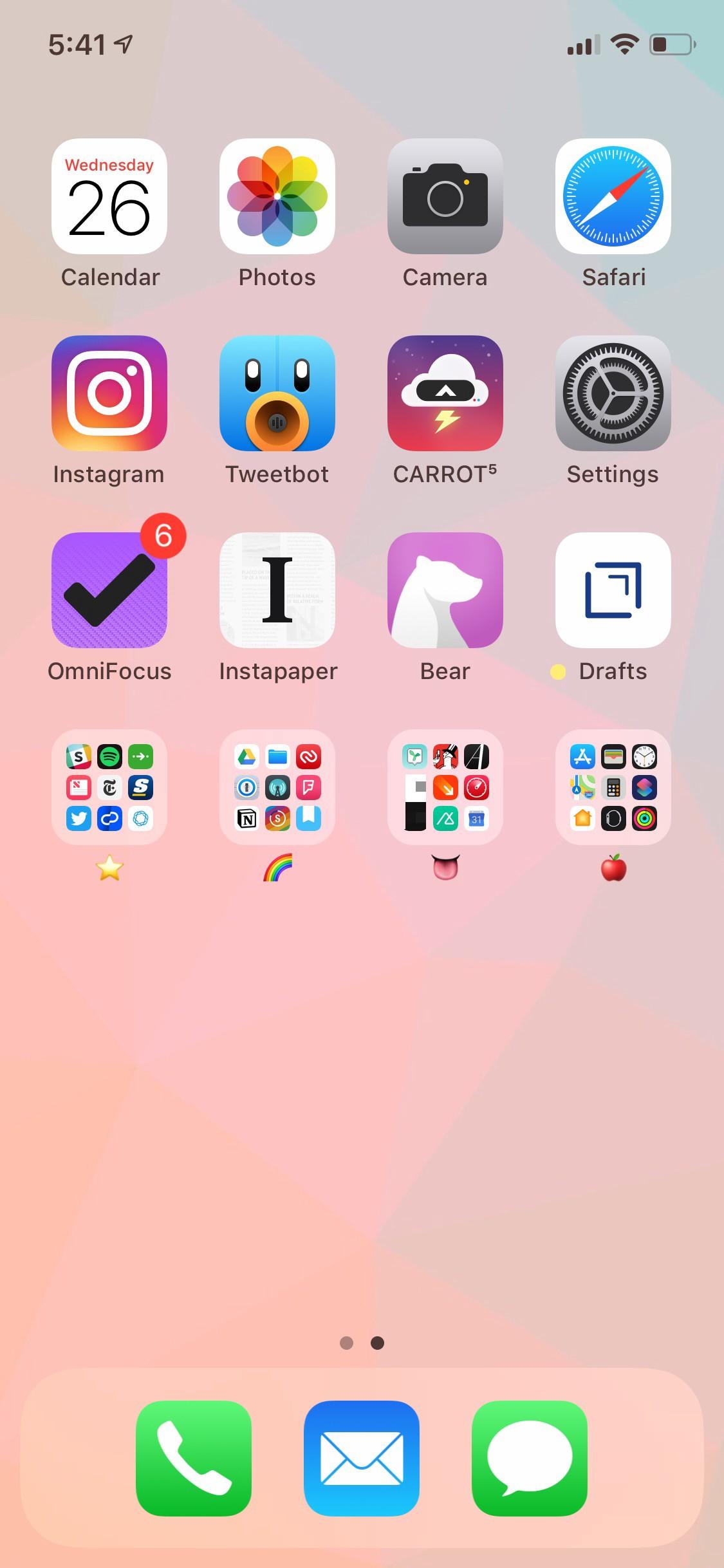
Let me say this right off the bat: I have an intense need to keep all of my apps on one screen. If I ever have a second page of apps, it’s because I’m trying a few out before I decide to fully commit and give them a coveted home screen spot.
I refuse to cover my entire screen with apps because I hate the way it looks, so aside from my dock and my first three rows of can’t-live-without apps (Instagram, OmniFocus, Bear, Drafts, etc.), I’m a big fan of shoving everything into folders that only make sense to me. The best way I can explain my folder system is that my most-used apps live on the first page of each folder, varying in importance from left to right on the screen.
My ⭐️ folder has some of my most important apps, like Citymapper, ClassPass, Slack, and my Simple banking app — all my money-related apps, like Venmo, Clarity, and Digit, live on the second page of this folder.
The 🌈 folder has a lot of productivity-related apps, like 1Password, Notion, and Streaks. The second page of this folder has some more of my “fun” apps, like Co-Star, Supergreat, and Giphy.
My 👅 folder has all of the apps we use or work on at Lickability, and my 🍎 folder has, naturally, a bunch of Apple’s pre-installed apps.
mb Bischoff
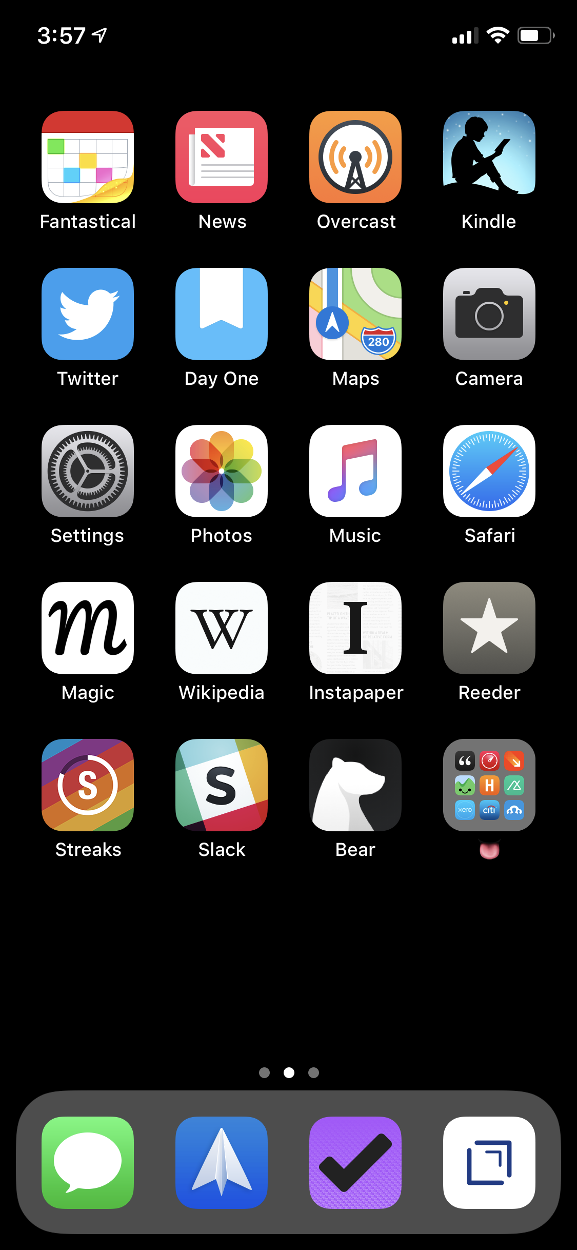
As you can maybe tell, I’m a little obsessive and I like things to be clear and well-organized. My home screen is a reflection of my personality and the apps I use every day to do my work and enjoy my life.
I wouldn’t be able to do my work without Messages, Slack, Fantastical, and Spark to communicate with coworkers and contacts. I take tons of photos (read: selfies), so Camera and Photos can never be too accessible. Bear and Day One are where I take notes and reflect. OmniFocus and Drafts are where I get shit done. And Safari, News, Music, Twitter, Overcast, Kindle, Wikpedia, Instapaper and Reeder are where I relax and learn new things. Finally, I want easy access to all the other apps we make and use at Lickability. 👅
Some honorable mentions: I’m bad at sleeping enough, so Streaks tries to help me with that, and Magic is for those times when I’m dreading doing something but I know it has to get done anyway.
Michael Liberatore
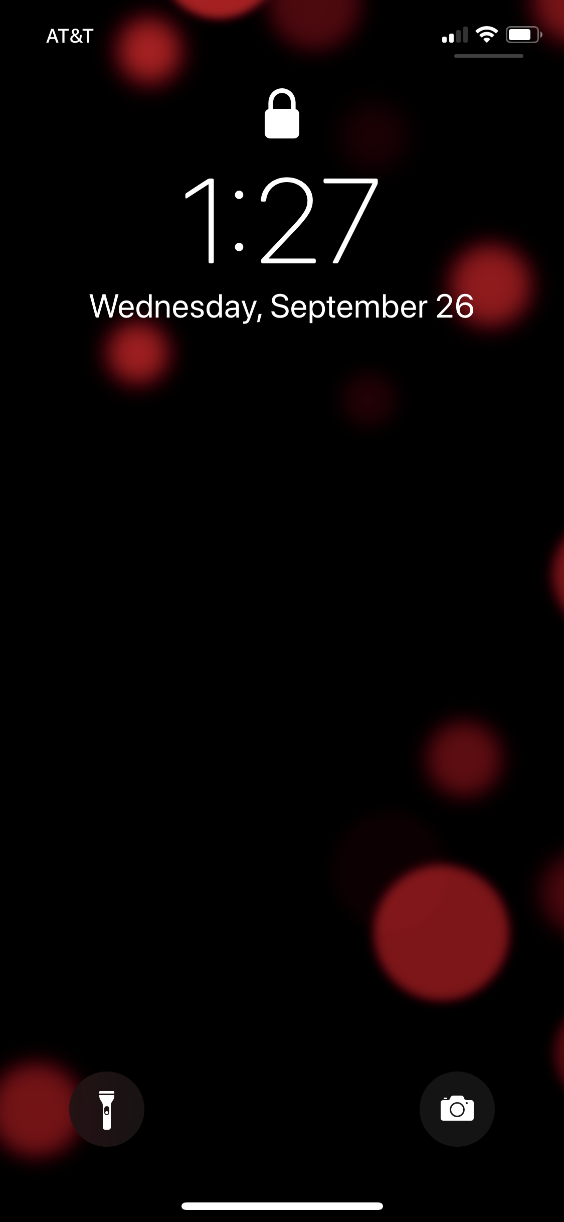
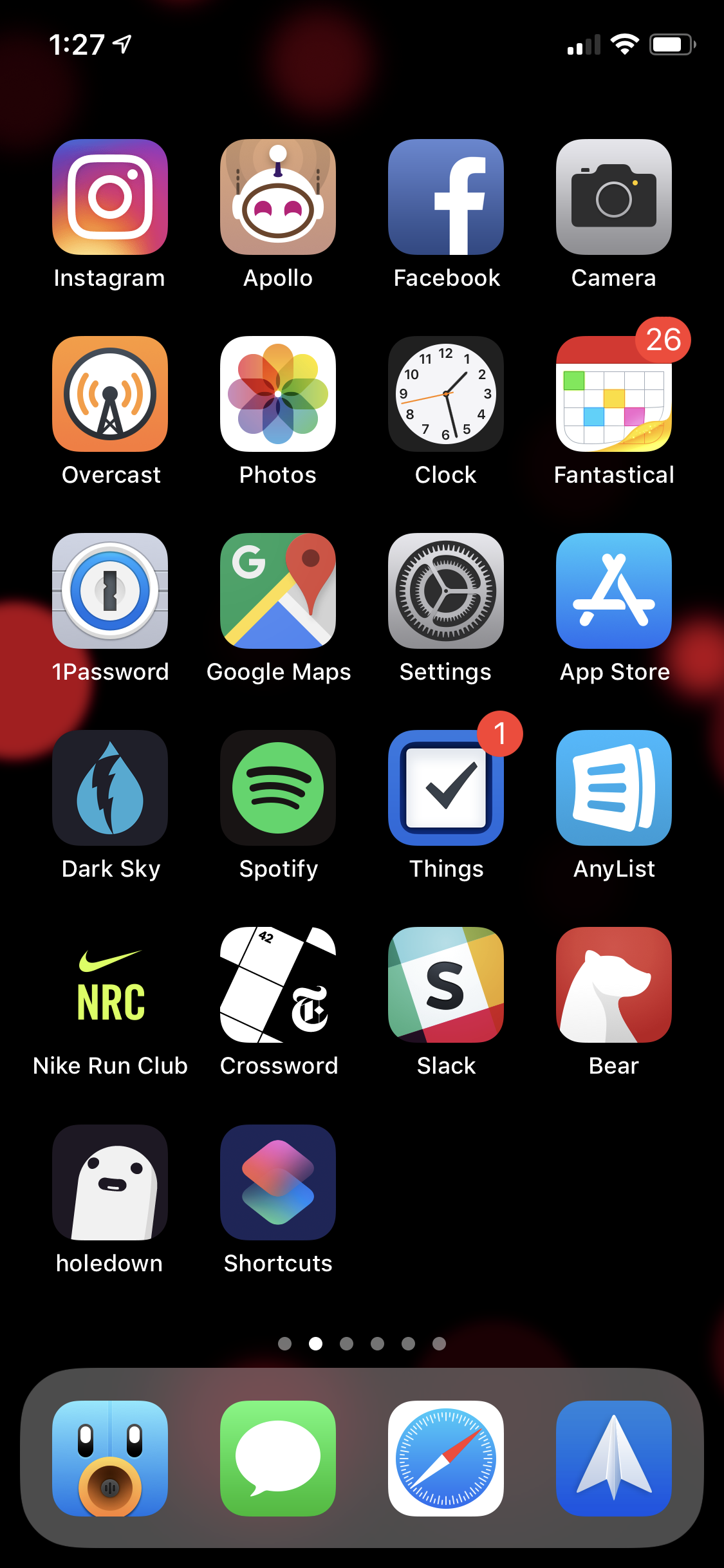
Since Spotlight search is incredibly quick to find the exact app you’re looking for, I’ve been far less precious about the organization of my apps in general. That aside, the apps that comprise my home screen loosely fall into three categories.
The first category, which accounts for most of my home screen (literally the top five rows and the dock) includes the apps I use multiple times a day. Additionally, for Messages, Spark, Slack, Things, and my most used social apps, I want to easily see my notification badges, so I like having them visible every time I unlock my phone instead of tucking them away in the unorganized basement storage closet that is screens 2–5.
The second and third categories change frequently. Currently, holedown fills category two: the games I’m playing right now. Games have a fairly short life span on my phone, and if I don’t see it on screen #1, I’ll quickly forget about it. The third category includes apps I’m checking out at the moment, aspire to use more, or have just downloaded and don’t want to forget to try. At the moment, Shortcuts is the only app in this category. I really aspire to use it more to get hooked on iOS automation.
Grant Butler
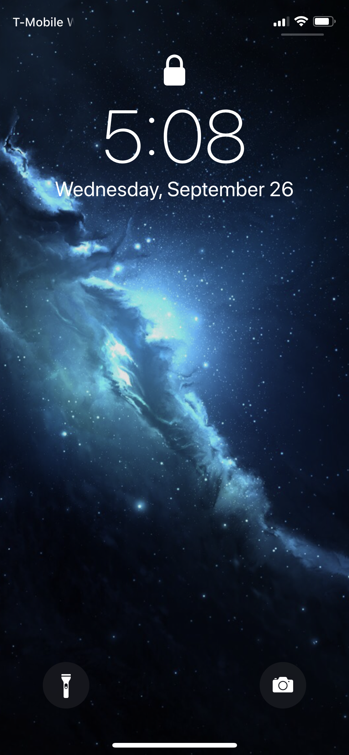
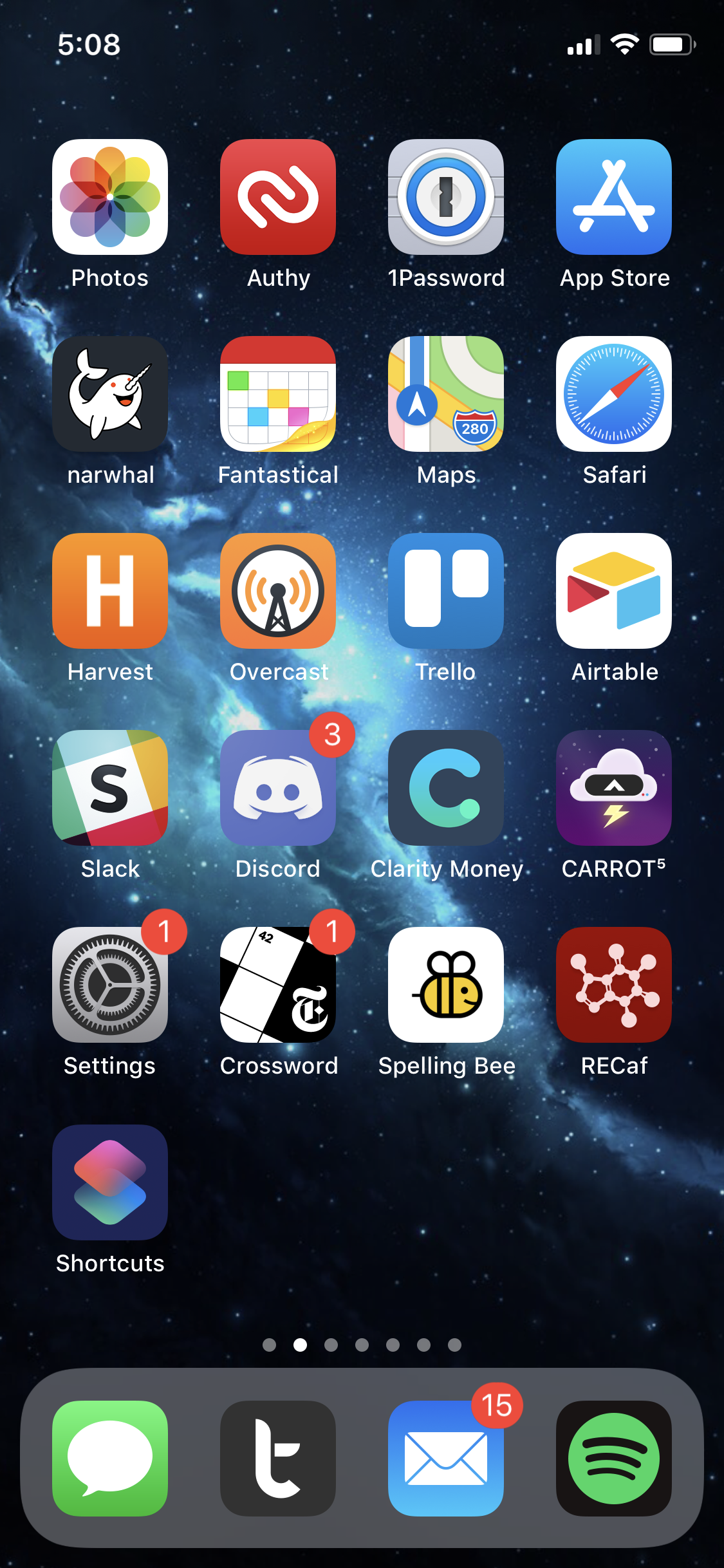
The apps on my home screen are usually the ones that I use on a regular basis, with the ones in my dock being the ones I use the most. Apart from those, Slack gets a lot of use for work, and Discord for talking with friends. Trello and Airtable are both used for convention planning and management, so having them on my home screen is nice for easy access to that information, especially when it’s the weekend of the event.
Some of the apps on my home screen are aspirational—apps that I want to start using on a regular basis. I’ve got Clarity Money and RECaf, in hopes that by having them on my home screen, I’ll use them often (it’s not really working so far). And Shortcuts is there to prompt me to experiment with it and try to find ways I can integrate it into my regular usage.
I’ve got a folder for games on a separate screen, but there are two that I keep on my homescreen: Crossword and Spelling Bee, both from The New York Times. While I’m not very good at either, I still enjoy the challenge.
Brian Capps
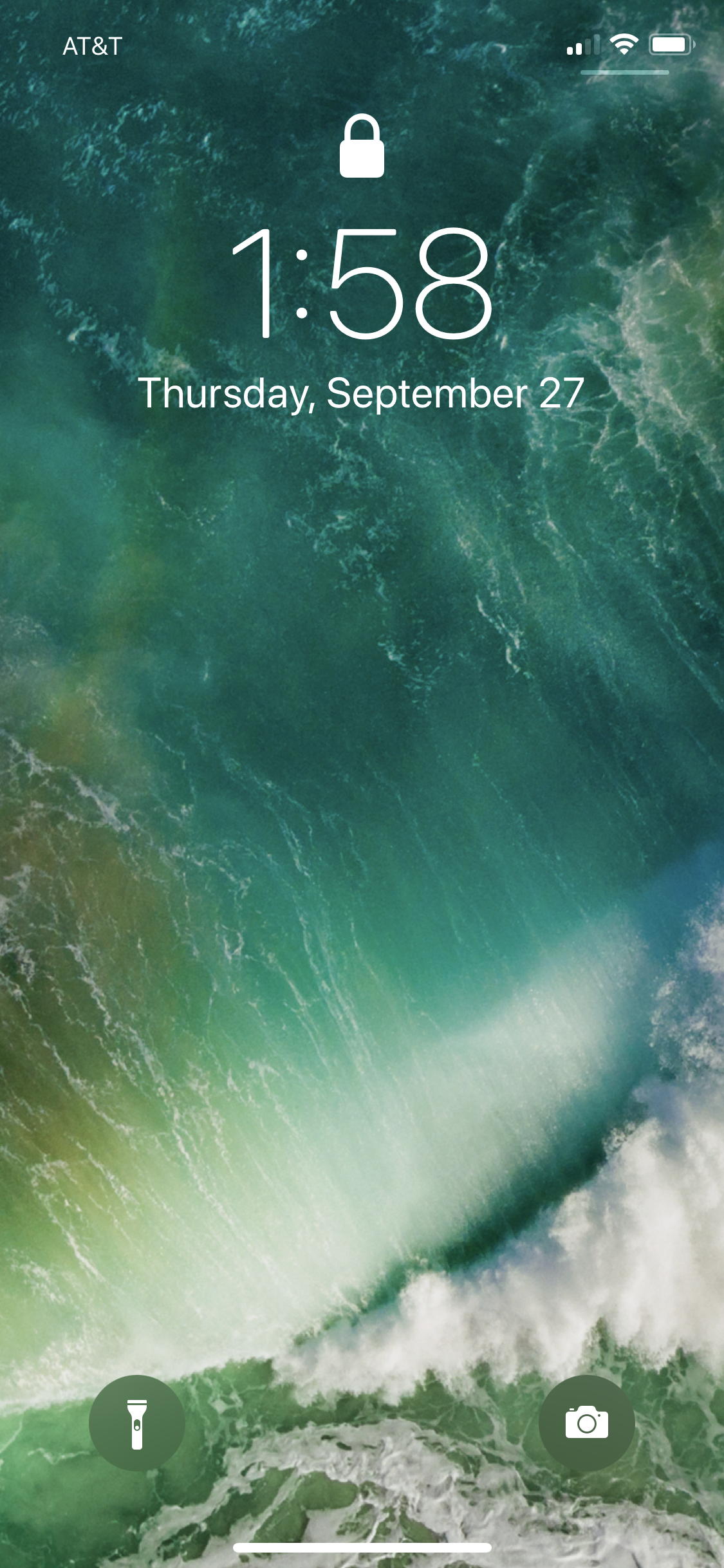
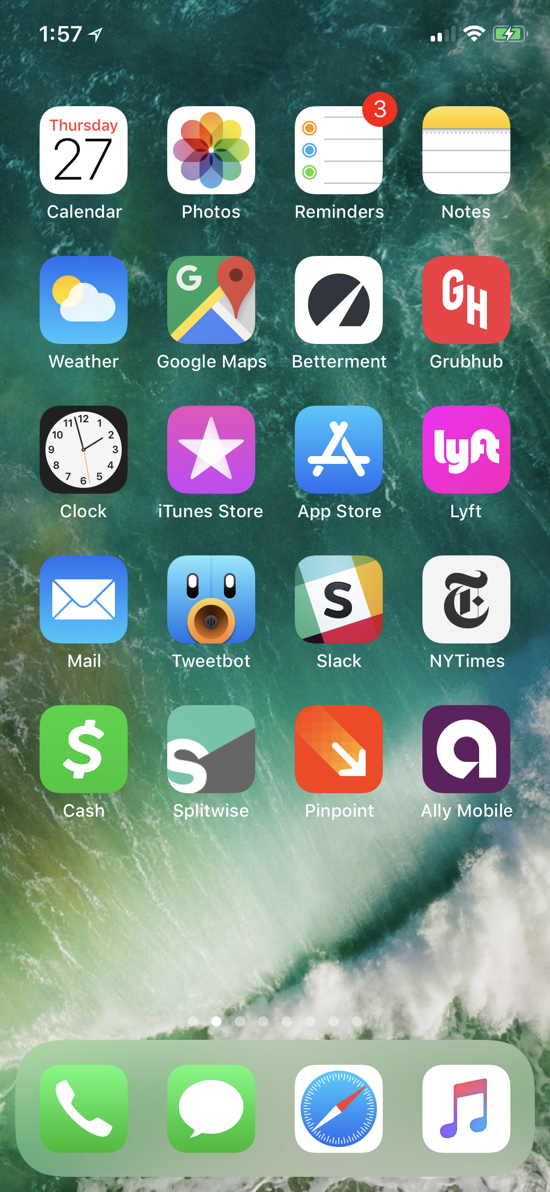
Here’s what Brian had to say about his home screen setup:
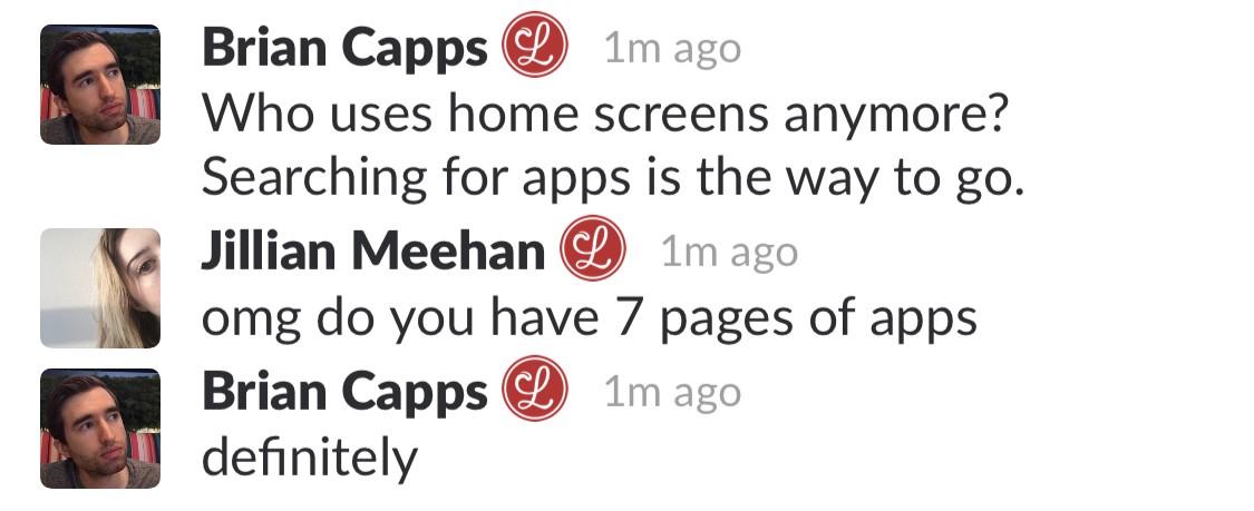
(Let it be known that Jillian has never once “searched” “for” “an” “app.”)
Michael Amundsen
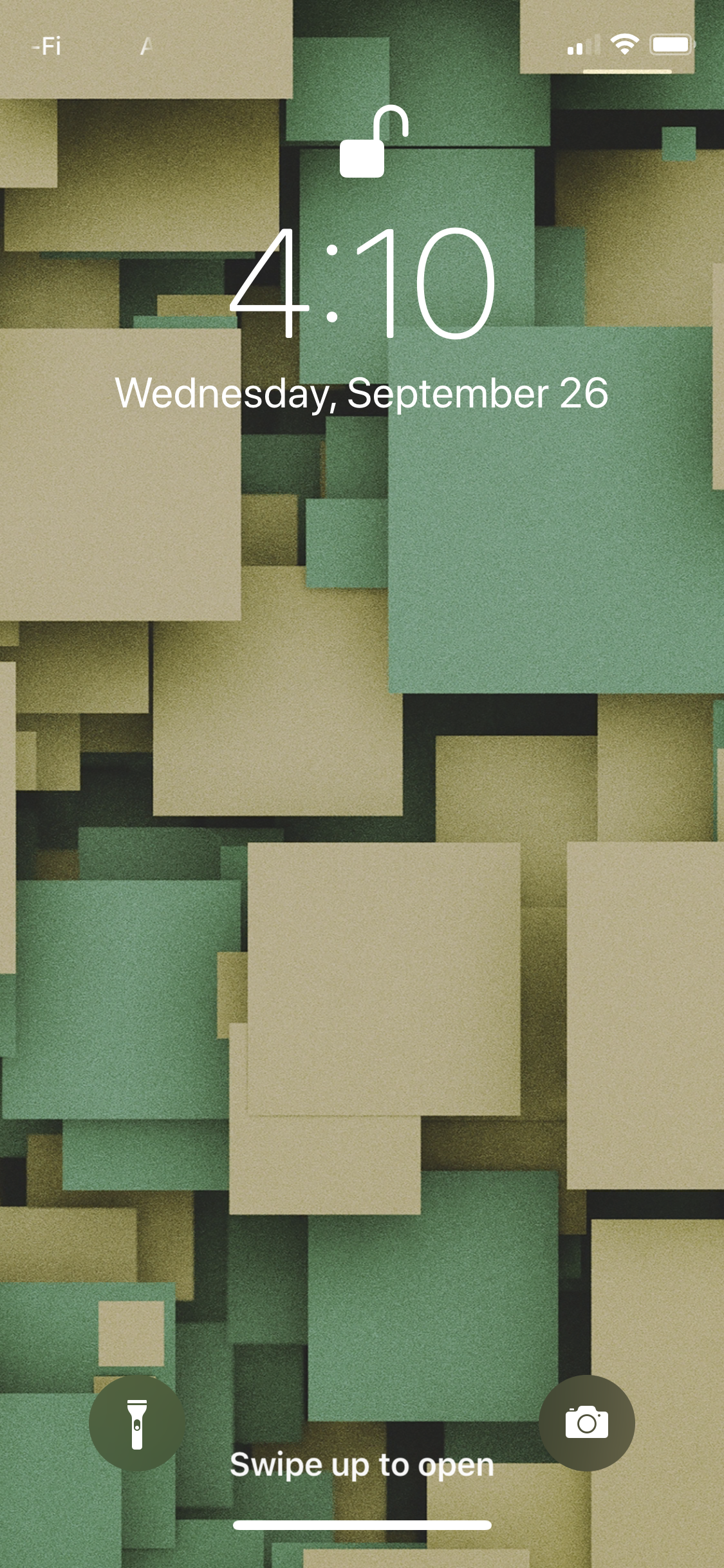
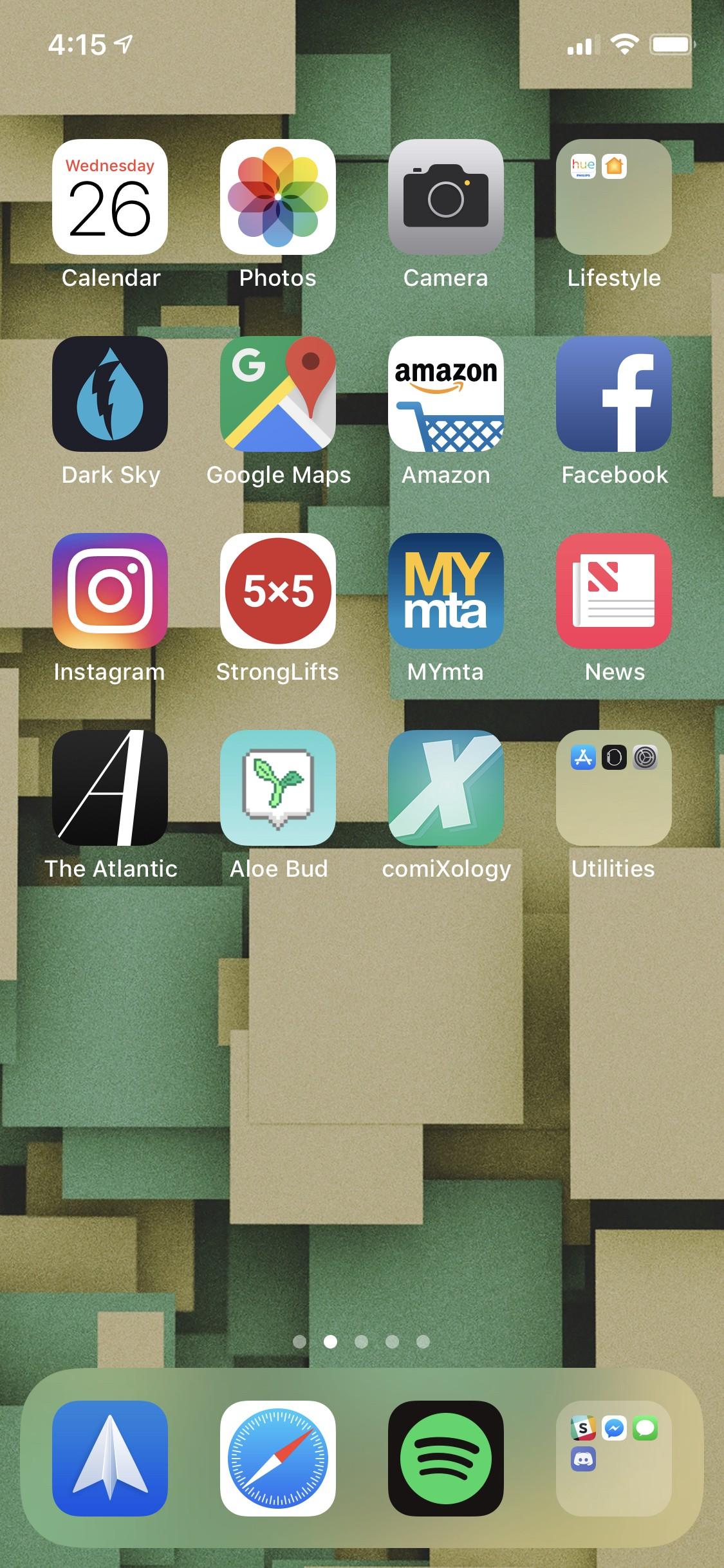
I have a wallpaper e-mail I get each Sunday that I update my wallpaper to. This week was green themed.
Generally, my home page has the apps I’m most actively using. Having said that, these days I just swipe down and search for the app I need, because most of the time, either Siri suggests what I’m looking for, or it’s faster to search
It’s kind of interesting that, if I think about it, my primary way of interacting with my phone or computer is to use Spotlight to search and open what I need.
Andrew Harrison
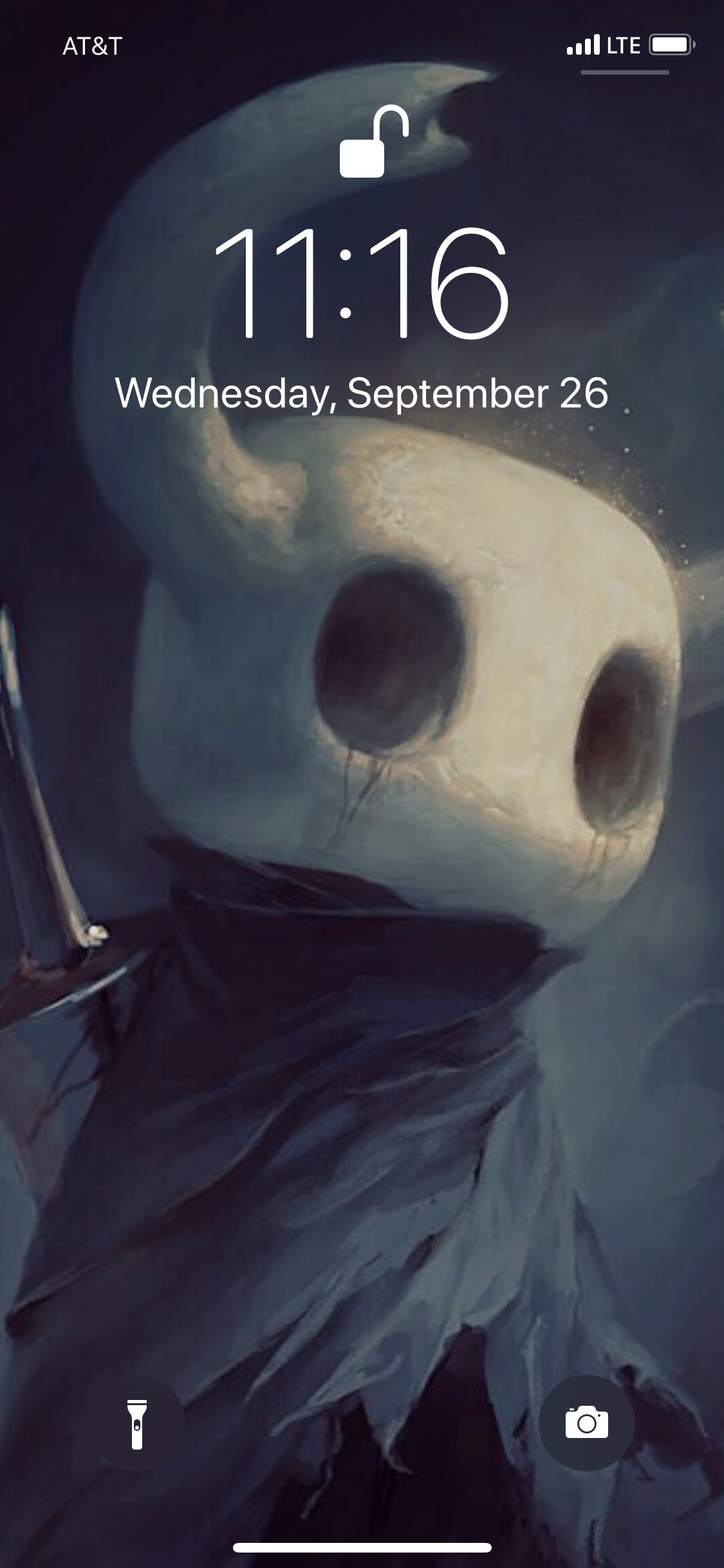
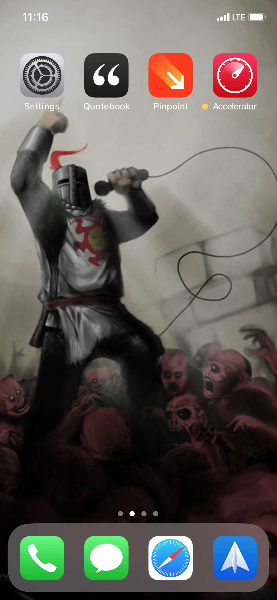
No comment. 😎