The Many (Watch) Faces of Lickability
A look at our Apple Watch faces ⌚️
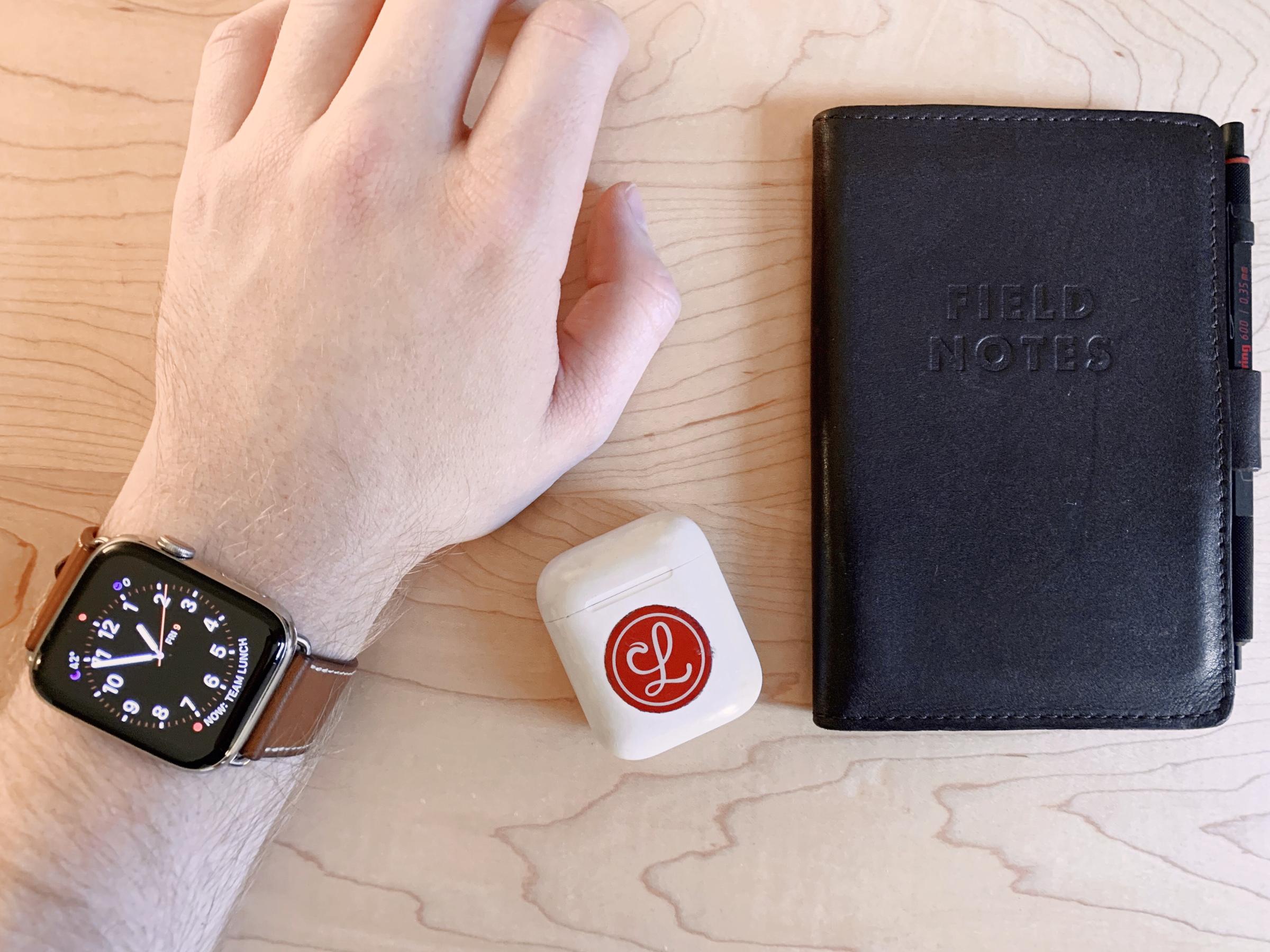
A few posts back, we showed you the Lickability team’s iPhone home screens — and you showed us some of yours. This time around, we’re sharing our Apple Watch Faces. Strap in, folks.
mb Bischoff
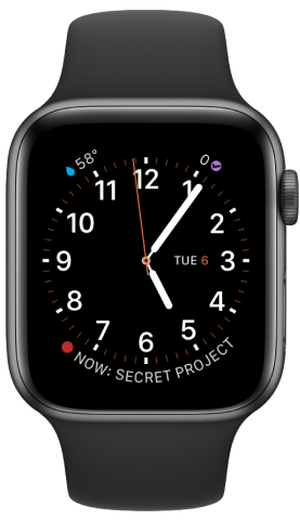
I’m a purist (read: elitist). I still love the Utility face that shipped on the Apple Watch Series 0. Four complications keep me aware of everything going on in my day: my next calendar event via Fantastical, temperature and weather conditions from the not-so-friendly A.I. of CARROT Weather, my OmniFocus to-dos, and the date. The second hand and minute markers are set in the signature Hermés orange, because I’m a sucker for exclusives and spent too much money on this watch.
Michael Liberatore
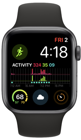
I’m currently using the new Series 4 Infograph Modular watch face on my Apple Watch. While it’s not the prettiest collection or layout of complications, it’s allowed me to have quicker access to more of the things I care about in my daily watch usage.
I care most about Activity, which gets the prime center spot, and Workouts to help fill those activity rings (err… bars in this case, I guess). I love the new weather complication with current, low, and high temperatures, and wouldn’t want a watch face without weather conditions prominently displayed. (Thankfully, there’s enough room for both.) I set timers a lot, frequently via Siri, but I like being able to see the time remaining at a quick glance without having the Timer app full screen.
Oh, and the date and time (duh).
Michael Amundsen
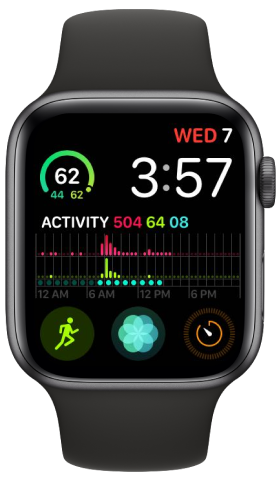
It’s a watch, so time and date are fundamental. I like the weather range complication. Activity, because it’s one of the major reasons I have an Apple Watch. Workouts complication for easy access at the gym. I like to use Breathe to help me fall asleep before bed, and I use timers a lot when cooking.
Jillian Meehan
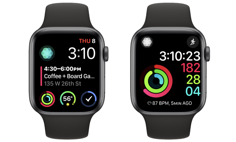
I fully believe in having multiple watch faces to suit your every mood, but the two I use the most are the Infograph Modular face (for everyday) and the Activity Digital face (for workouts).
My main watch face shows me all of the most important things that I need to be able to see at a glance day to day, like my next calendar event, the weather, and how many tasks are left on my Things to-do list. Having my Activity rings and the Breathe icon there reminds me to check in with my body now and then throughout the day.
I am by no means a serious athlete, but for times when I want to see a more detailed view of my Activity for the day, check my heart rate, or start a workout (in my case, usually yoga) I like to be able to swipe over to my Activity face.
Grant Butler
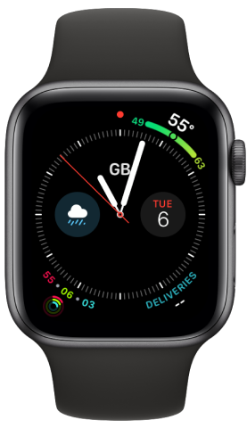
I’m currently using the Infograph watch face. It’s a bit of a variation of the Utility face I had been using on my Series 0 watch. I’ve got the current temperature, activity information, and today’s date on there. Since the Infograph face has many more complication slots than the Utility face, I also added the current weather conditions, as well as Deliveries’ complication.
…oh, and Brian Capps
Actual quote from Brian: “What’s an Apple Watch?”