A New(er) Look for The Atlantic
How we built the redesigned app
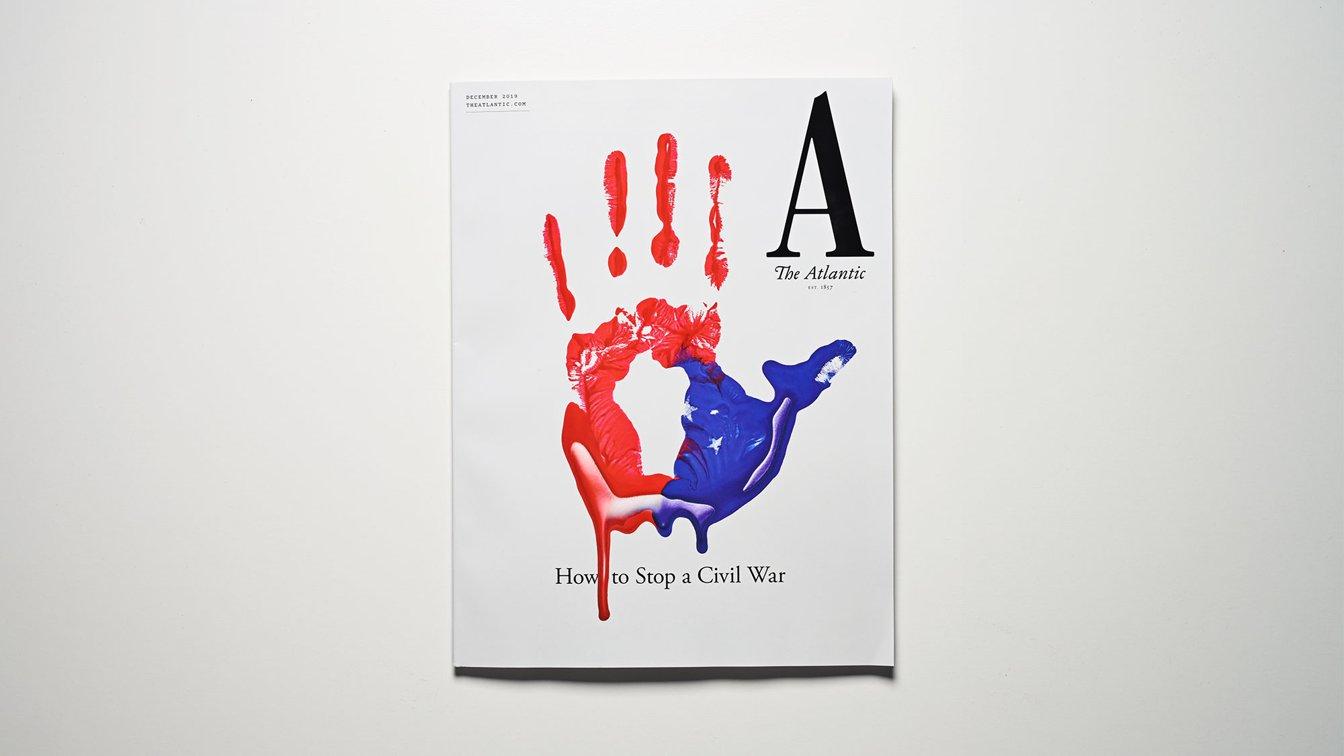
Everyone loves receiving a good grade. Seeing a giant, red “A” at the top of an assignment is such a great feeling—in fact, that‘s the same grade we would give The Atlantic on the new look they debuted a few weeks ago. They redesigned their brand from top to bottom—with a bold, red “A” logo to match—and in the process took a whole new look at how they approach news on mobile. Naturally, we jumped at the chance to help them build it.

The Atlantic 6.0 may seem a bit familiar to users of the previous version—the general structure is similar, but it also includes some huge changes. The most vital update is on the very first screen, which has a completely new Today tab: a guide to the stories that matter each day, with thoughts and articles curated by a team of mobile-specific editors. It is a confident and unique approach to presenting the day‘s news, focused specifically on readers with devices in their pockets. This shift coincided with a full rebranding of The Atlantic, with new fonts, icons, colors, story presentations, article layouts, and account management, among just some of the updates.
We built The Atlantic to feel right at home on iOS 13. With the design team at The Atlantic, we worked to make every screen look great in dark mode, including dark variants for images on story lists. If you‘ve logged into The Atlantic on Safari, we auto-fill your information when logging into the app with iCloud Keychain. Articles should load faster and saving your position within them should be more reliable. And, for our fellow nerds: under the hood we’re even making use of Apple‘s all-new compositional layouts and diffable data sources in addition to standardAppearance to provide a solid foundation for future work. (Want some help making sense of them all? Get in touch!)
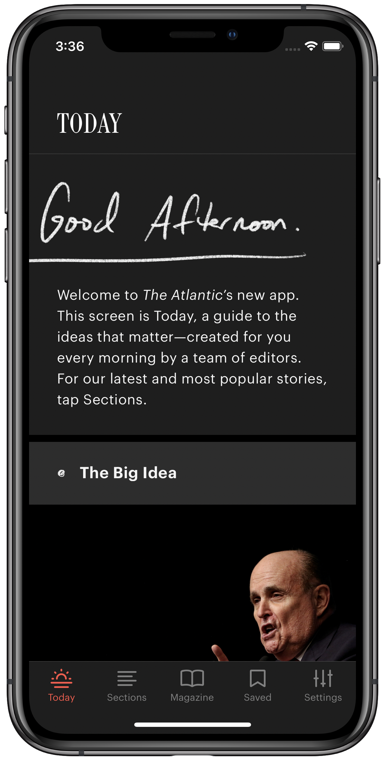
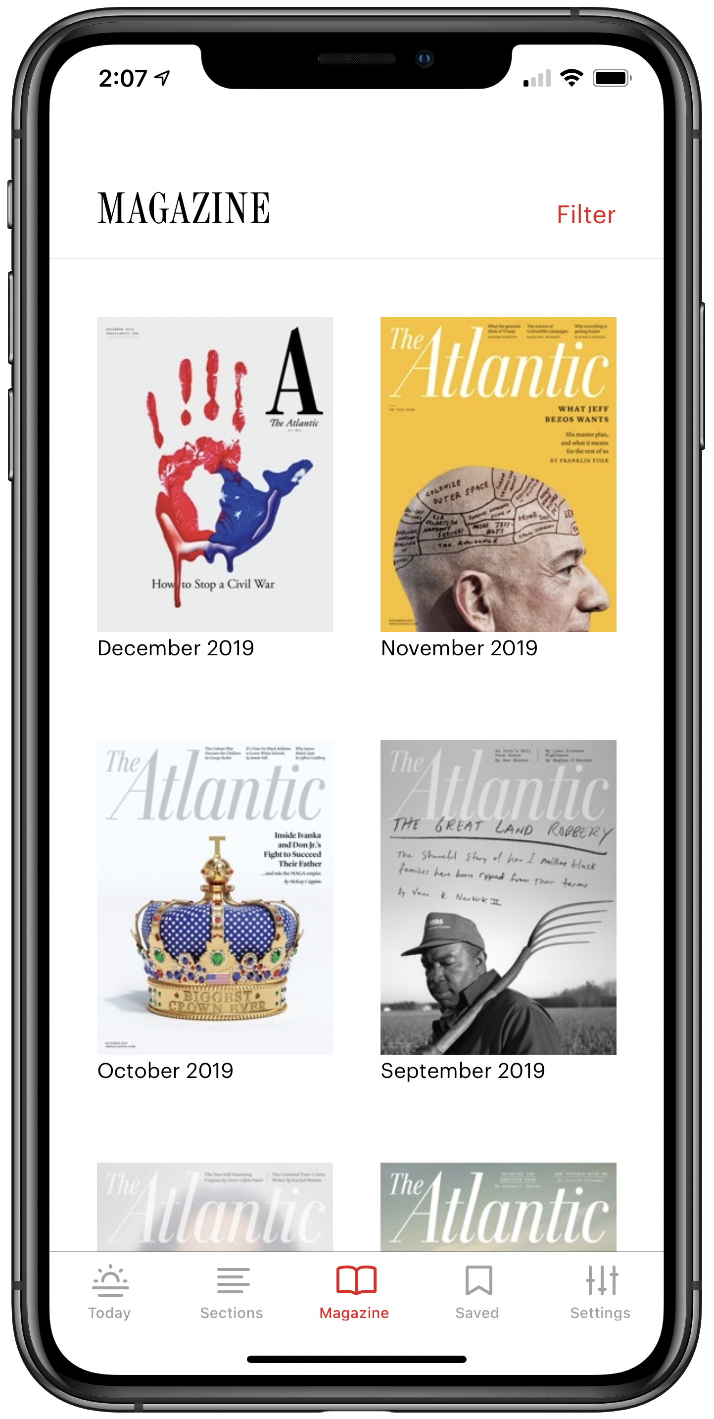
Screenshots of the new Atlantic app
We also fundamentally believe that people of all abilities should have the opportunity to comfortably use the software we build, especially when it comes to journalism. The Atlantic made accessibility a priority on this project, and we worked hard to make the iOS app completely accessible, from full VoiceOver and Voice Control support to thoughtful support for Smart Invert preserving image colors. We checked every color in the app through Apple‘s accessibility tool to make sure the colors included in the app contrast each other for maximum legibility, and we included both system and in-app control for dynamic type sizes.

It was a pleasure working with our friends at The Atlantic once again on this project. We are so proud of the new release, and it was only possible due to their strong vision and smart decisions about where the company is headed. We were able to move quickly, work with the latest technologies, and make an app that looks and functions in a modern way, thanks to their team of smart and kind people. The Atlantic has a whole new look, but more importantly it has a new approach to news on mobile, and we hope that you love it as much as we do.
Download the app today to see it all in action!