Our Apple Sports design critique
Breaking down the design details (so you don’t have to)
A few weeks ago, Apple did a surprise announcement of Apple Sports, a new app for sports fans. We do internal design critiques quite often, but we noticed a few things worth mentioning for designers and developers thinking about modern iOS design practices.
This app remixes stock UI components in really interesting ways. We once heard someone say, “design your app for the current iOS version + 1.” So with that lens, we’ve been looking at what the design of Apple Sports can tell us about iOS 18.
Apple has been playing with navigation bars a lot recently. We could probably write a whole post about just the nav bar. Take a look at how it stretches during over-scroll and transitions to a squished state when collapsed:
Gradients are used a LOT in this app. This nav bar gradient effect is becoming pretty common throughout first-party apps as well — first with the iOS 17 Health app, then Journal, and now Sports. watchOS 10 is also full of gradients.
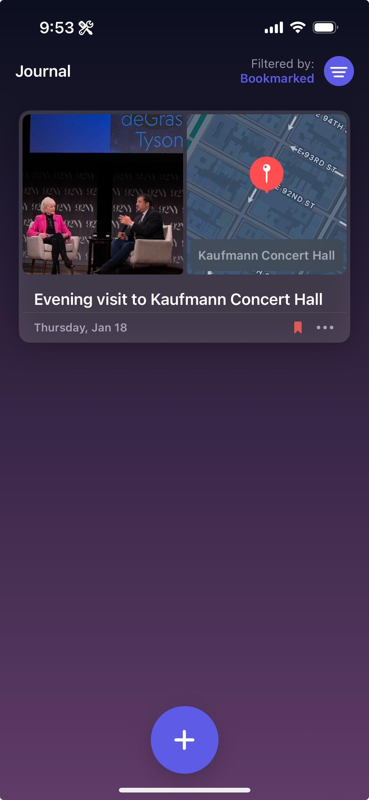
The Journal app is entirely gradients!
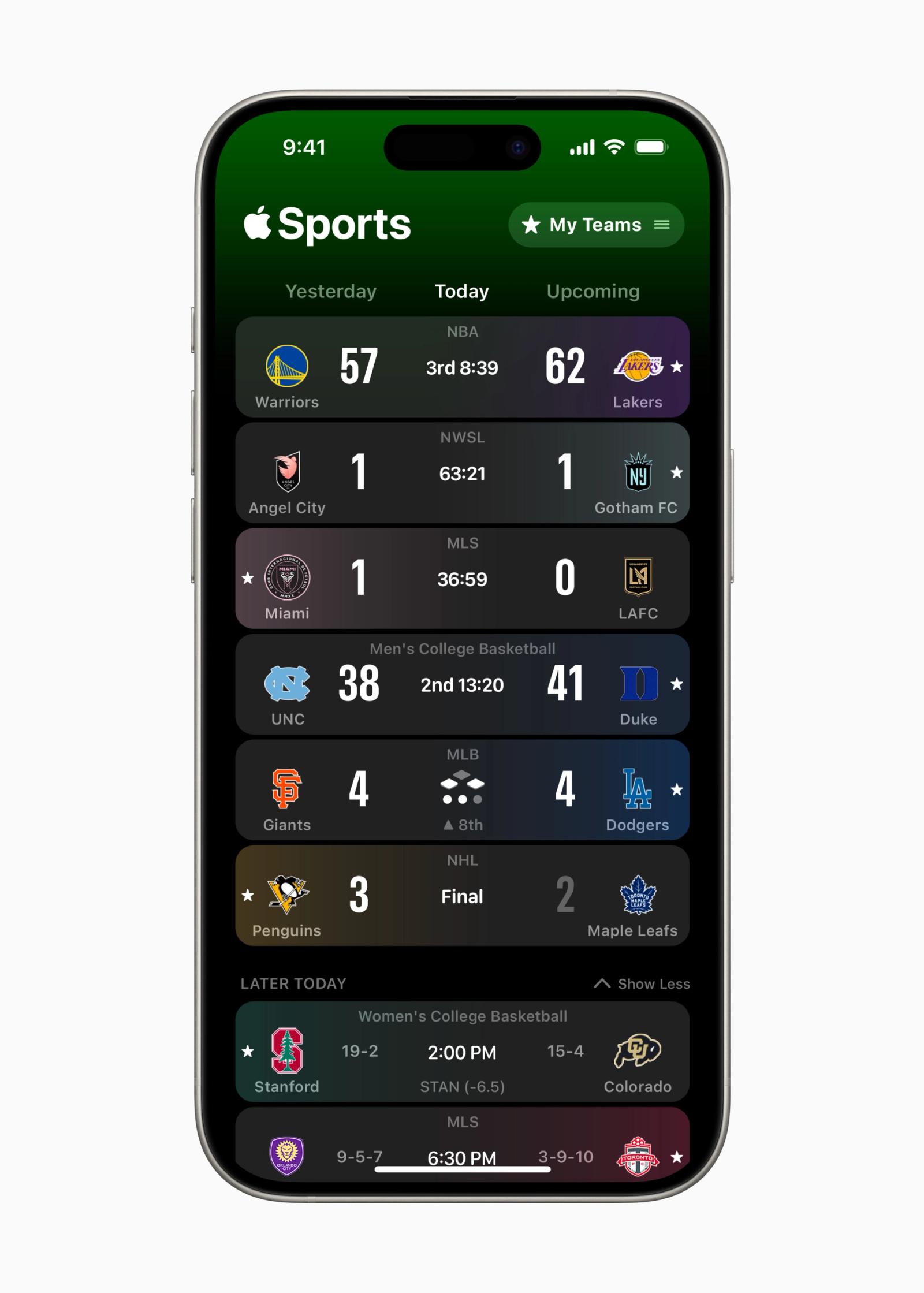
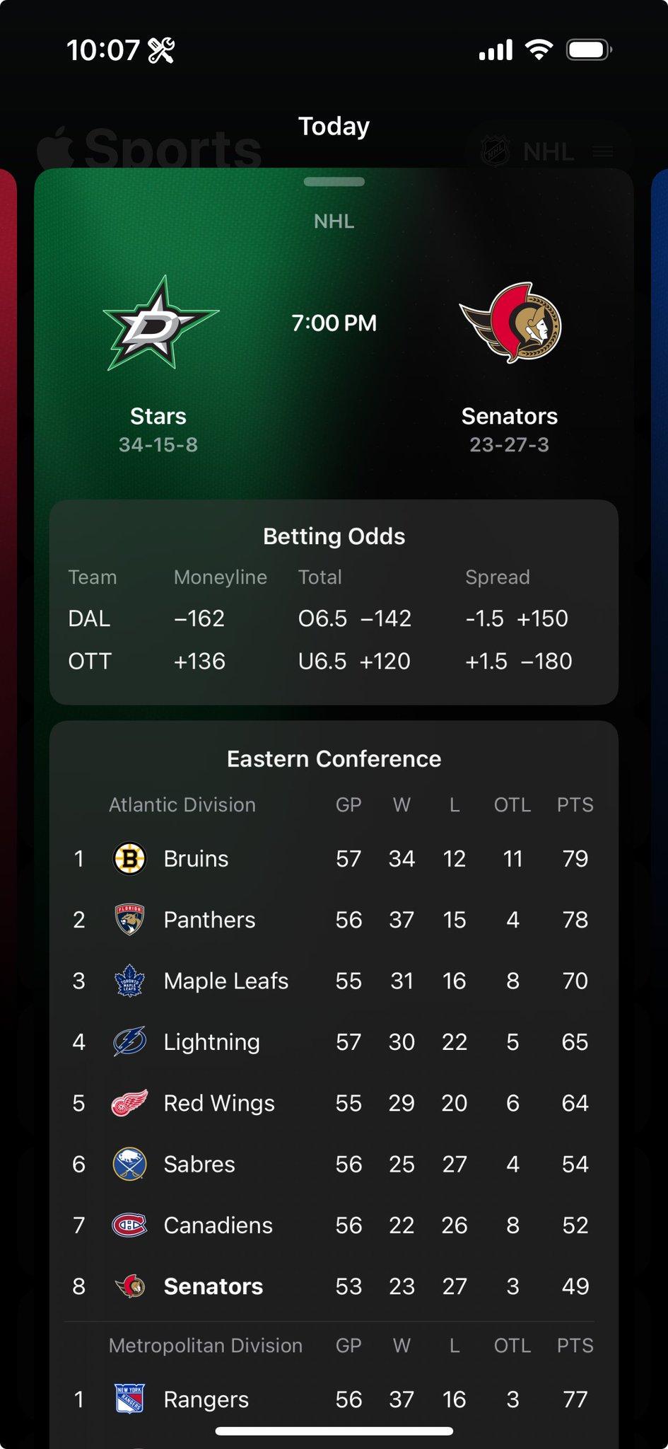
Take a look at the “Yesterday / Today / Upcoming” picker right above the list. This is functionally a segmented control, but they did not opt to use the stock style. Instead, they’re making heavy use of the system-provided vibrancy effect. The default control is blockier and stands out more, which wouldn’t make a ton of sense in this context where it isn’t a super important control.
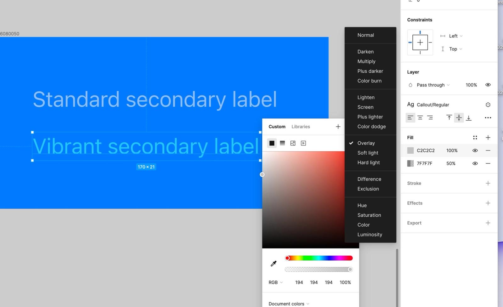
If you’ve used the new iOS Design Library in Figma and noticed color styles like “Vibrant Secondary Dark,” you’ll see this effect emulated. This isn’t 1:1 with the actual iOS implementation, but it’s a good visualization.
In dark mode, a standard secondary label color is just off-white at 60% opacity. But the vibrant label styles are more complex — they let the background color shine through by stacking multiple fill colors with various blend modes.
There’s a lot of fun typography, too! Take a look at the score numbers — these use the system variable font features to make the weight bold and the width compact. We love messing with the font width axes for display type to see what effects we can achieve.
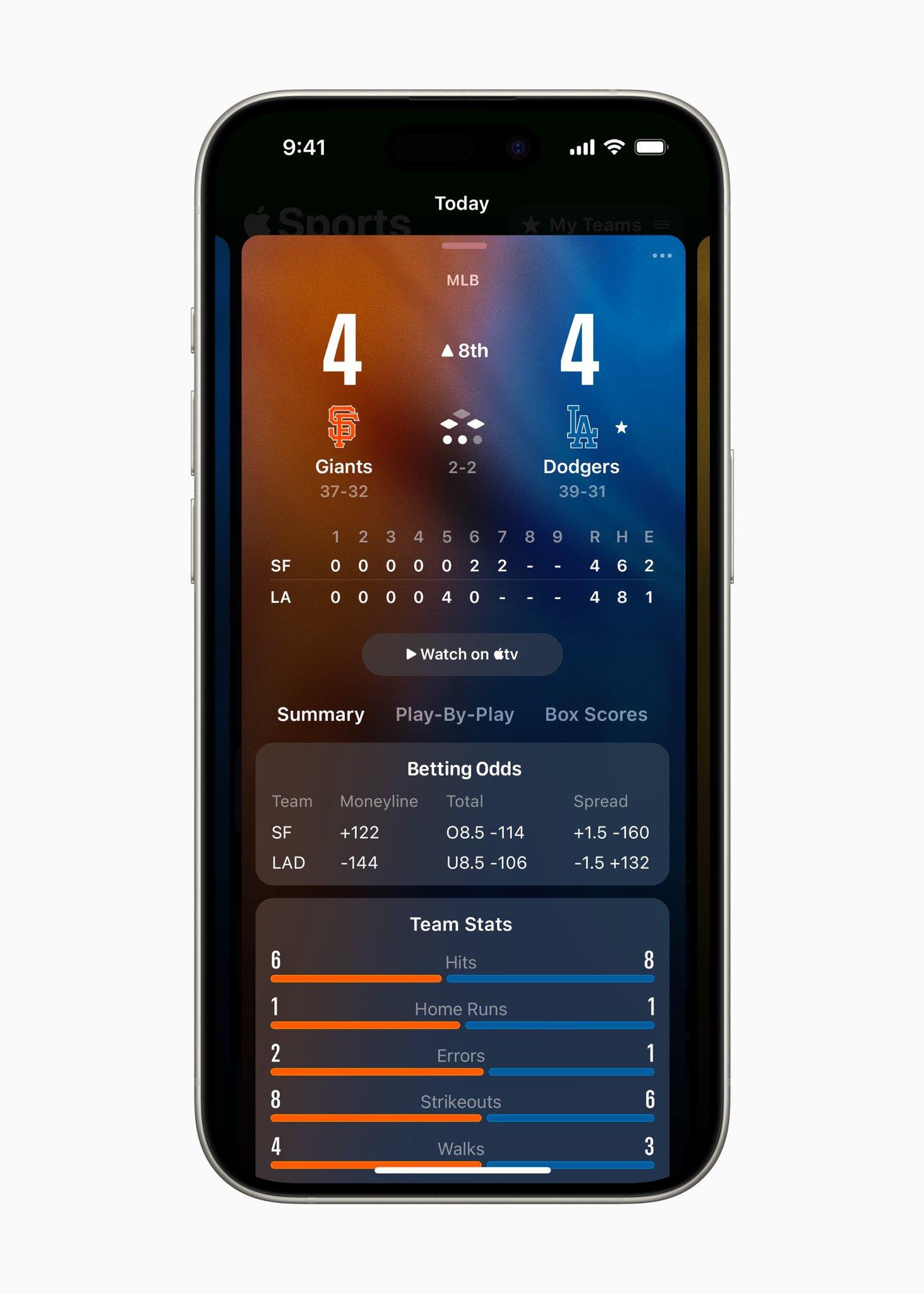
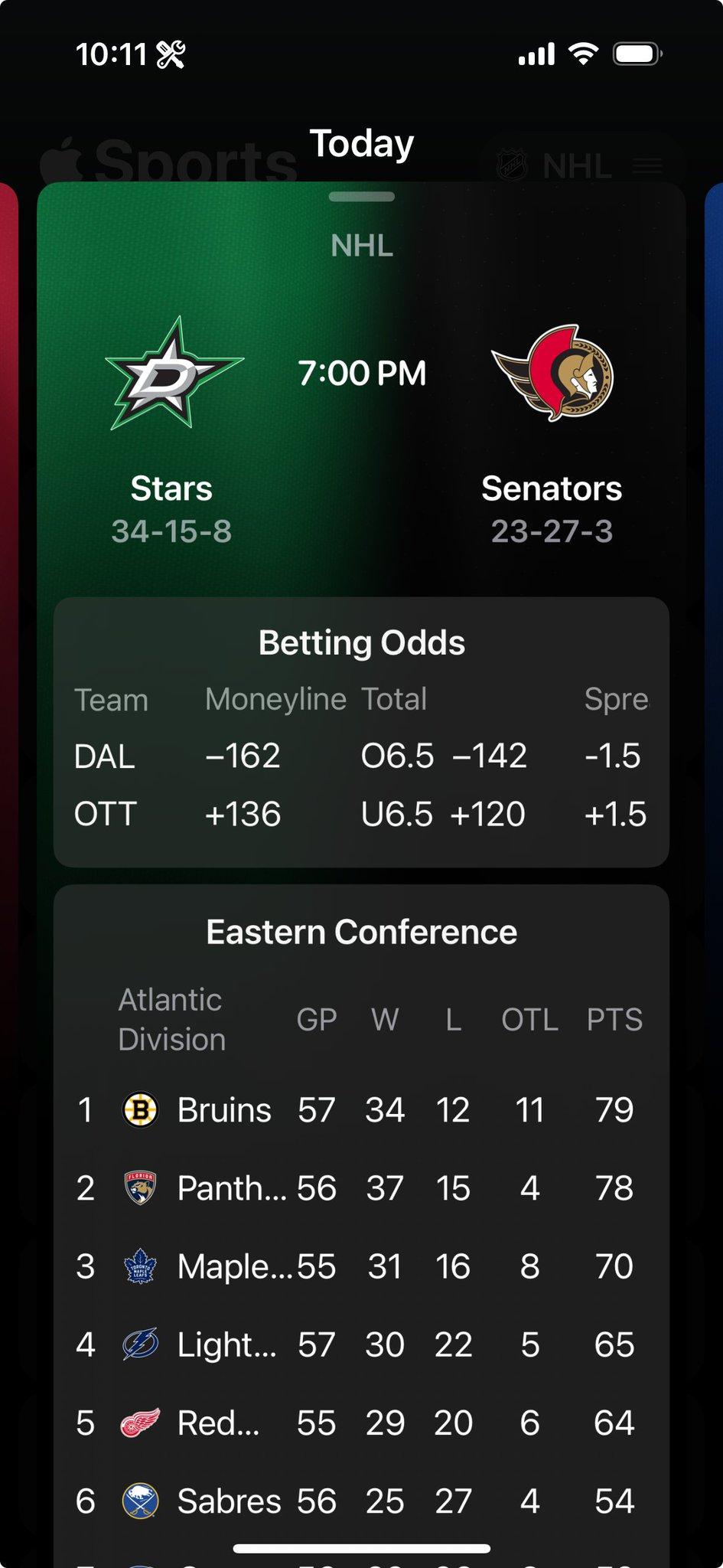
This is also the first time we can recall a super dense data grid in a first-party app. These are always a huge pain to construct, but they’ve implemented this really well. Take a look at what happens when you increase the Dynamic Type size, too:
Finally (and this is a big one): motion backgrounds. It’s easy for an app to feel lifeless when it’s just displaying static data, like the Weather and Sports apps. It’s really hard to get right, but they’ve implemented this animation quite well.
It’s hard to tell what’s going on, but here’s our guess: There are two color swatches where the exact gradation point shifts a little bit (maybe ± 10% from the middle). Highlights shimmer on top of that gradient. Then, underneath it all, this cloth texture we extracted from the app bundle is tiled and warped by a Metal shader.
Will iOS 18 include more apps with this jersey cloth texture? Almost certainly not. But to make your app feel ahead of the curve, you gotta (and excuse the cheesiness) skate to where the puck is going to be. And the puck is headed towards a lot of gradients, motion, and remixing the nav bar in fun ways.