Designing Mastodon’s reply safety features
Exploring the design process behind Mastodon’s latest trust and safety feature
Lickability has been Mastodon’s design partner since 2021, when we helped design their first-party iOS app (and more recently, their Android app). In 1.0 for each of those apps, there have been the expected safety features — mute, block, and report. But those are very direct and technical tools. Don’t get us wrong, those features are critical to having some level of safety on any online platform. But their reach is limited to what you see, which, by definition, puts the onus on the person who needs it. If someone is bothering you, you’re required to block or mute them.
With two million active users, Mastodon facilitates thousands of conversations regularly. We’d like to see each one be incredibly fruitful, but things are bound to go downhill for any number of reasons. Maybe someone discovers a post by following a hashtag and inappropriately replies with a familiar tone. Maybe they reply in a way that detracts from the main point. Maybe they didn’t realize they’re replying to a post from over a year ago. They might not be malicious, but their reply could feel unwelcome to the recipient all the same. Moreover, blocking/muting/reporting might not be the right “level” of response for this type of interaction.
There was certainly room for a different type of safety feature. We started by looking at other products that allow writing public replies and comments on content.
Competitive research
Back in 2019, which was roughly 400 years ago, Instagram announced an “intervention” feature that combined a prompt with a send delay to give you a chance to cancel sending a comment before it actually went through.
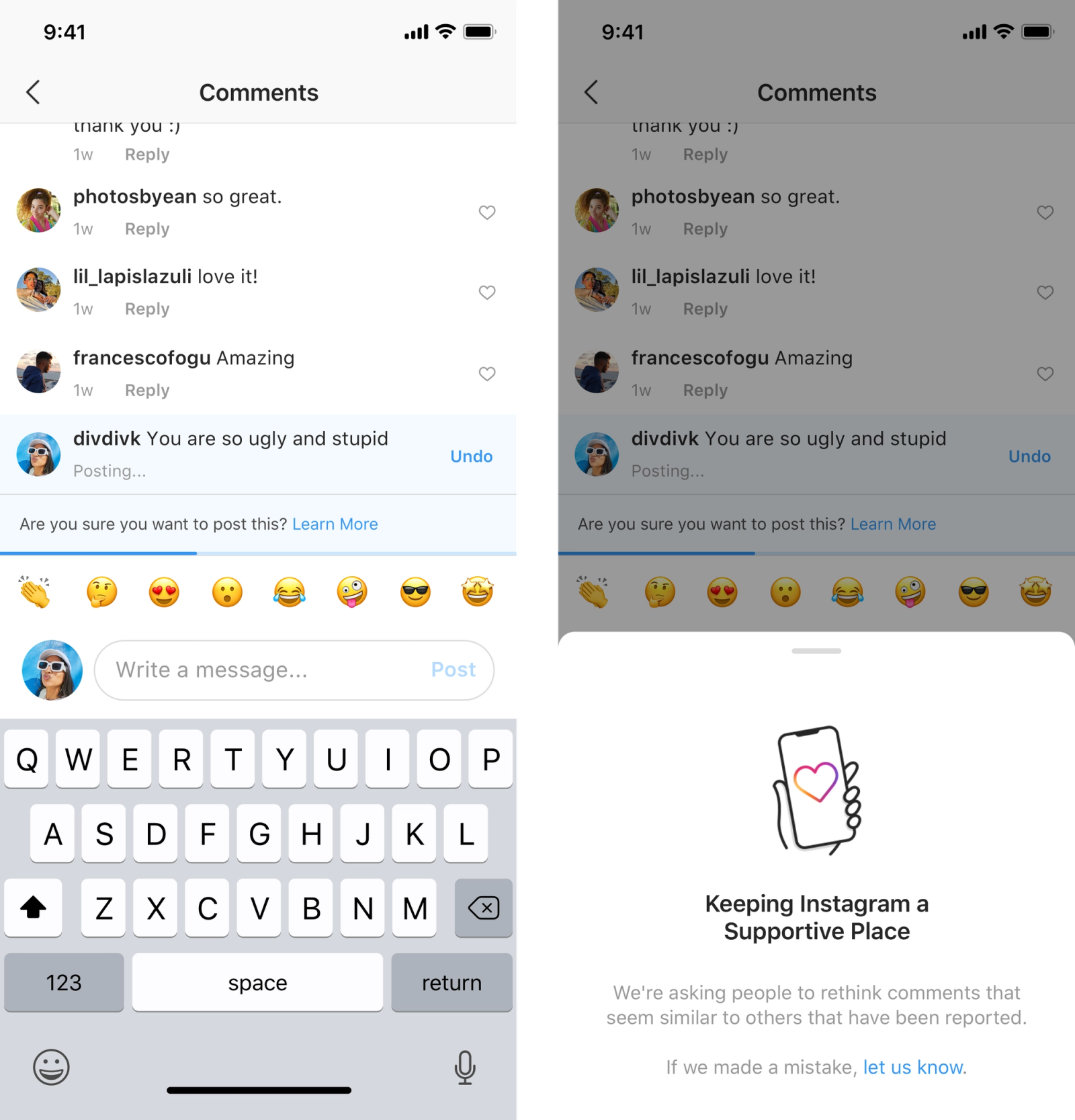
Credit: Instagram
Twitter rolled out a similar experiment that asked users to rethink sending a tweet “if it uses language that could be harmful.”
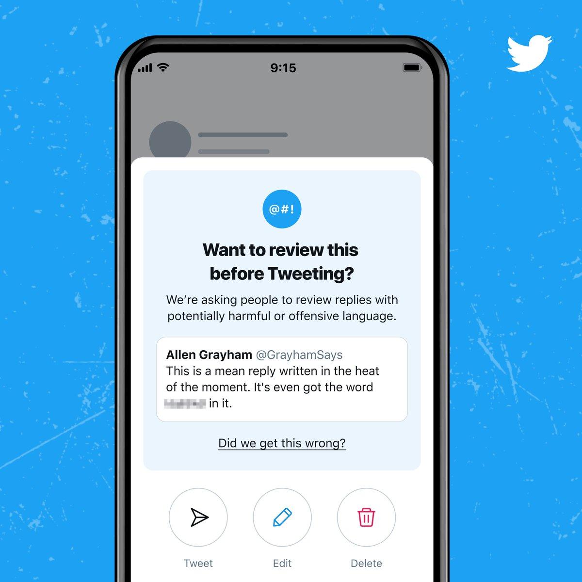
Credit: Twitter
And YouTube is currently testing their own version of this prompt.
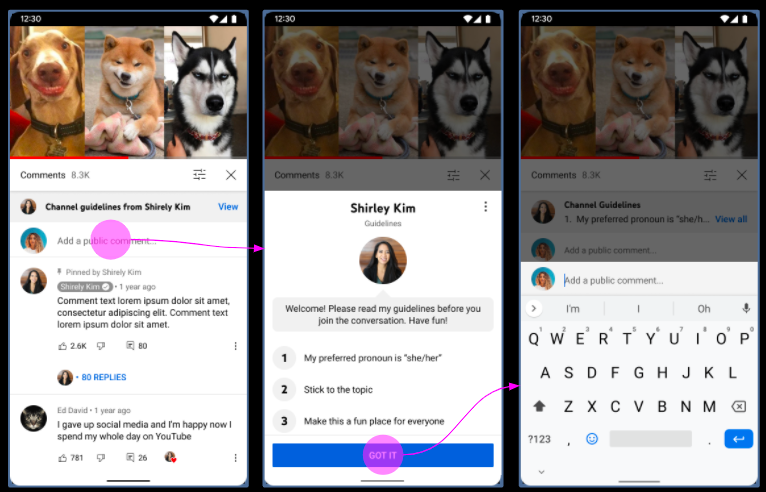
Credit: YouTube
Twitter and Instagram both prompt after you’ve drafted a post that they find to be harmful, while YouTube (and Twitch, for that fact) prompts prior to writing anything — everyone gets the YouTube sheet the first time they comment on a channel.
Instagram’s prompt is the only one where the tone is centered around the product (“Keep Instagram a Supportive Place”) and not the interaction itself. It primarily depends on how much personal resonance the user feels with Instagram, the platform. Feel about that how you wish.
Drafting our prompts
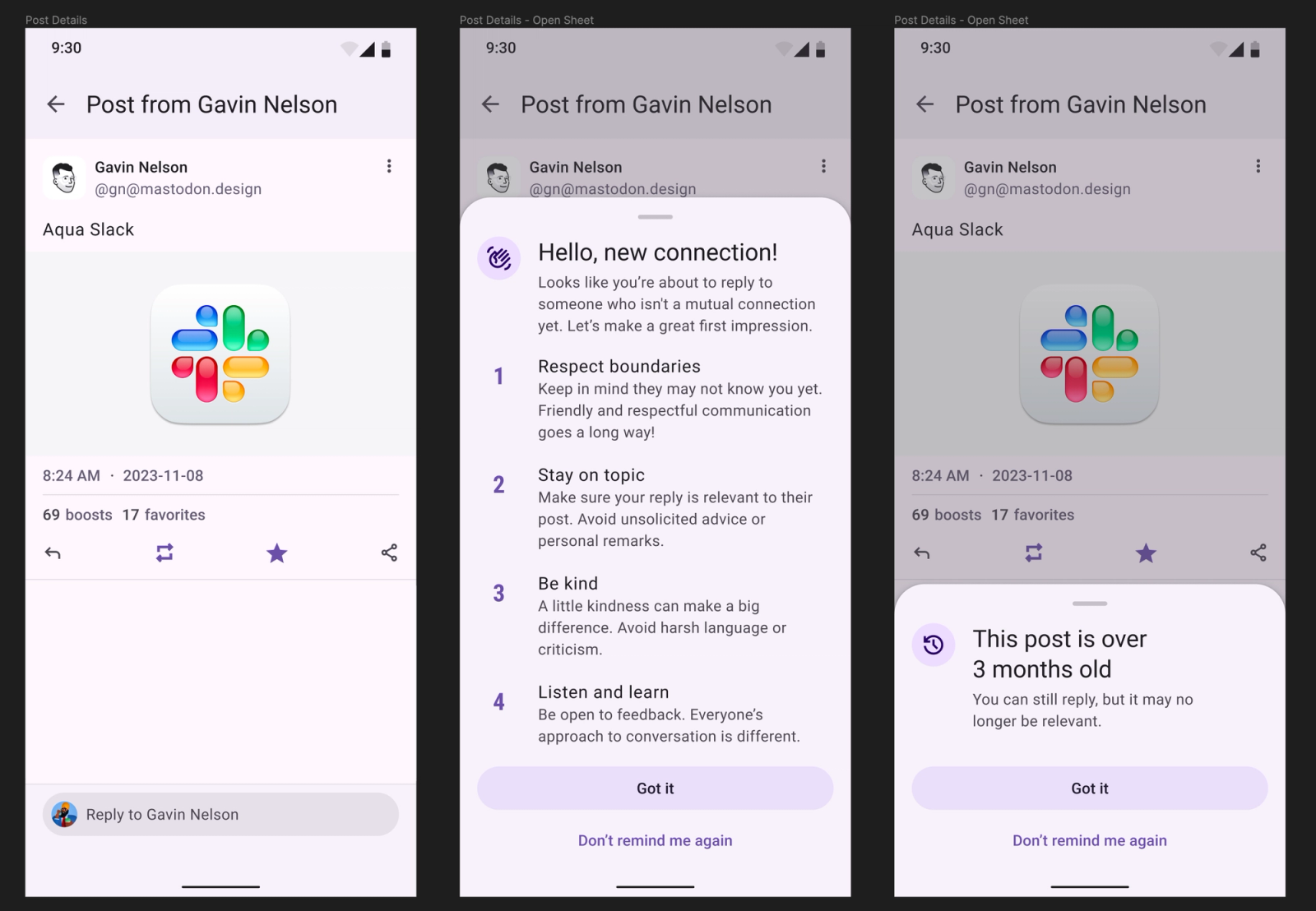
With these references in mind, we started drafting our own prompts. With apologies to Gavin Nelson for being my placeholder user in our initial design concepts:
We liked YouTube’s approach for a few reasons:
- You haven’t drafted anything yet, so if you decide against writing a reply altogether, you haven’t wasted any time.
- The primary action is, in both cases, to proceed to commenting. We don’t want to hinder conversation, we just want to make the conversation higher quality. In contrast, the action Instagram’s prompt wants you to take is “don’t send this after all,” and Twitter weights their three actions equally.
- We wanted to move fast, and since this prompt is happening entirely on device, it does not involve any sort of tone analysis that might tax the hardware.
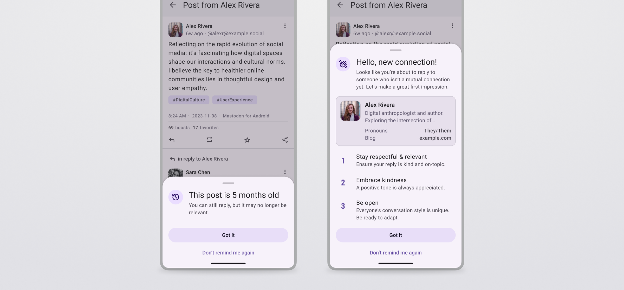
But this wasn’t exactly right. The copy for the old post prompt didn’t sit right with me. It tells the recipient about the logic gate (post.monthsSincePublished >= 3 ? showPrompt() : simplyDont()) and makes them fill in the blanks. When showing the draft to a few people, we got feedback that the non-mutual prompt is just a wall of text and doesn’t provide any color on who you’re about to reply to. Our next iteration shortened the rule list and included an abbreviated user profile as an inset card.
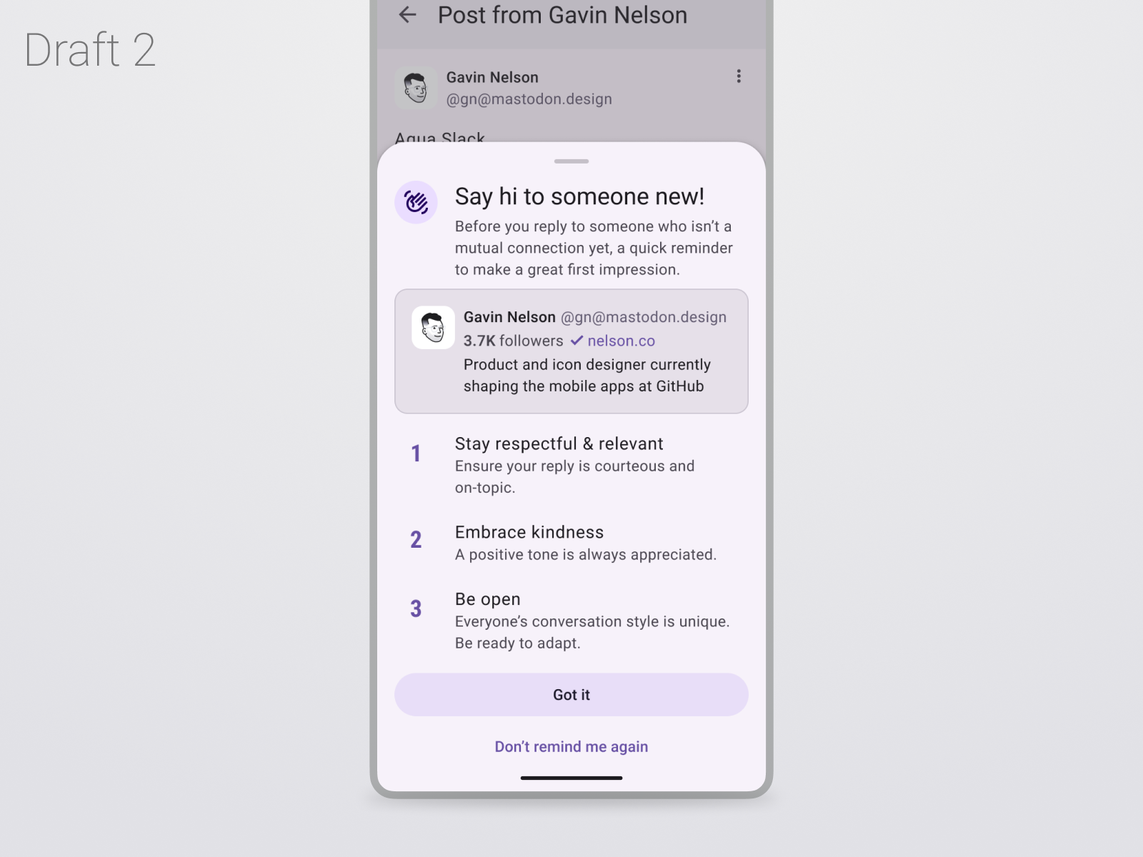
For final changes, we made the profile photo larger (you should know who you’re interacting with!) and included four lines of text: the first two lines of their bio, and the first two custom fields (key-value pairs). We’ve noticed that people tend to put pronouns or their job title in their custom fields, which gives the prompt recipient some background to avoid potentially misgendering someone or explaining something to an industry expert.
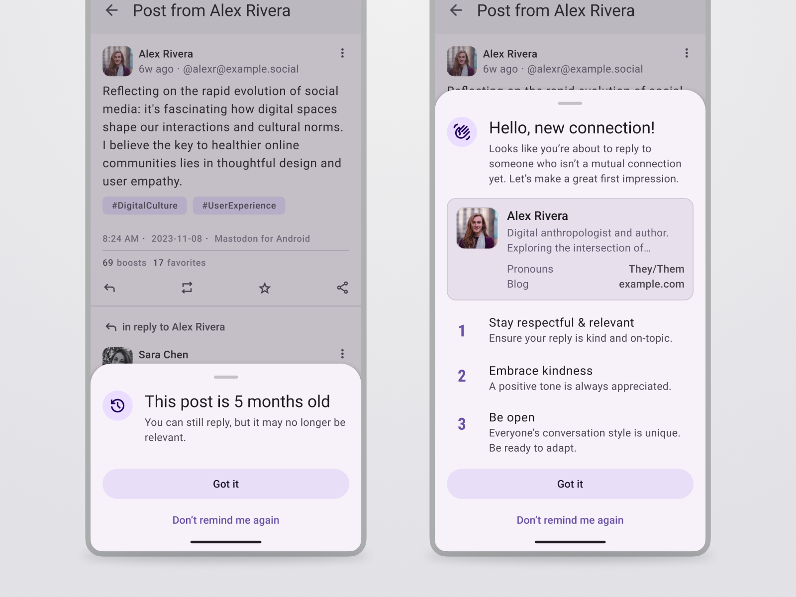
Our final design.
Design learnings
The announcement and rollout went well, with the people who this was designed to help expressing their interest in this feature. It was picked up by themedia and was a gay ol’ time.
There were also Opinions in the replies to the announcement post, to be sure. A few people mentioned an interstitial prompt is poor UX and increases cognitive load & friction. But when the feature goal is safety, we’re not really designing for people to cruise through the product — we’re designing to mitigate potential damage. Making things frictionless and letting people think less would be counter to what we’re trying to achieve.
That said, the design above likely isn’t the final final iteration that will stick around for the long haul. We’re still keeping an eye on how people interact with this feature and making changes accordingly.
Successful UX design has often been characterized as design that disappears and gets out of the way to let the user do their thing. It’s partially why Mac OS X’s Aqua interface got toned down over the years from sharp pinstripes to gray gradients:
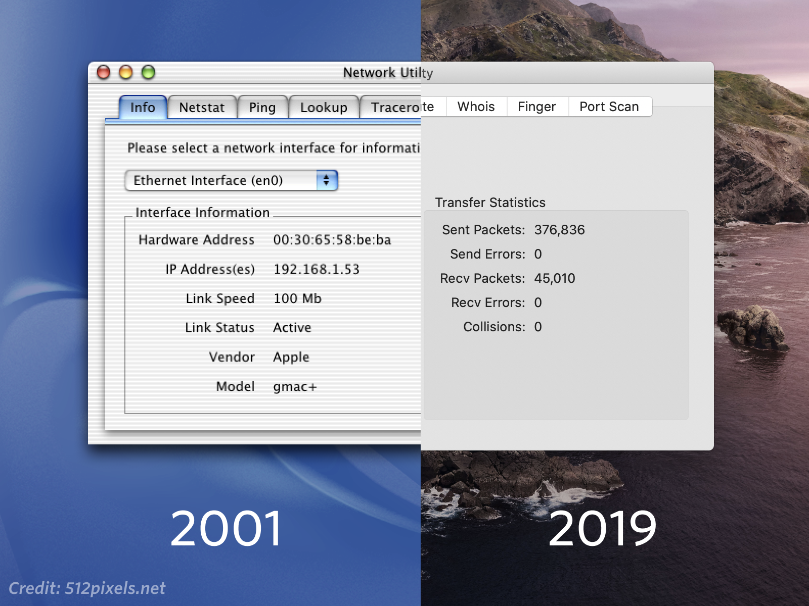
Credit: 512pixels.net
But thoughtful UX design is willing to step out from the shadows and make itself known if it might benefit the greater good.

