We Like Widgets!
An updated look at our home screens, lock screens, and watch faces.
It‘s been a while since we shared our home screens and watch faces here—so long, in fact, that those blog posts look a bit like time capsules now. So we figured it was time for an update. Here‘s a new look at our digital layouts, including all the widgets and complications we’ve welcomed into our lives in the past few years.
Tom DeVuono
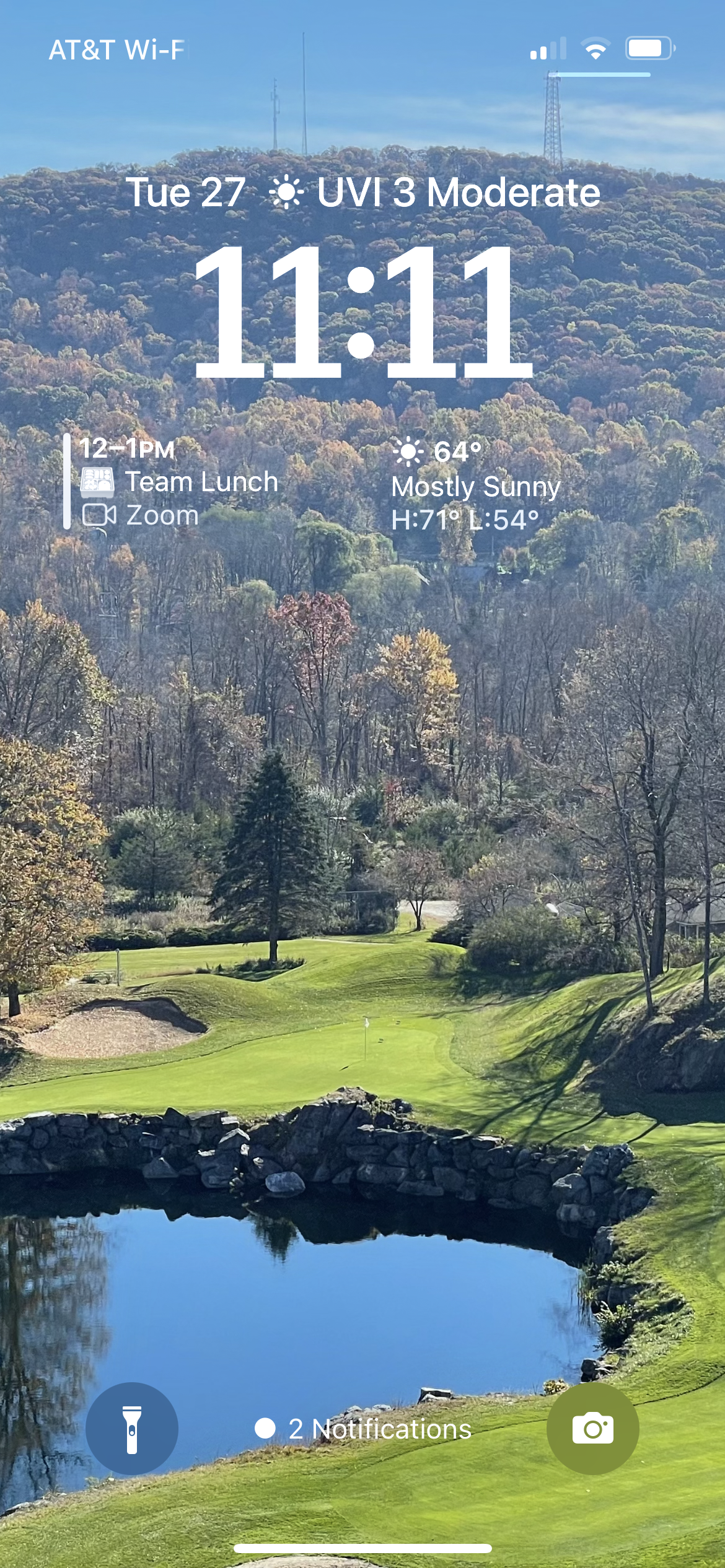
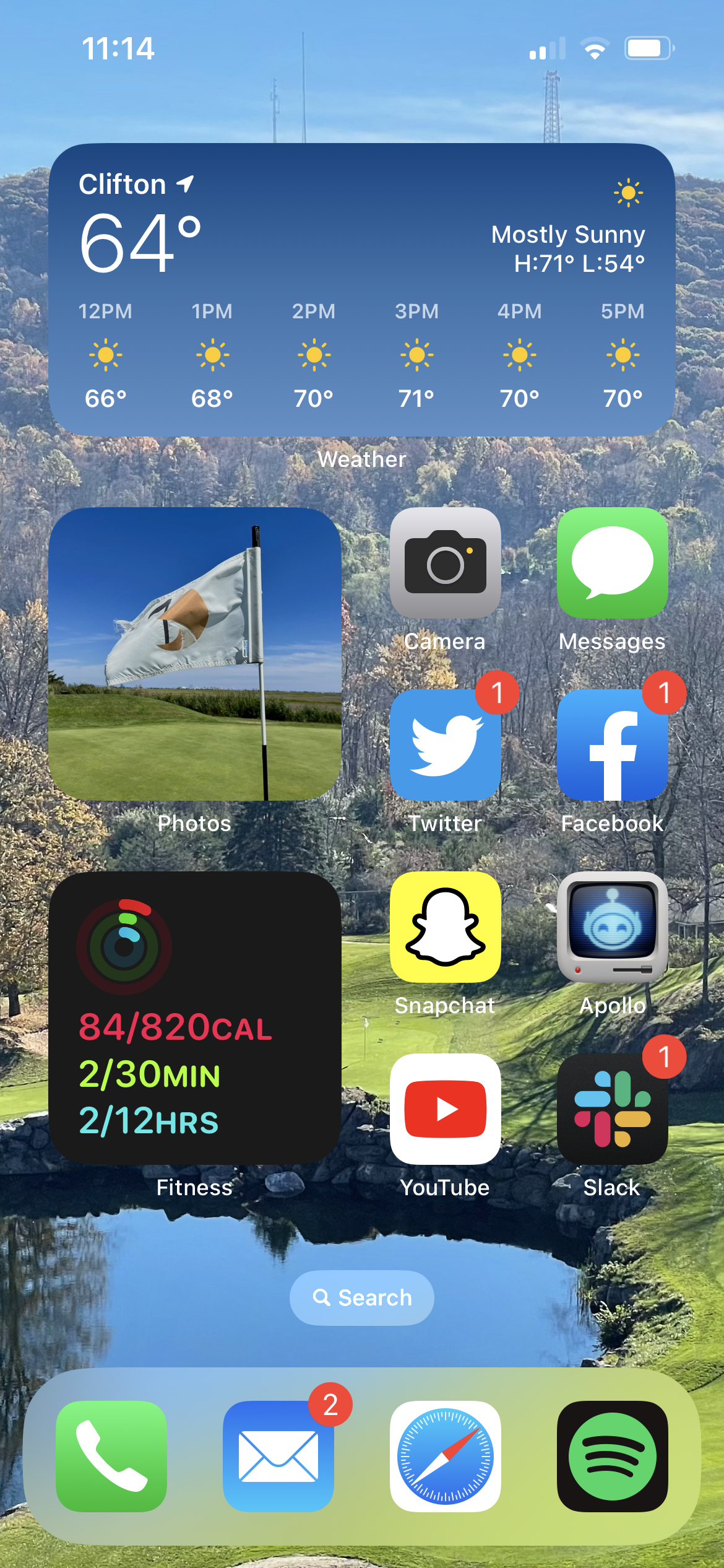
I like to keep my lock screen pretty simple and avoid widget overload. Weather is my favorite widget and the one I find most useful, so it’s always front and center no matter where I am. For the lock screen, I also added the upcoming meeting widget, which is great for work. I round out the top with UV Index, ’cause the sun is a deadly laser.
For the watch, again, keeping it pretty simple. I really like the new astronomy choices, and the little animations it does when I raise my watch are fun.
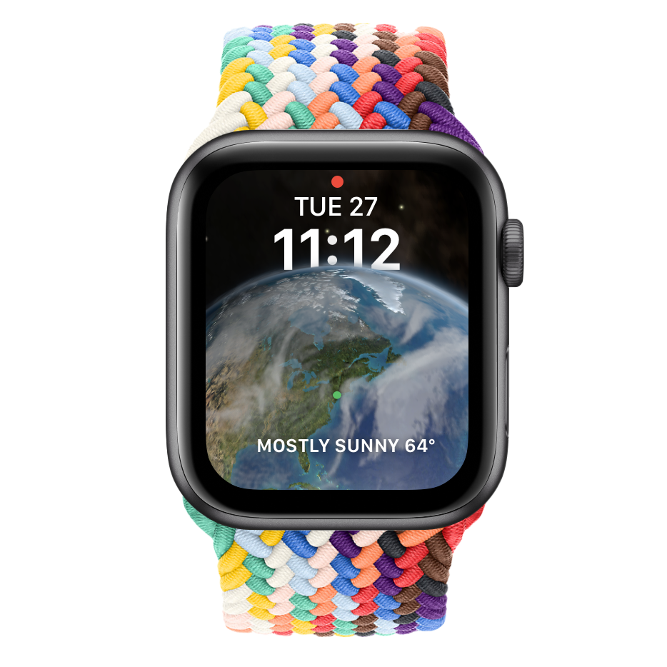
Home screen layout and widget choices remain the same, just a new wallpaper that matches the lock screen. My home screen is the only page I run— everything that’s not on there I get to with Spotlight search.
Sam Gold
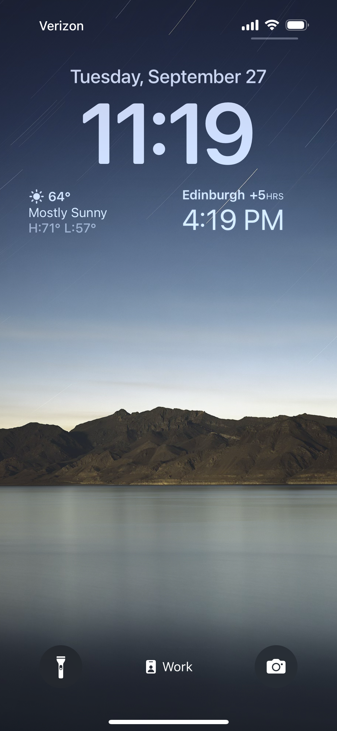
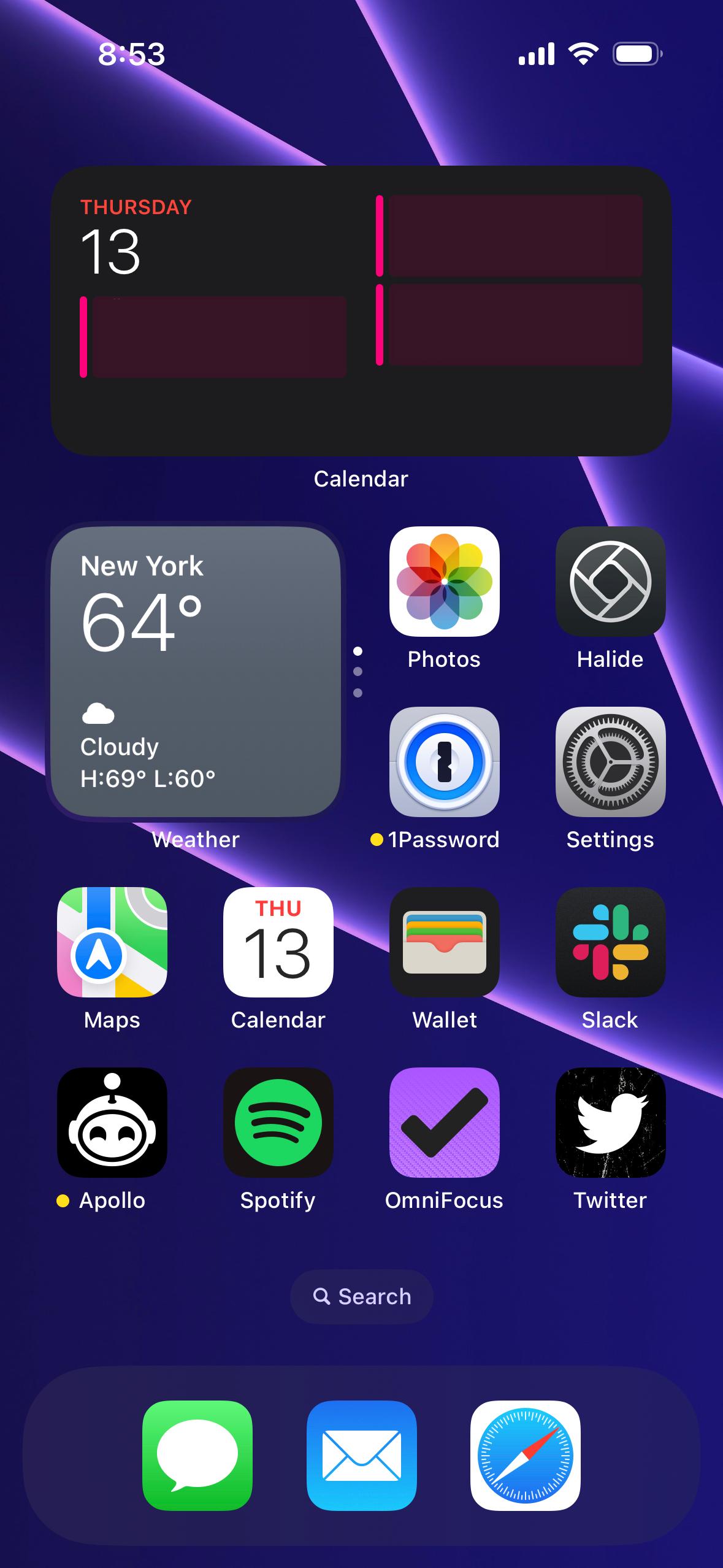
I’m bored out of my mind looking at these screenshots of my phone, but that’s by design. I’ve been trying to use my phone less throughout the day, so I’ve demoted (most) of my social apps to the app library…except Twitter. If I lose Twitter, I’d have to pick up a different vice to fill the void.
My home screen icons are mostly tools to do something, which I’ve found helps to trick my brain into viewing my phone as a utility rather than a recreational object. Widgets have been huge in this regard—I don’t even need to open apps to see what I want to know, and it dramatically reduces my screen time.
There’s not much to note for my lock screen. My brother is at school overseas, so I’ve got a world clock as a reminder to not text him at 2AM his time. I’ve been using this original iPad wallpaper as my lock screen wallpaper since 2012 and it’s the objectively correct wallpaper. A bit of detail at the bottom, but nice and clear at the top for my widgets.
Michael Liberatore
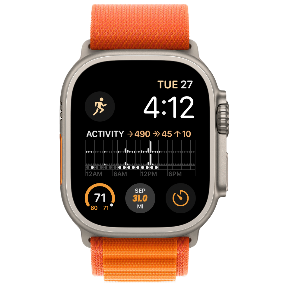
Not much has changed in the last four years regarding my primary watch face. I’m still using the Modular (previously known as Infograph Modular) face, and most of my complications are the same. I’ve swapped out weather conditions for Nike Run Club’s complication to quickly see my number of miles run in the current month. This gives me the extra nudge I need to keep my streaks on track. I’ve also switched from multicolor to orange, which unapologetically matches the garish accents on my new Apple Watch Ultra and its Orange Alpine Loop.
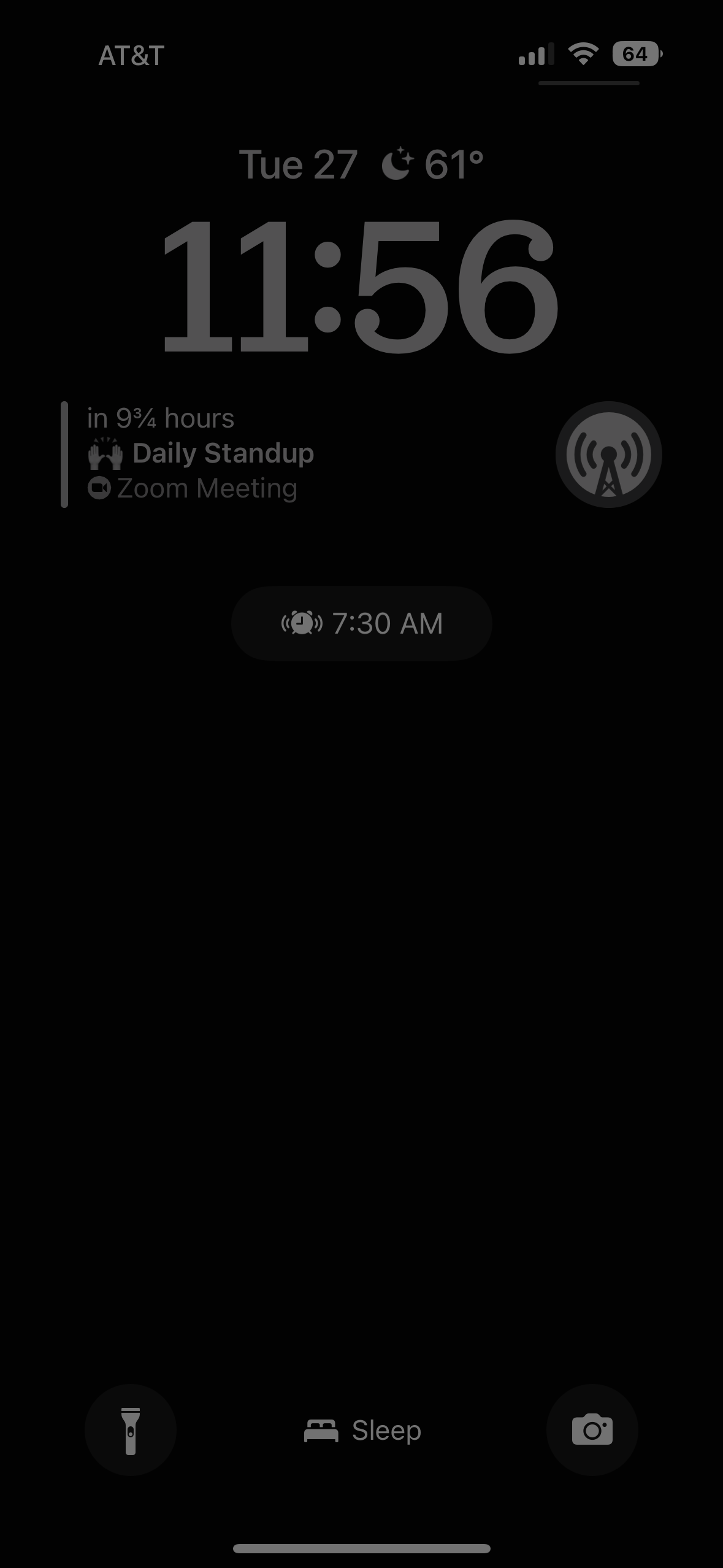
I’m still trying to figure out which widgets I want to live on my lock screen throughout the day, but for now, I’m pretty set on this setup during my sleep schedule. This collection of widgets gives me 99% of what I ever need when either going to bed or waking up. At night, I can quickly glance at my lock screen to see tomorrow’s first event using Fantastical’s “Up Next” widget. I can easily suppress my anxiety about whether my alarm is set thanks to the bonus alarm time that’s present on the lock screen during a sleep schedule, or even change the alarm if tomorrow’s first event is earlier. Overcast’s “Icon” widget allows me to quickly jump into the app to start a podcast without other distractions in the way (I fall asleep to podcasts). Finally, when initially waking up, the first thing I want to know is the temperature and conditions for my morning dog walk, which I can now see without unlocking my phone if I wake up before my alarm goes off and my morning summary appears. My background and text colors are a bit boring here, but that’s intentional for my sleepability.
mb Bischoff
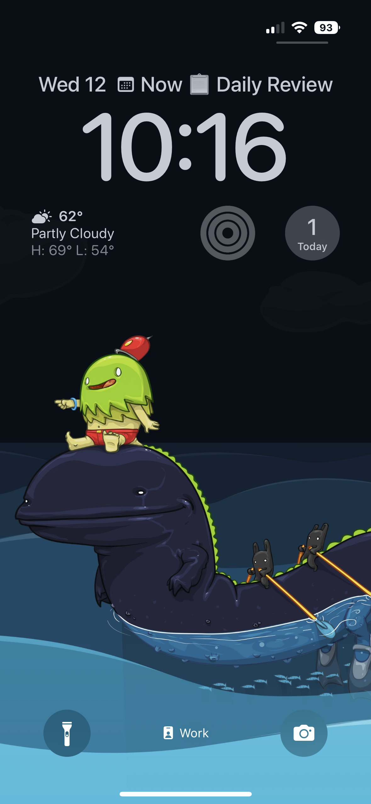
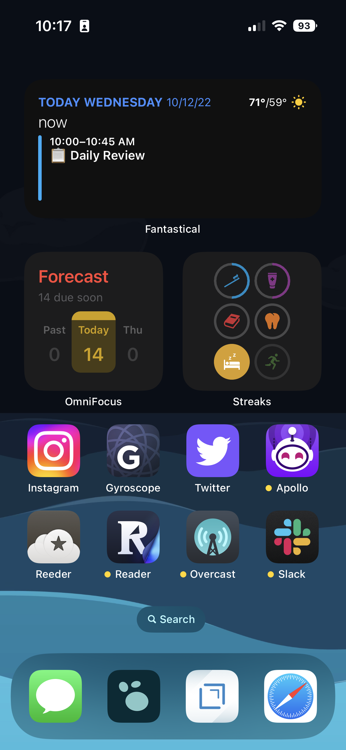
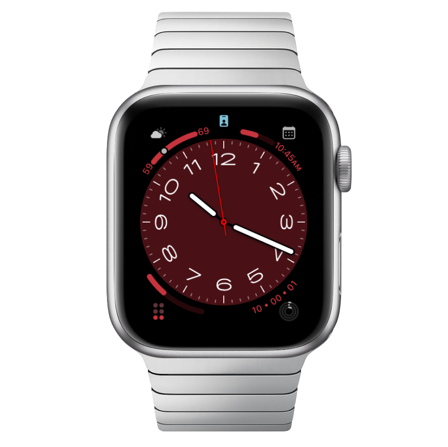
My home screen and lock screen change with my eight different focus modes, but here’s what they look like during work. Artwork by one of my favorite illustrators, David Lanham, reminds me not to take things too seriously. Widgets from Fantastical, Streaks, OmniFocus, and CARROT Weather show me the information I most often need at a glance. And I’ve got quick access to the apps I most frequently launch throughout the day to catch up on messages like Slack and Messages, jot down note with Drafts and Logseq, or take a break on Instagram and Twitter.
Jillian Meehan
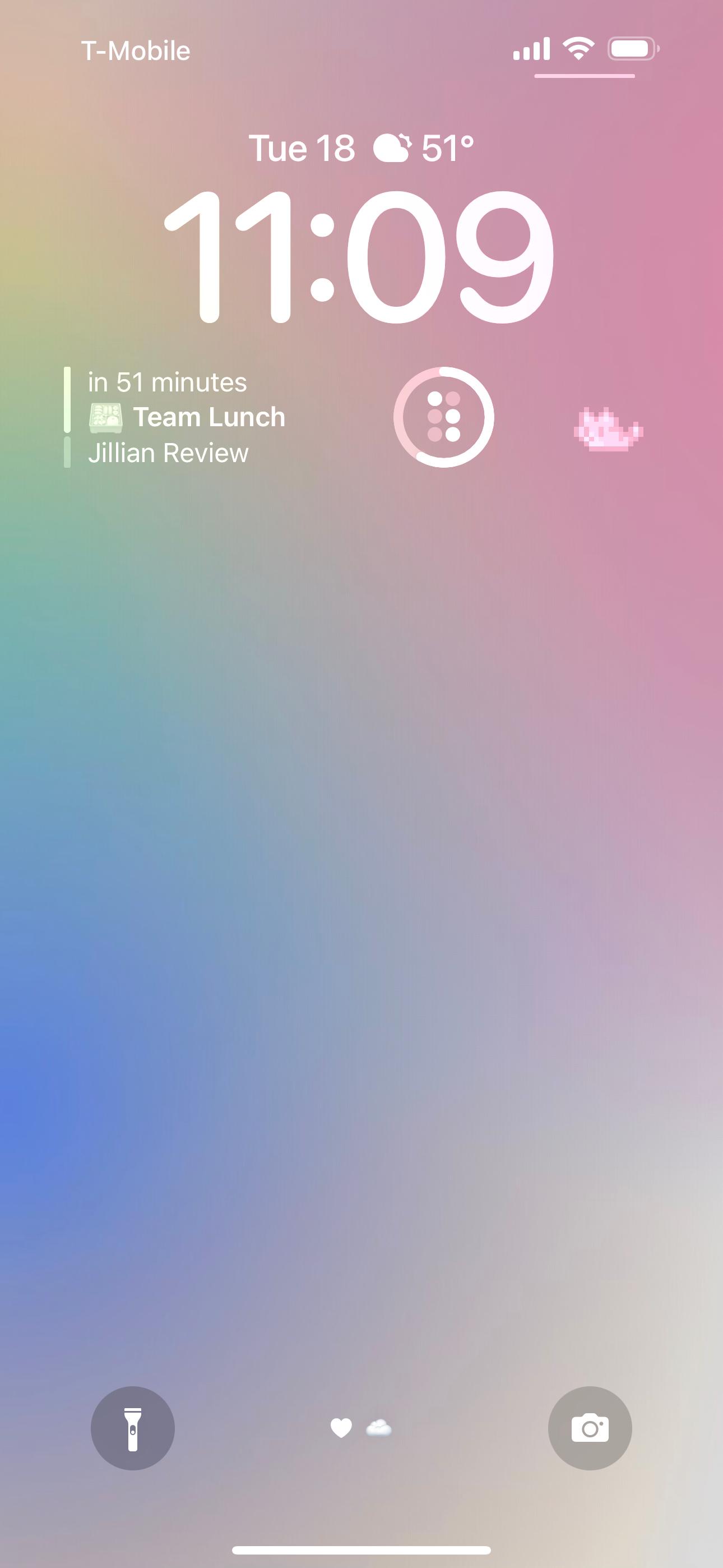
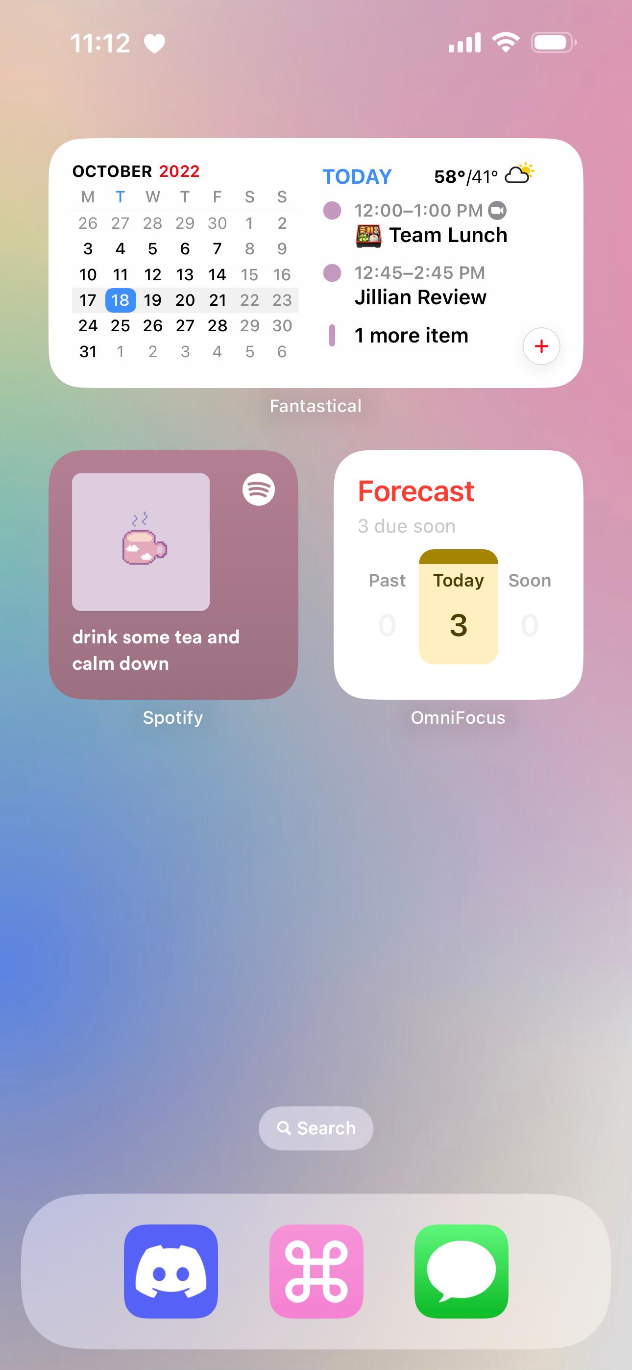
I also have a few different home screen + lock screen situations depending on what focus mode I‘m in, but this is what I see the majority of the time. On my lock screen, I’ve got widgets from Fantastical, CARROT Weather, and Streaks—plus the adorable pixel pal widget from Apollo.
My home screen has a few widget stacks working overtime—each stack has about five different widgets that I cycle through. Aside from the ones you see here (Fantastical, Spotify, and OmniFocus) a few of my favorites are the Forest time distribution widget, a small Streaks widget showing my next four tasks, Notion widgets linking to my most-used pages, and Pinterest widgets that show a random pin from a selected board (for the vibes). In my dock, I‘ve got Discord and Messages for quick communication, and a sort of all-in-one shortcut that I use to create new OmniFocus tasks or open frequently used apps.
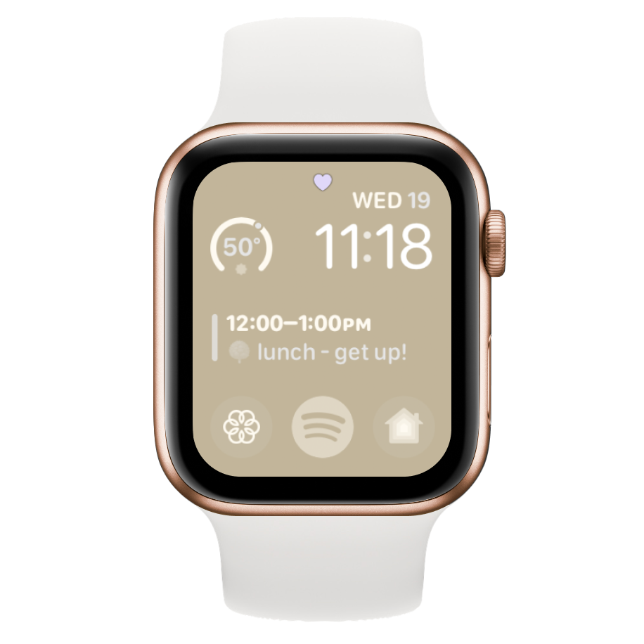
I have a pretty simple modular watch face—I can see the current weather from CARROT & my next event from Fantastical, and I have quick access to Spotify and the Home app.
Andrew Harrison
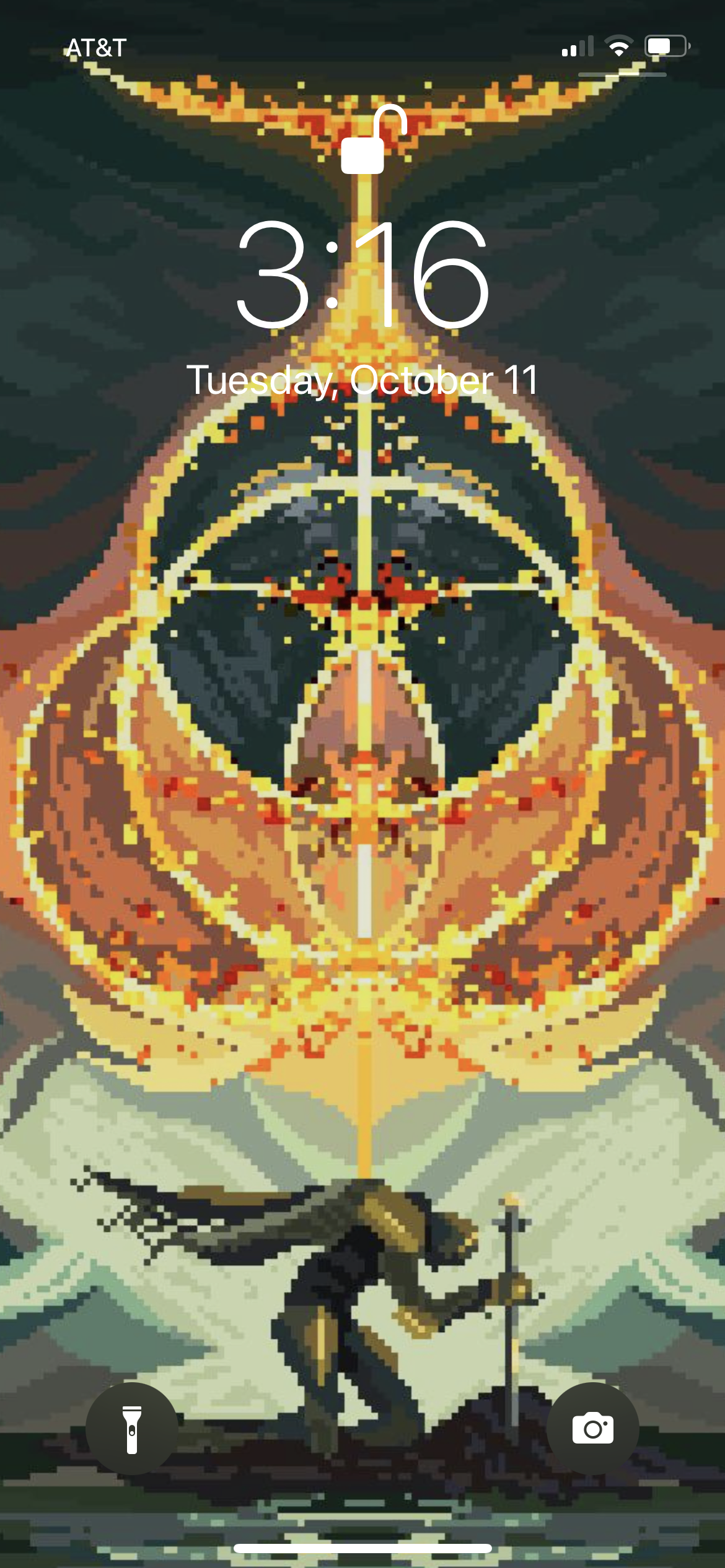
This is my Lock Screen, but I’m not even on iOS 16 yet soooo...

