A New Look for The Atlantic App

Here at Lickability, we obsess over journalism. Having worked for and with some of the most important mediaorganizations, we have nurtured a deep respect for thoughtful reporting and opinion. So when The Atlantic contacted us last year about partnering with them to redesign their iOS app, we were humbled and ecstatic to work with such a vital publication that excels in providing high quality news and analysis.
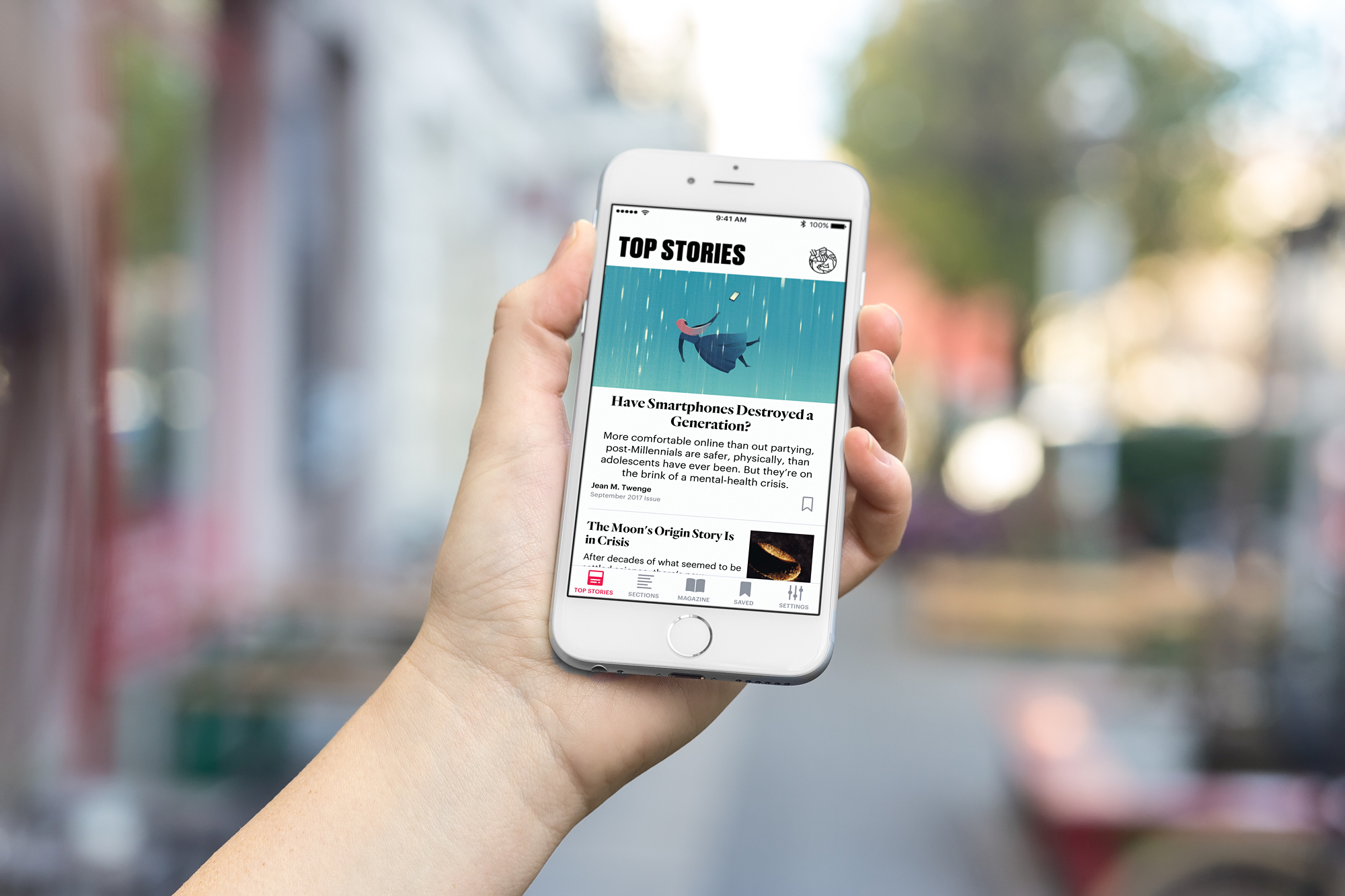
In April of this year, we visited The Atlantic’s offices in Washington, D.C. to spend some time with their fantastic team and collaborate on ideas for the new version. During this process, we helped refine an app design that we believe is simple to use and understand while reflecting the sensibilities and history of the publication. The design should also feel right at home when iOS 11 launches, adapting the large title styles of the upcoming operating system.

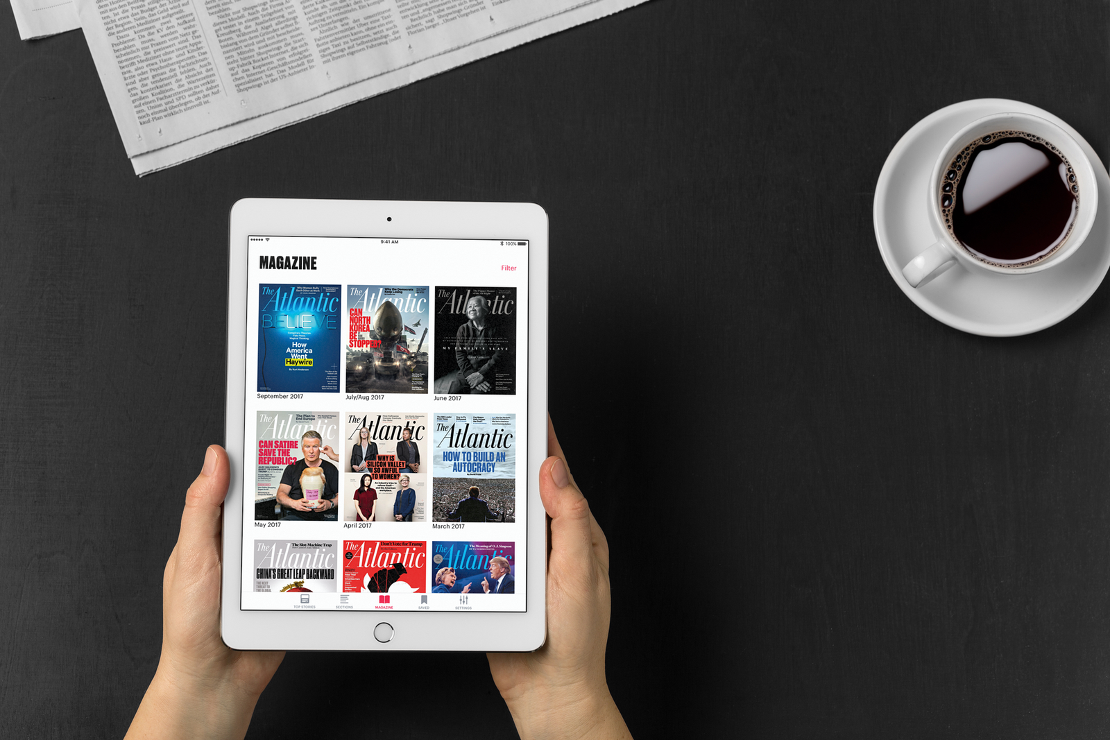
From top to bottom, The Atlantic 5.0 is a universal iOS app that is more modern, easier to use, and faster. The app’s speedier tab bar navigation now clearly organizes the content into top stories, sections, and magazines. Magazines are displayed with their full cover, and archived issues are now accessible all the way back to 2004. It’s also quicker than ever to save stories and full magazine issues for reading offline and manage those items so they don’t take up too much space.

Building the App
We developed this version of The Atlantic using the latest available technologies, exclusively writing it in Swift 3.1 with iOS 10 APIs. The app uses stack views, Auto Layout, adaptivity APIs, and Dynamic Type, allowing readers to set their own size for the app or use the system-wide settings. It is also ready for multitasking, with customized layouts on iPad for each size of the app. Finally, we adhered to programming best practices such as the single responsibility principle and separation of concerns, with small, focused types, and made use of view models for each view in the application. These techniques provide a solid foundation for continuing to iterate on the product to add exciting features and fix troublesome issues.
Our Tools
Nobody builds software in a vacuum. On nearly all of our projects, we have found that Buddybuild streamlines our continuous integration, distribution, and submission processes. This time especially, Buddybuild made configuring and sending test builds a breeze, so that all of our testers were always up-to-date. We are also proud to incorporate open-source work from the iOS community in this app, including extensive use of PINCache for persistence, Kingfisher for image downloading and caching, and Kanna for HTML parsing. It would have been far more difficult to complete everything along our timeline without the use of these thoroughly-reviewed, well-tested libraries, along with many others.
With the small, focused, and determined team at The Atlantic, we were able to assist in bringing this app from conception to release in 4 months. This timeline would not have been possible without the tireless work of the whole team. We believe that today’s release represents a significant step in The Atlantic’s continued success on digital platforms, and hope that it provides an even better mobile venue for some of the most important journalism in the industry.
Download the app today to read this essential publication with its brand new look.
Need some assistance making or updating your app? Send us a note at [email protected] and we’d love to chat about how we can help.


