Building a Customizable UITextField with Combine
Our guide to text field overlays, customizations, and more


Customizing text fields is a critical feature of almost every mobile app. We often use them when we need a user to fill out text as part of a form. Because we use them so often, we’re always trying to find ways to optimize implementing them in our app’s user interface.
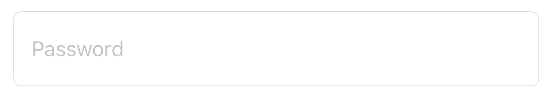
Here is an example of a customized text field that has additionally inset text and an icon on the right:

Building a Customizable Text Field
To help us build a similar text field that is customizable, we’ll start by subclassing UITextField.
To achieve setting custom insets we‘ll need to override a few methods, specifically the bounds of the text field’s label. Overriding textRect(forBounds:) and editingRect(forBounds:) will yield the results we want:
/// Used to inset the bounds of the text field. The x values is applied as horizontal insets and the y value is applied as vertical insets.
private var centerInset: CGPoint = .zero {
    didSet {
        setNeedsLayout()
    }
}

// MARK: - UITextField

override func textRect(forBounds bounds: CGRect) -> CGRect {
    insetTextRect(forBounds: bounds)
}

override func editingRect(forBounds bounds: CGRect) -> CGRect {
    insetTextRect(forBounds: bounds)
}

private func insetTextRect(forBounds bounds: CGRect) -> CGRect {
    let insetBounds = bounds.insetBy(dx: centerInset.x, dy: centerInset.y)
    return insetBounds
}
We talked about adding custom views in the text field as well. Since we modified the bounds of the text field‘s label we’ll need to consider the adjusted insets. Similarly to the overridden methods above, we‘ll need to override rightViewRect(forBounds:) like this:
/// Sets padding for the `rightView` from the text field's edge.
private var rightViewPadding: CGFloat = 0 {
    didSet {
        setNeedsLayout()
    }
}

override func rightViewRect(forBounds bounds: CGRect) -> CGRect {
    var rightViewRect = super.rightViewRect(forBounds: bounds)
    rightViewRect.origin.x -= rightViewPadding
    return rightViewRect
}
The frame of the right view‘s rectangle is also adjusted to include some padding. Since we have a foundation set up for the right view all that is left is to populate it. UITextField doesn‘t have a method like setImage to instantiate an image view for us like a UIButton would. Setting the right view with a UIButton will suffice. Here‘s what that would look like with some optional properties like text and tint color:
private let rightAccessoryButton: UIButton = UIButton(frame: .zero)

/// Sets padding for the `rightView` from the text field's edge.
private var rightViewPadding: CGFloat = 0 {
    didSet {
        setNeedsLayout()
    }
}

/// Sets an image for the `rightView`.
private var rightViewImage: UIImage? {
    didSet {
        rightAccessoryButton.setImage(rightViewImage, for: .normal)
        rightViewMode = rightViewImage != nil ? .always : .never
    }
}

/// Sets text for the `rightView`.
private var rightViewText: String? {
    didSet {
        rightAccessoryButton.setTitle(rightViewText, for: .normal)
        rightAccessoryButton.setTitleColor(rightViewTintColor, for: .normal)
        rightViewMode = rightViewText != nil ? .always : .never
    }
}

/// Sets tintColor for the `rightView`.
private var rightViewTintColor: UIColor? {
    didSet {
        if rightViewImage != nil {
            rightAccessoryButton.tintColor = rightViewTintColor
        }

        if rightViewText != nil {
            rightAccessoryButton.setTitleColor(rightViewTintColor, for: .normal)
        }
    }
}

private func commonInit() {
    rightView = rightAccessoryButton
    rightViewMode = .never
}
Setting the rightViewMode will notify the text field when the right view overlay should appear. We also need to update the insetTextRect(forBounds:) with the additional right view padding and width of the right view:
private func insetTextRect(forBounds bounds: CGRect) -> CGRect {
    var insetBounds = bounds.insetBy(dx: centerInset.x, dy: centerInset.y)
    insetBounds.size.width -= rightViewPadding + rightAccessoryButton.bounds.width
    return insetBounds
}
Configuring the customized text field
Applications typically use a standardized design pattern (such as MVP or MVVM), which mostly derive from conforming to the separation of concerns principle. How do we handle text field customization and responding to user initiated actions while separating logic?
The core of this subclass contains several properties. It looks like we can make use of a view model as the main source of configuration for the text field. So far we have the center inset and padding properties but we could benefit from adding a right view object along with the text field properties:
/// The view model containing information necessary for configuring the display of the view.
struct ViewModel {
  /// The properties that can be applied to the right view.
  struct RightView {
    /// The optional image for the right view.
    var image: UIImage?
    /// The optional text for the right view.
    var text: String?
    /// The tint color of the text and image.
    let tintColor: UIColor?
    /// The padding between the accessory text and edge of the text field.
    let padding: CGFloat }
  /// The text.
  var text: String?
  /// The color of the text.
  let textColor: UIColor?
  /// The placeholder text.
  let placeholder: String?
  /// Sets the center inset of the text field.
  let centerInset: CGPoint
  /// The optional `RightView` to display on the `rightView` of a `UITextField`.
  var rightView: RightView? }
This is also a perfect use case for taking advantage of Apple‘s Combine framework. Pre-Combine, the text field responses could have been handled with closures or delegates. UIKit does not provide Combine support by default, so to simplify some of the following logic we‘ll use a 3rd party framework, CombineCocoa, for the UIKit publishers we need.
Installing CombineCocoa with Swift Package Manager
Adding a dependency via Apple‘s built in Swift Package Manager is quite easy. In Xcode, simply select File → Swift Packages → Add Package Dependency. There, you will be prompted to enter a package repository url where you can add the CombineCocoa GitHub url. Selecting next will default to the latest release tag from the repository. After confirming the package options you should now see the dependency added in the project navigator:

Adding Combine publishers
We did a lot of customization with the text field subclass we created. Let‘s address event handling and responses to the right view button.
Since CombineCocoa is a wrapper around UIKit, there are built in publishers we can use. We‘ll focus on textPublisher for text changes in the the text field and controlEventPublisher(for:) for control events from the button.
These publishers can be added at initialization:
private var cancellables = Set<AnyCancellable>()
private func commonInit() {
  rightView = rightAccessoryButton
  rightViewMode = .never

  rightAccessoryButton.controlEventPublisher(for: .primaryActionTriggered)
  .sink {
         self.rightAccessoryButton.isSelected.toggle()
  }
  .store(in: &cancellables)

  textPublisher
  .sink { text in
         self.viewModel?.text = text
        }
  .store(in: &cancellables)
}
Since the publishers are exclusive to private properties we‘ll need another one for accessing the selected state of the button. CombineCocoa’s ControlProperty property publisher offers a very useful solution for this. We could initialize this generic publisher with a specific control event and key path:
/// Called when the right accessory's enabled value has changed.
var rightAccessoryButtonEnabled: AnyPublisher<Bool, Never> {
                                                            Publishers.ControlProperty(control: rightAccessoryButton, events: .primaryActionTriggered, keyPath: \.isSelected)
  .eraseToAnyPublisher()
}
Now that we‘ve included the rightAccessoryButton‘s publisher we need to subscribe to the values it emits. In the DemoViewController this can be set up at viewDidLoad():
override func viewDidLoad() {
  super.viewDidLoad()

  customTextField.rightAccessoryButtonEnabled.sink { [weak self] isSelected in
    guard let self = self else {
      return
    }
    self.customTextField.viewModel?.rightView?.image = isSelected ? .unlocked : .locked
    self.customTextField.isSecureTextEntry = !isSelected
}
  .store(in: &cancellables)
} 
Adding @IBInspectable
After all these additions to customize the UITextField subclass there is another option to extend these properties to Interface Builder. To better visualize this in Interface Builder, let‘s mark the properties as @IBInspectable. This will allow us to edit those properties in the attributes inspector in Interface Builder. In code, that looks like this:
/// Sets the center inset of the text field..
@IBInspectable private var centerInset: CGPoint = .zero {
didSet {
setNeedsLayout()
}
}
/// Sets padding for the `rightView` from the text field's edge.
@IBInspectable private var rightViewPadding: CGFloat = 0 {
didSet {
setNeedsLayout()
}
}
/// Sets an image for the `rightView`.
@IBInspectable private var rightViewImage: UIImage? {
didSet {
rightAccessoryButton.setImage(rightViewImage, for: .normal)
rightViewMode = rightViewImage != nil || rightViewText != nil ? .always : .never
}
}
/// Sets text for the `rightView`.
@IBInspectable private var rightViewText: String? {
didSet {
rightAccessoryButton.setTitle(rightViewText, for: .normal)
rightAccessoryButton.setTitleColor(rightViewTintColor, for: .normal)
rightViewMode = rightViewText != nil || rightViewImage != nil ? .always : .never
}
}
/// Sets tintColor for the `rightView`.
@IBInspectable private var rightViewTintColor: UIColor? {
didSet {
if rightViewImage != nil {
rightAccessoryButton.tintColor = rightViewTintColor
}
if rightViewText != nil {
rightAccessoryButton.setTitleColor(rightViewTintColor, for: .normal)
}
}
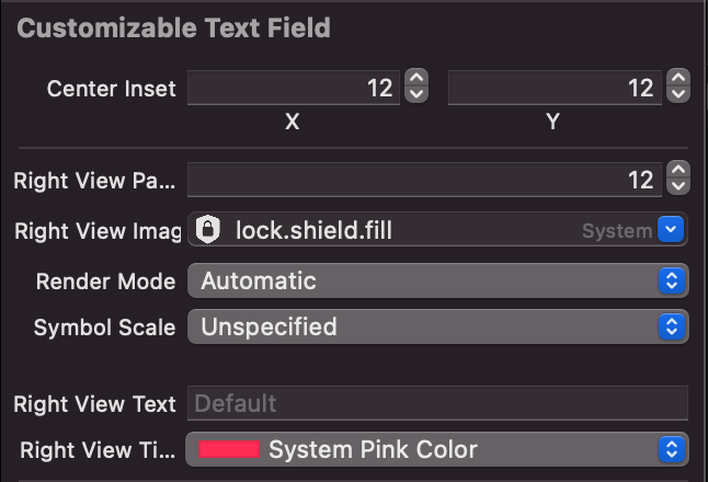
}And in Interface Builder, it should look like this:
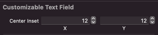
Since we have all the inspectables set up in Interface Builder, we can go a step further and have those values set up as the default view model, and then take a look at what the project‘s Interface Builder generates from the inspectables:
override func awakeFromNib() {
    super.awakeFromNib()
    viewModel = ViewModel(text: text, textColor: textColor, placeholder: placeholder, centerInset: centerInset, rightView: .init(image: rightViewImage, text: rightViewText, tintColor: rightViewTintColor, padding: rightViewPadding))
}
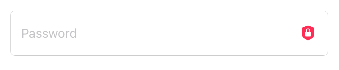
Results in Interface Builder
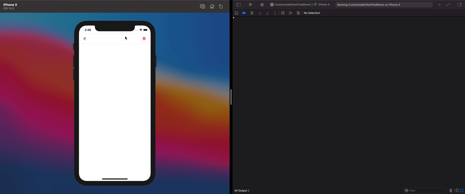
Running the project without having modified the view controller will reveal that the properties have been set directly from the Interface Builder:
Summary
Being able to set up inspectable properties directly in Interface Builder allows for more flexibility and clarity when composing reusable views. The source of truth in the view model also allows us to set default properties. In this post, we learned how simple it is to set up a chain of Combine publishers. We also leveraged an older feature like IBInspectable and paired it with a newer technology like Combine. We hope this provides useful insight on how to implement these reactive changes in your existing apps.