Designing Mastodon’s App
Social networking, back in your hands

At Lickability, we’ve long been interested in the power of social networks, which is why we’ve worked on apps like Houseparty, Tumblr, and Clubhouse over the years. But there are few social networks where we’ve built a presence. In 2018, we joined Mastodon—a decentralized open-source social network from Eugen Rochko (aka Gargron). And in 2021, Eugen came to us to design the official Mastodon iOS app. Then in February, the team released 1.0 of Mastodon for iOS on the App Store to much fanfare and rave reviews.


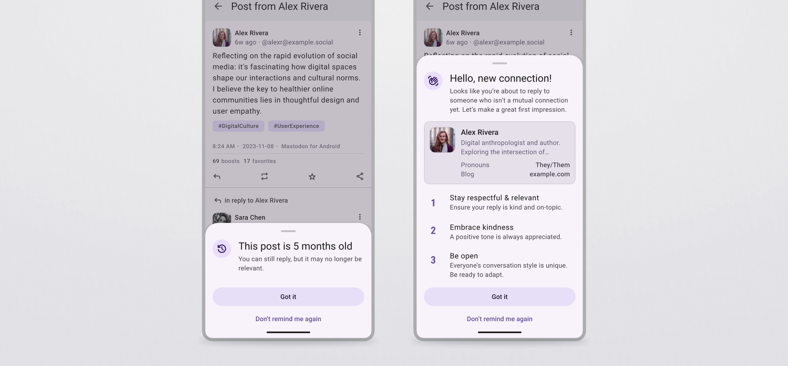
While there have always been many third-party iOS apps for Mastodon on the App Store, Eugen wanted us to create a native first-party application that showcased what’s unique about Mastodon while also focusing on bringing in entirely new users. The app incorporates many of Mastodon’s signature features: robust privacy controls, custom profile fields, content warnings, polls, and custom emoji for each Mastodon server.


Our designer, Sam Gold, drew inspiration from Mastodon’s existing web application, Apple’s Human Interface Guidelines, and decades of social media network design to craft something that looks at home on iOS but still feels like Mastodon. The app works in both light and dark mode and makes extensive use of context menus and haptics to feel fast and modern. Plus, it’s peppered with whimsical illustrations of actual mastodons from artist Dopatwo.
Working with the team at Mastodon and their development team at Sujitech was an absolute dream come true for us as longtime fans of the network’s ethos and ethics. And we’re not done yet. We’ve still got plenty of new features for the app up our sleeves in future releases, so stay tuned to the Mastodon blog and Patreon for updates.
Whether you’ve never used Mastodon before or you’re a longtime fan, download the app and find your community. Follow your friends and discover some new ones.


