Redesigning our documents
How & why we did it

Between Learn with Lickability sessions, attending conferences, and asking our friends for advice in our “everybody” Slack channel, we’re always looking for ways we can level up our game here at Lickability. Here in Salesland (as we so fondly refer to it in our team meetings), our latest improvement is a ground-up redesign of all the documents we use during our sales process, and today we’d like to walk you though the why‘s, how’s, and (preliminary) results of this project.
Our sales process
First, here’s a high level overview of our sales process. We divide the stages of our pipeline as follows:
- 📨 Lead comes in—via our website, a personal contact, social media etc.
- 📞 Initial call to determine if it’s a good fit for both parties
- 🧮 Estimate the project with our engineers & draft a proposal
- 🗣 Proposal walkthrough with the client
- 🤝 Share formal contracts, legal review, and negotiation
- ✍️ Signatures and project kickoff
If you want the full explainer, check out our How We Do Sales post.
The docs & how we use them
For each of the stages of our sales process, we have a collection of documents that we may send to clients. These include formal contracts with lots of legal and business terms, like our Statements of Work or Services Agreements, and supporting documents like proposals, summaries of our work, or design showcases.
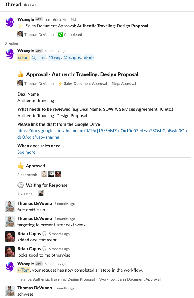
We store the documents in our shared Google Drive as templates, and we customize them for each client. When creating a new document for a client, an account manager fills out the appropriate template with the information needed, and it is reviewed and approved by our operations, engineering, and finance teams using the Wrangle Slack app. If everything checks out, it goes on its way.
We present our documents in a variety of ways, but most commonly we walk clients through them together over Zoom. When formal contracts are ready to be reviewed, those are sent out to the appropriate folks either via email (if we expect some legal back and forth) or DocuSign (if everyone is happy and ready to sign).
Here’s a list of our most used and important documents:
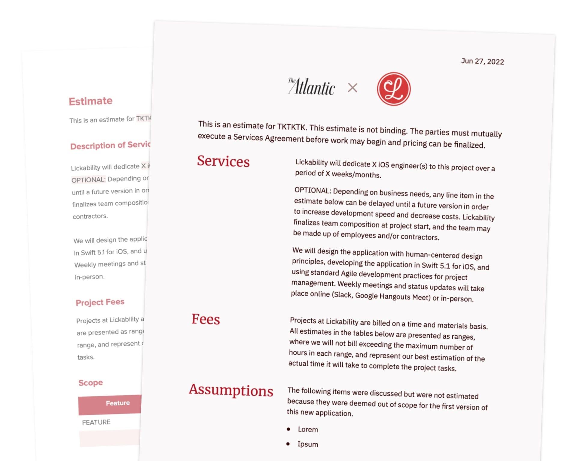
- Proposal: Arguably the most important document we will send to a client. This is our chance to explain how we would approach their project, what they can expect to happen as it progresses, and the benefits of choosing Lickability as a partner.
- Statement of Work: This document is a formal restatement of the proposal and defines important project terms like what’s in scope, what assumptions have been made, and payment terms.
- Services Agreement: This document goes hand in hand with our Statement of Work and defines important business and legal items such as Intellectual Property, Termination, and Confidentiality
- Amendment: This is used when we need to make small changes to a Statement of Work, such as extending the project term or adding folks to a project.
- Contractor Agreements: We also have a slew of documents we use when working with fellow agencies or independent contractors, and we give them the same care and effort we would a client.
Why update our docs?
A question that came up when we were thinking about starting this project was, “why should we spend time doing this?” Our old documents were easy to prepare, clients gave us positive feedback on their simplicity, and we were successfully closing deals with them. However, they were a few years old and showing their age, plus it was a chance to show off our design chops to clients right at the start of our conversations with them.
We’re big on Steve Jobs quotes around here (ever wondered where the name Lickability comes from?), and one was particularly front-of-mind when starting this project:
When you’re a carpenter making a beautiful chest of drawers, you’re not going to use a piece of plywood on the back, even though it faces the wall and nobody will ever see it. You’ll know it’s there, so you’re going to use a beautiful piece of wood on the back. For you to sleep well at night, the aesthetic, the quality, has to be carried all the way through.
Although our Statement of Work documents are barely marketing tools, we want to show clients that we sweat the small stuff, even if it goes unnoticed. To that end, we put a lot of care into the details: the paper’s subtle red tint, using all the typographic tricks in the book (like the № sign in lieu of “#” or “Number”), and laying out section headers in the margins like magazines do.
The research, finding inspiration, and the design process
Finding reference material was challenging, since other companies tend to be fairly cagey about sharing the minutiae on their internal tools. Branching out to find seasoned documents (not just glossy Dribbble templates) from different sectors proved to be difficult, but we were able to find a handful from other agencies we’ve worked with, which was certainly helpful to assess what works and what doesn’t. With those notes in mind, and only a number of guard rails in place, it was time to get to work.
Since we’re a fully-remote team, getting immediate feedback on design drafts was paramount. For this, we used a dedicated Slack channel and a shared Google Drive to keep everything in one place. As Sam made design changes, he called out the ones he felt less certain on and people from all different functions around the company helped suggest changes. Cross-function collaboration is invaluable for design tasks like these—we worked together to tailor the designs to Tom’s presentation style, and our Ops team offered fresh eyes on the copy to make sure the tone wasn’t too sales-y.
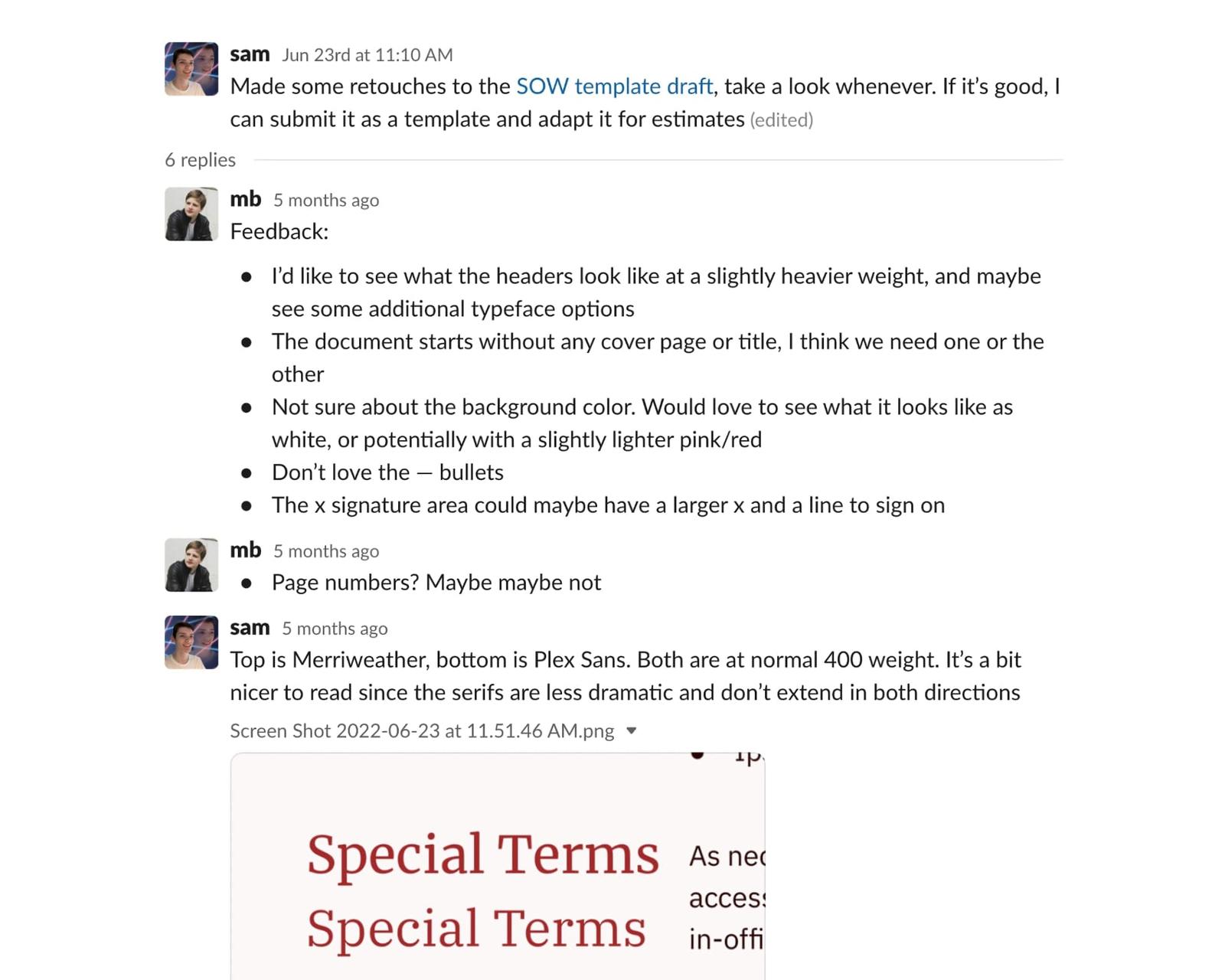
Typography for Lawyers was an invaluable resource throughout the design process. Since Sam’s background is in product design, it helped inform many decisions regarding hierarchy and layout in this different context.
Old vs. new
Previously, our documents were in format purgatory—partly Word format, partly Google Docs. This made it difficult to export them nicely as either. Additionally, the formatting was baked in and extremely fragile. For example, bullet points were created using a series of spaces, dashes, and more spaces instead of using standard word processing lists. This meant that any changes could cause the document to reflow in unexpected ways, since line breaks were used instead of just letting lines wrap.
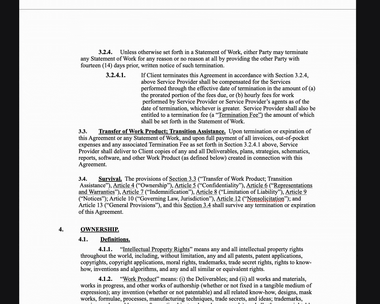
Editing lines with forced line-breaks creates unexpected wrapping.
Invisible characters in our old documents. Note the forced line breaks after each line and the string of spaces after each header.
Another issue was that they were designed to be printed, but we‘re a digital studio selling digital services to companies that value their digital presence—print is the least important medium at this point. This gave us the opportunity to take some visual liberties and inject more of our brand. We could worry less about printers cutting off the edges or wasting ink with a subtle paper tint color.
All of our new documents are Google Docs-native, making doc-specific feedback a breeze both internally and when we sent it out to third parties for review. (By which we mean lawyers and no other examples.)
We can also use quality-of-life features like Google‘s date chips and the outline view. They’re designed digital-first but gracefully degrade—exporting nicely to Word, Pages, and PDF. They‘re still A4 size so if it does get printed, printers will know how to handle it (rather than one long, seamless PDF that would print out as a thin strip on a single sheet).
Most importantly, the new docs elevate the client’s brand to the same level as ours, and are unmistakably us.
Our results
So, how have our shiny new documents been received? In short, fantastically! Clients tell us they love the simplicity and clarity of how we structure the information, the care and attention to detail in our design, and that we include their logo front and center. All of this combined makes the documents easier to share, present, and communicate their meaning.
Design is never finished, so we’re continuing to refine the templates to meet the needs of ourselves and our clients. Right now, we’re working on adapting the design language of the new documents into an agency overview slide deck. We can’t wait for you to see the final product. You should totally reach out to us if you’d like a personal overview. 😉