Shelf: A Retrospective
Why we didn't ship
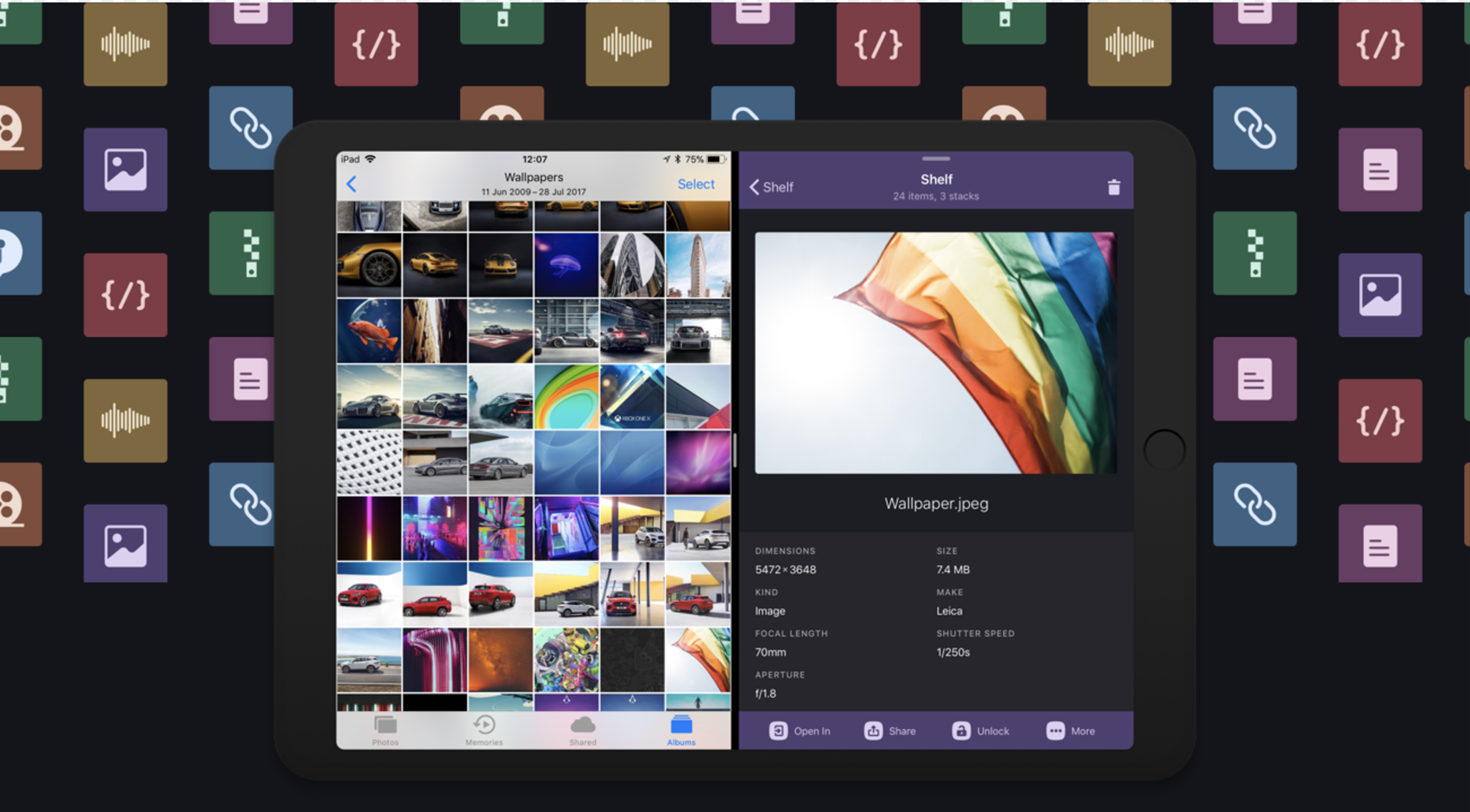
It’s June 5th, 2017. WWDC’s Keynote is in progress, and the Lickability team is spread across the auditorium in San Jose and our office in NYC when Apple unveils the iOS 11 updates coming to iPad. We are instantly excited about drag and drop.
In the aftermath of all the announcements, we quickly gathered to discuss building something new for the release of iOS 11. We were inspired by Federico Viticci’s iOS 11 iPad wishes and concept video and wanted to make the “shelf” concept a reality. During the past summer, Lickability was busy dragging and dropping away to deliver our vision of that concept: Shelf. Though we ultimately chose not to ship the app, we wanted to share with you our journey throughout the process.
Exploring Shelf
Shelf was to be a tool for iPad power users to temporarily (or permanently) store and organize groups of items to drag and drop. It would become a scratchpad full of the stuff you’re working on and frequently need to reference or drop into other apps.
By being able to run in full screen, split view, or slide over, Shelf would always be available to use to quickly access items while working. Drag some items in from apps like Photos, Safari, or Maps, and then drag them back out when needed. This would help to reduce time spent looking for that thing you know you sent a few days ago.
Design and Development Approaches
From a design and development standpoint, we wanted Shelf to display rich previews of the majority of the item types you would drag and drop. We identified these main categories for that:
- Images
- Text (Plain or Rich)
- PDFs
- Map Locations
- Contacts
- Phone Numbers
- Email Addresses
- Links
- Files
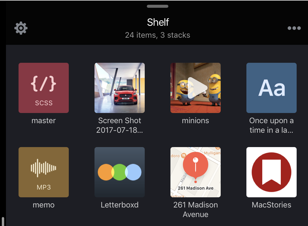
Design mockup of file categories
It was also important to us to support the concept of “stacks” of files that would function like folders when in Shelf and drop as multiple items when dragging out. These two primary features were where we wanted to provide a rich user experience.
We hired a designer, Jeremy Swinnen, and got to work, focusing on making the data models as generic as possible while maintaining the desire to keep the highest fidelity data.
We watched all of the drag and drop WWDC video sessions and explored all the sample code to figure out the API’s capabilities, navigating API changes and various bugs throughout the process. We were on the bleeding edge, so if something wasn’t working correctly, it was up to us to figure it out — all while trying to make sure Shelf would be a consistent and reliable experience.
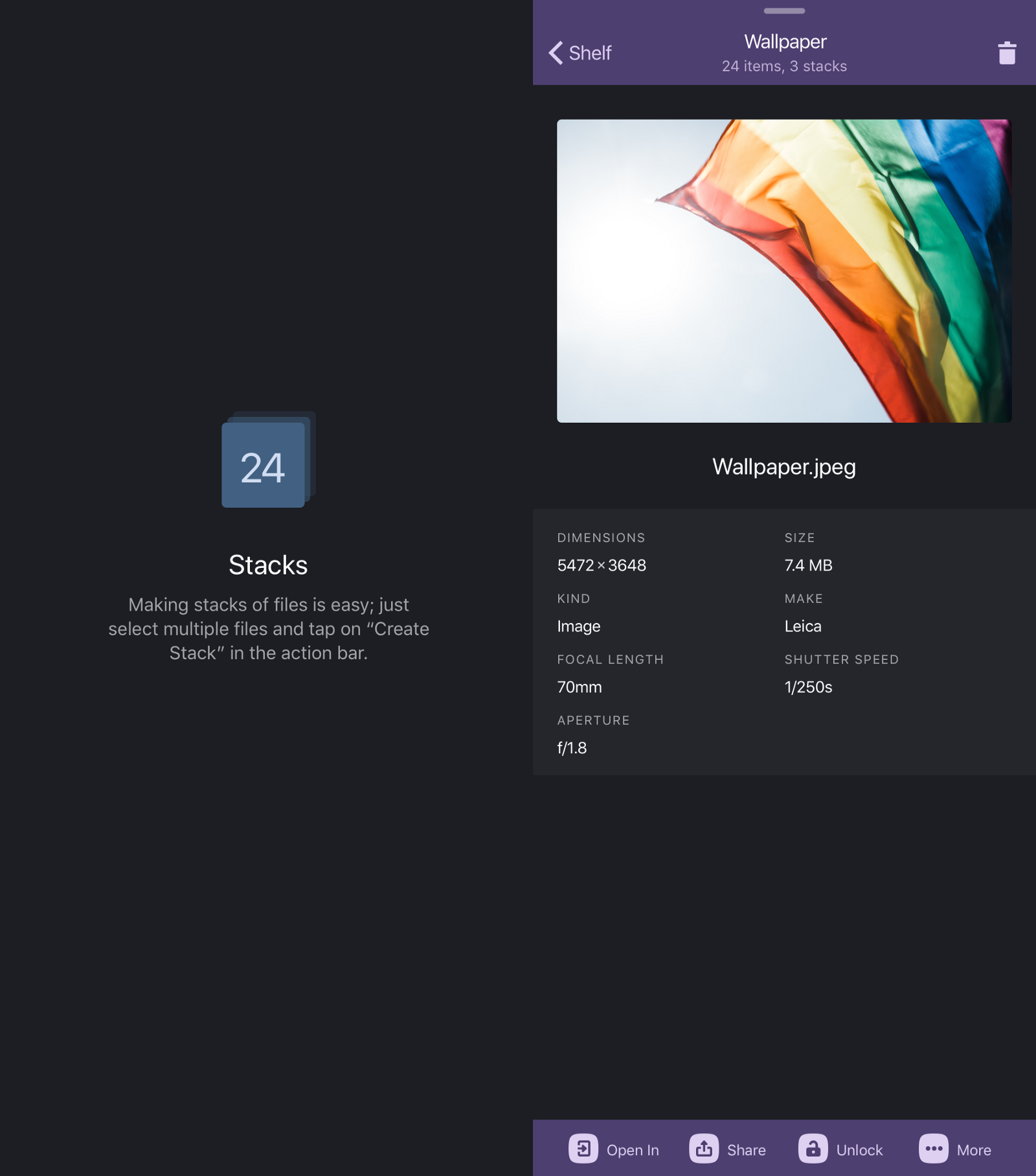
Left: Stack concept. Right: Quick Look mock-up.
Challenges and Takeaways
One of the best parts of working on Shelf was for us as a team to take an idea from brainstorming and try to have an app ready for launch day. We now have a deep understanding of the ins and outs of the drag and drop API, as well as many of its quirks, which has made applying this knowledge to our other projects a breeze.
On the flip side, we should have taken a look at the new APIs as a team and had a prototyping day to validate what we thought was achievable on an accelerated timeline. This would have allowed us to better estimate how much time we needed to dedicate to the project and when we needed to be in alpha and beta.
Reaching beta on the later side of “beta season,” we realized that we may not have identified the most useful features. It became clear from the competition that being able to store data in multiple different representations was important—for example, dragging in a markup document and dragging it out as the original file, an image, a rich text file, or plain text.
We ended up with a way to generically store any data in Shelf, at all representations, but this had significant impacts on our architecture rather late in the development cycle. It also took a lot of time away from making sure we had as many rich preview representations of files as possible.
Working with a beta API is always challenging. We found the rough edges of the API, particularly with trying to handle placeholders and various pieces of making “stacks” of items work. There came a point where we were writing a work-around for a work-around, because a particular private file format was broken mid-beta and didn’t get fixed by release.
Why We Didn’t Ship
With the late beta of Shelf and the release of iOS 11, we quickly discovered we did not have the right combination of features. While Shelf had one of the best user interfaces, we felt we didn’t have enough of some of our competitors’ major features to justify investing more time. The last thing we wanted to do was release an app we wouldn’t want to invest more time in.
There also were some outstanding issues that hadn’t yet been solved in a way we felt was high-quality enough. For example, there was a point where we could reliably crash our app, as well as all of our competitors’ apps, with a use case we felt was core to the Shelf experience.
We believe apps like Shelf will be vital in moving the platform forward as a productivity device, but the current user base and market doesn’t seem to be large enough for these kind of products just yet. It may be a few more years until enough people are using their iPads daily for “power user”-level productivity.
Rather than release an app that we didn’t feel reached our high standards, we decided to shelve Shelf and instead take it as an incredible learning opportunity for the entire team. In the words of Ms. Frizzle, “Take chances, make mistakes, and get messy.”
