The New Lickability
A fresh face for our studio
Lickability has evolved a lot over the past 15 years. What started as a group of three friends grew into a company of great folks making apps that we’re proud of and that reach millions of people worldwide.
Our old logo, with the tried and true cursive “L”
In that time, the Lickability brand has grown alongside us — that classic cursive “L” accompanied us to different offices and website iterations, and adorned plenty of business cards, pins, stickers, and hoodies. We even put it on a custom ice cube stamp for company holiday parties! It has served us extremely well.
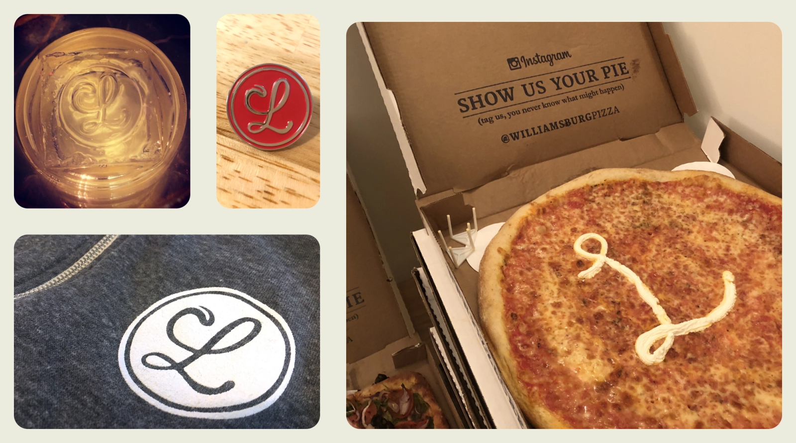
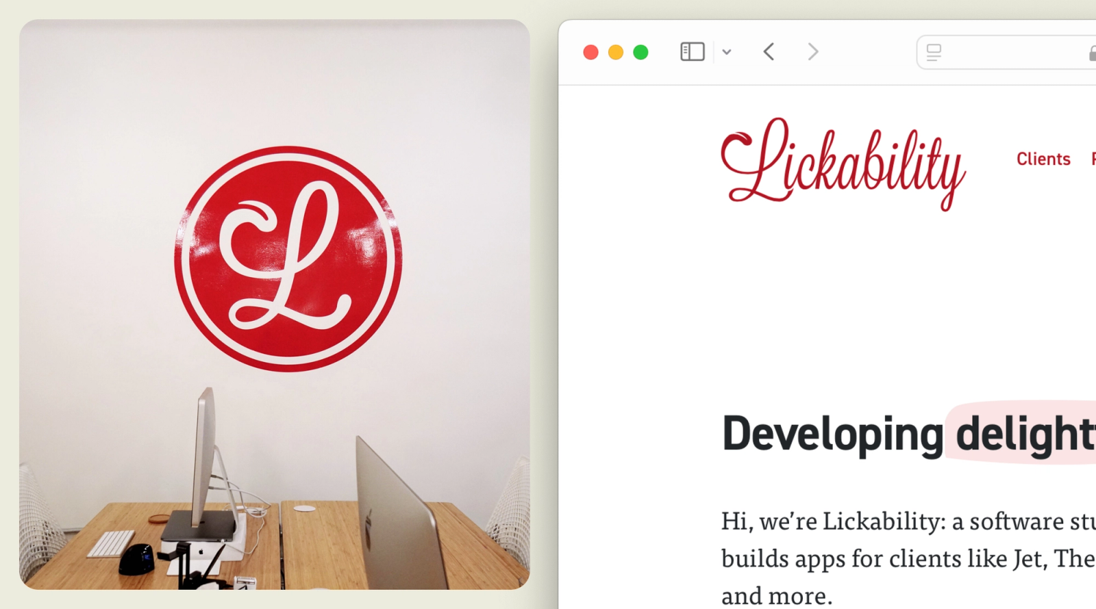
The circle “L” was everywhere
The Lickability of today is not the same Lickability that existed 15 years ago. The landscape of our industry has changed, and we’ve changed along with it. When iOS apps were just starting to take center stage, we carved out a niche for ourselves, crafting apps that stand shoulder-to-shoulder with the industry’s best. Now, our clients are looking toward us to help with more than apps — we shape design systems, build backends, and ship cross-platform software.
To compliment our evolution, it’s time for our brand to evolve, too. A little less than a year ago, we decided to start the search for the next version of Lickability. Today, it is officially here — it’s real, we love it, we’re excited, and we’re ready to share it.
The beginning
You may have seen the new logo somewhere already, and you’re probably reading this on our redesigned website. So while you get better acquainted with our new look, let’s jump back a few months to talk about the journey we took to get here.
It started, as many things do, with a Notion document. We put together a “Lickability Brand Brief” to use as a roadmap of where we wanted to go. It came in handy when we started reaching out to branding agencies to find the perfect partner.
We talked to lots of folks — we told them our story and explained what we were looking for — before meeting Radialinear, the wonderful Chicago-based studio that we ended up working with. They got to know us over a handful of weeks, helped us figure out who we wanted to be, and walked us through many possible versions of our new visual identity. We were lucky to partner with people who understood us so well.
The process
Working with a branding agency was pretty eye-opening! We knew we wanted to do a “brand refresh,” and we had our story packaged up in a nice little document, but it turns out it’s hard to distill 15 years of company history into the essence of who we are and how we want to present ourselves to the world.
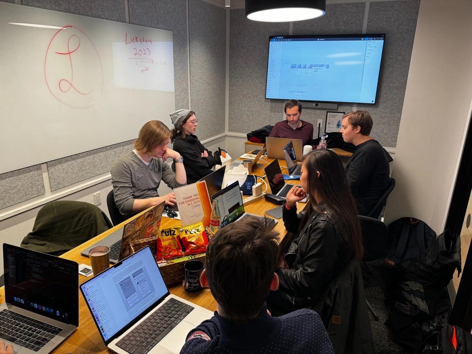
Luckily, we were in good hands with Radialinear. We started with a “brand discovery” phase, where we got the whole team together for some collaborative exercises to help us figure out what “Lickability” means to each of us. We went into this project thinking we already knew our brand well, but we quickly learned that there was so much more to think about. This was a crucial first step, and it turned out to be a lot of fun.
After doing some more behind-the-scenes research to learn about our company, they helped us nail down our brand strategy & identity — our mission, our personality, and our core values. Then we were ready to get to the real fun part: the visuals.
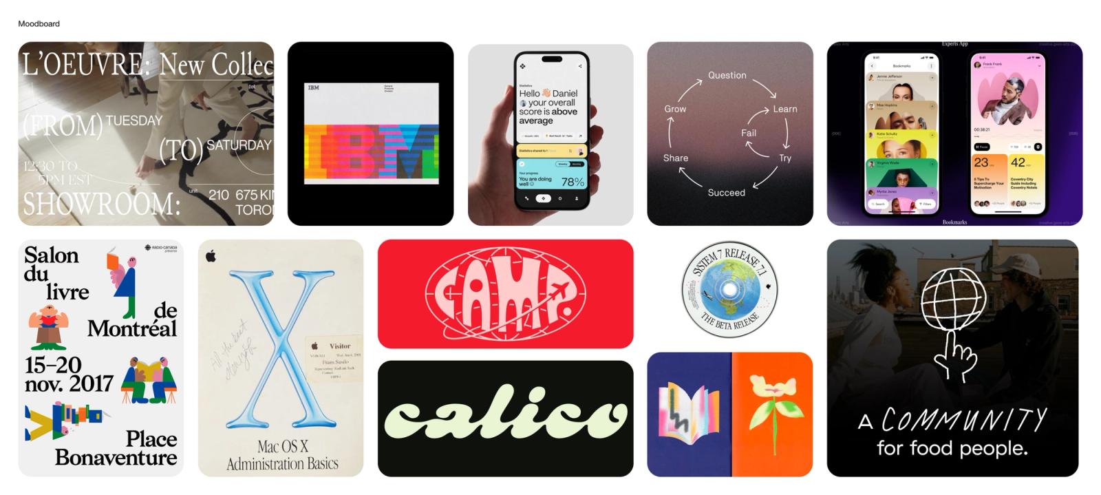
The final moodboard
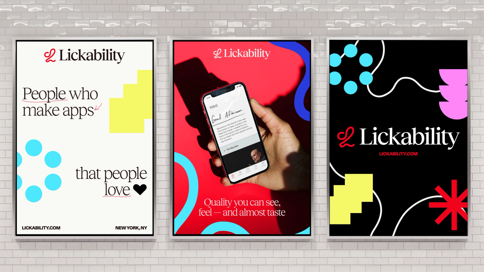
Some early concepts
We started by reviewing moodboards from Radialinear, pointing out the things we liked and didn’t like until we had a solid base of inspiration to draw from, including everything from 2000s Mac OS X to 1960s peace posters. From there, we spent a few weeks trying out different visual directions — shapes and colors, logos, typography, etc. — until all of the work finally culminated in a finished product. We found something that felt right.
The final form
This is the new Lickability. Except, not really — we are the same company as we were a year ago. But now we know ourselves a little better, we’re more confident in what we’re doing, and we have a shiny new logo to put on our business cards and stickers. (Time to order a new custom ice stamp!)
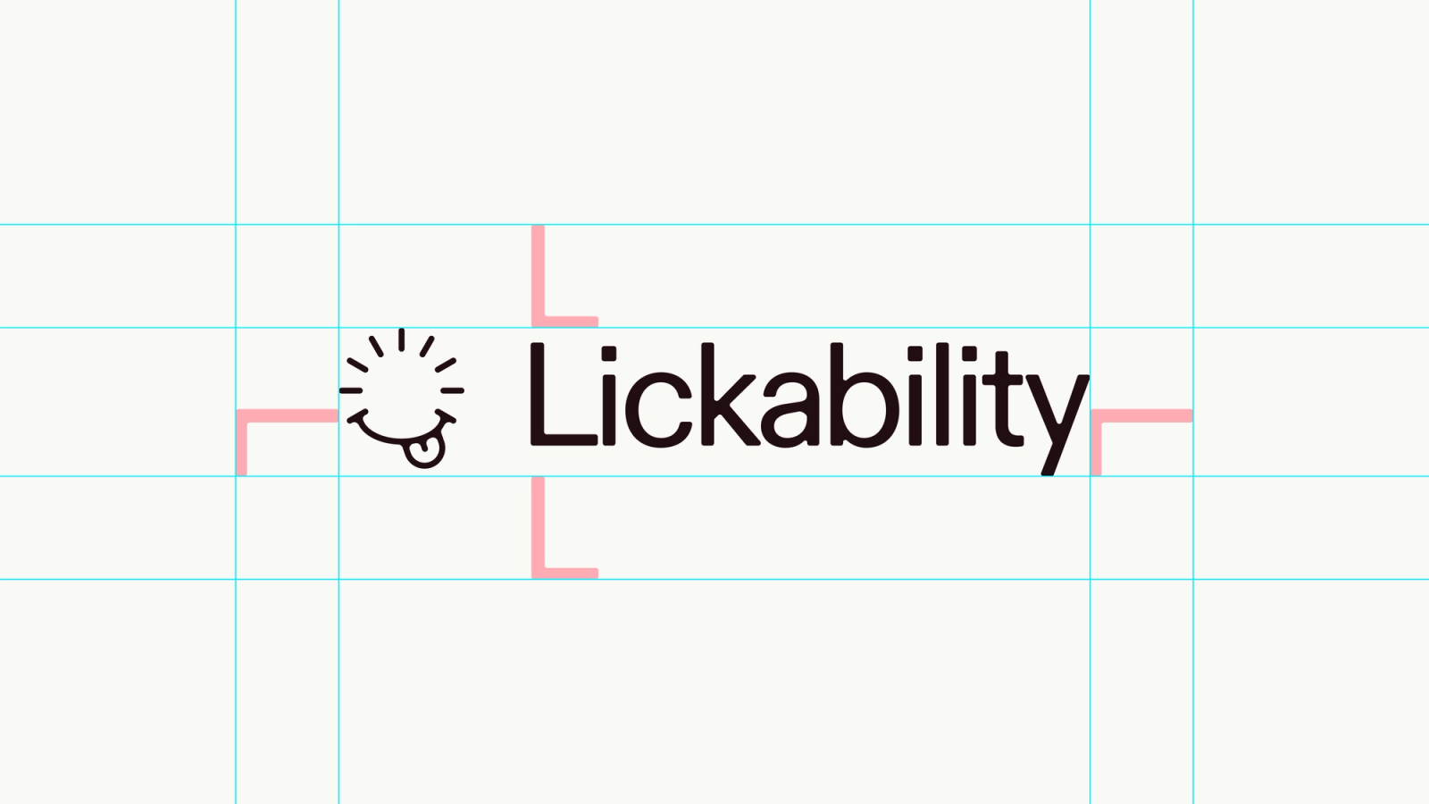
Our new logo
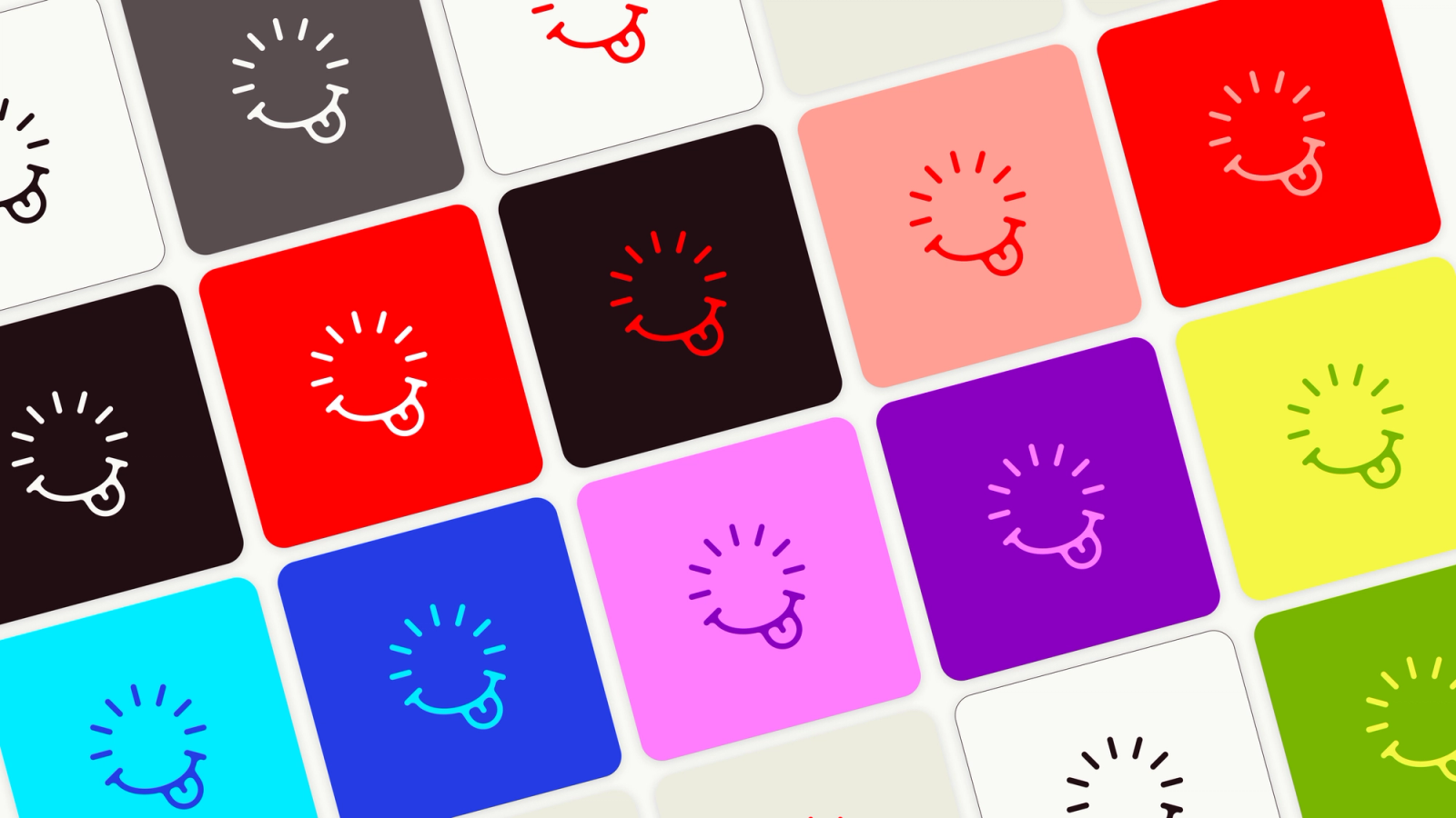
Our new glyph
We’re very glad we worked with Radialinear on this project. They made the whole process enjoyable, and we couldn’t be happier with the end result. Their founder, Amy, also left us with some nice parting words:
From our first conversation with the Lickability team, it was apparent that they care deeply about the people who interact with the apps they build. This passion, paired with their craft and playfulness, fueled a truly joyful brand design system. It also inspired their brand positioning statement: “People who love to build apps that people love.” This focus on the humanity behind digital products already set Lickability apart from the rest as a company, and now their brand reflects that.
Lickability is such a fun name, and inspired a lot of logomark explorations. The final logomark speaks to the name and its origins in a famous Steve Job quote, while also referencing progress, iteration, and app loading screens. The mark also balances the duality of Lickability – detail-oriented experts who are full of personality.
It’s not often we make a brand system that we wish we could steal for ourselves. We’re immensely proud of this work, and so thrilled to have partnered with the wonderful humans at Lickability.
Amy Schwartz, Radialinear
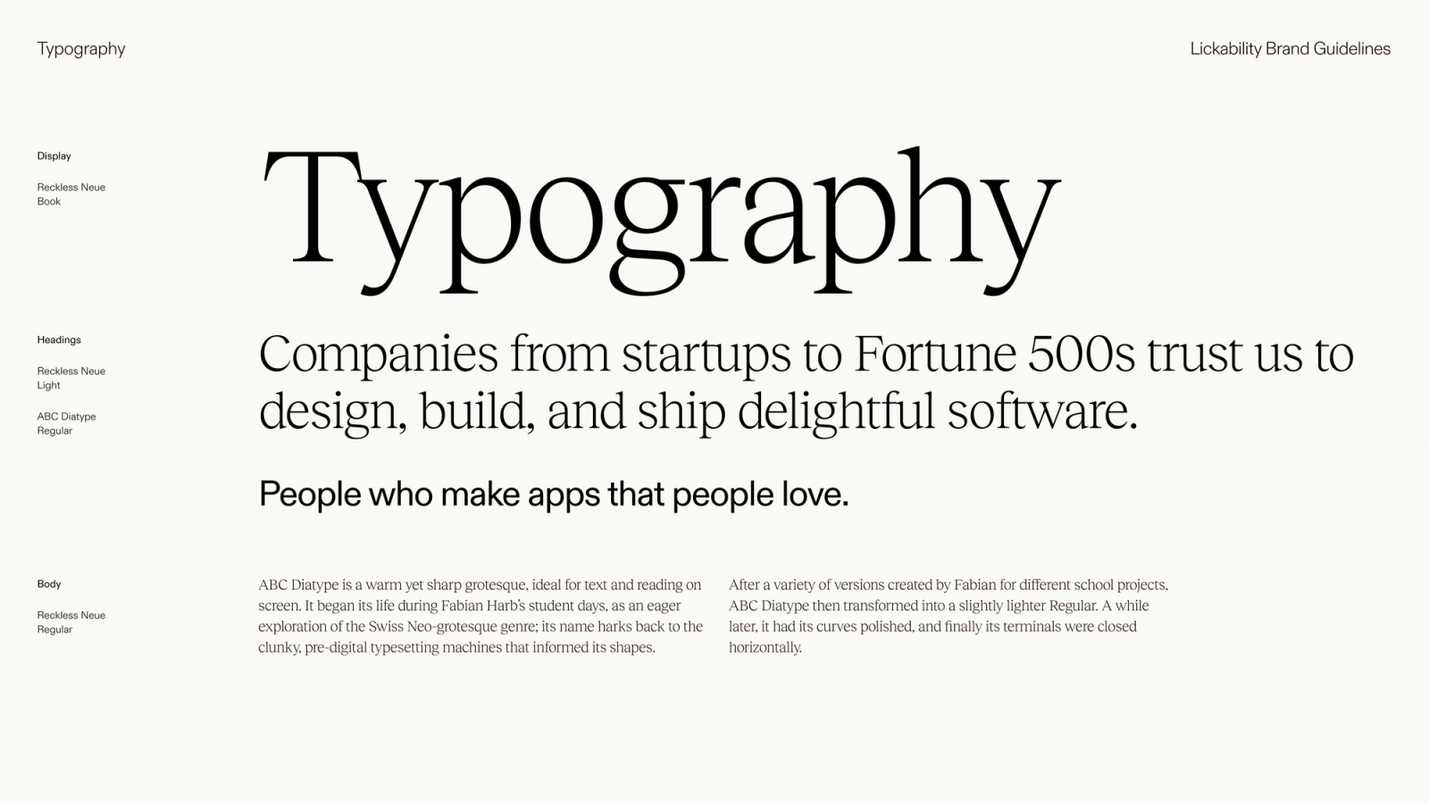
Our new typography guidelines, featuring Reckless Neue and ABC Diatype
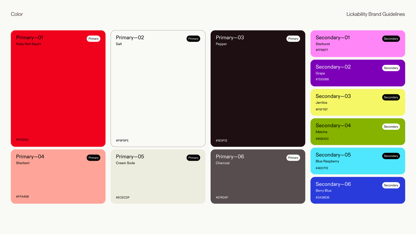
Our new color palette
In the months since they handed us the deliverables, we’ve been building up our brand assets in the shadows, not yet ready to step out into the light and show off our new look. Turns out, rolling out a rebrand is not quite as simple as slapping a different logo on some stuff and calling it a day — there was a lot of work that still had to be done.
The first thing we did was change our Slack workspace icon. That’s how you know it’s serious. We also ordered a batch of new business cards for everyone, got some new pins and stickers to give out at conferences, and designed some new shirts for our Cotton Bureau store. If you have any of our old merch, congratulations — that’s a rare, vintage collectible now.
Redesigning our website has been the biggest part of the project. We’ll save the fun details for another day, but we’re happy to officially present the new Lickability.com! It’s been a real labor of love over the past few months, and it feels great to finally be able to show it off.
The future
We spent nearly a year figuring out how to evolve our brand into something that represents where we’ve been and where we‘re headed, and we’re proud of the result. Changing a logo that’s been with you for a decade is scary, and digging deep to refine the principles you use to do your work every day is even scarier. But it’s also really rewarding to get it right.
Lickability will continue evolving — it’s impossible not to when you have the chance to work alongside so many brilliant, passionate people. So, as we grow, we hope that this brand identity will grow with us as we tackle new, challenging projects and ship even better software.