Helping Build The New Yorker Today
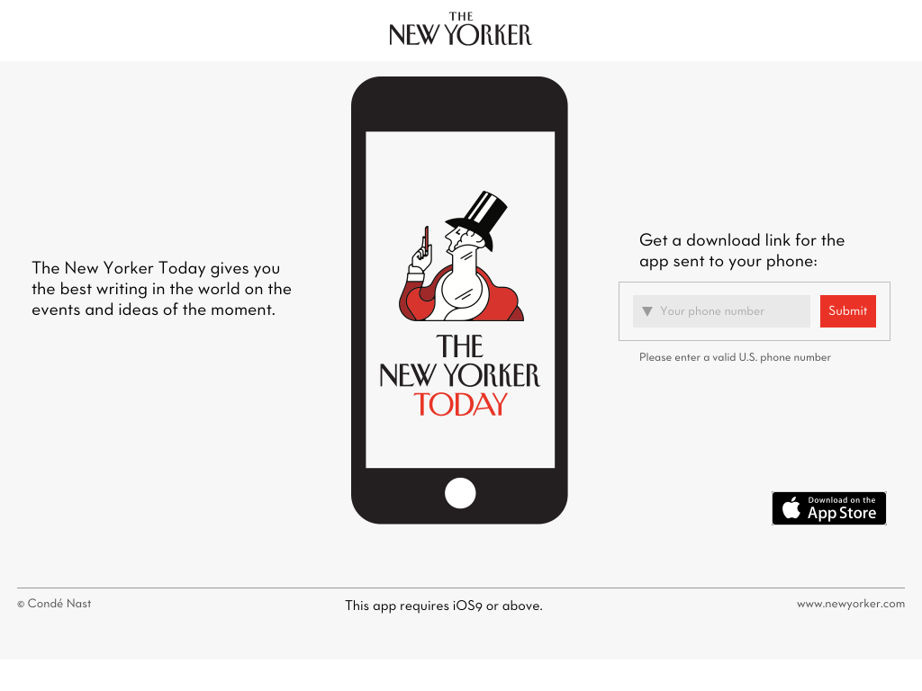
When The New Yorker first launched its flagship iPad app in 2010 and an iPhone version two years later, it was designed to mimic the magazine’s typographic layout. But as phones have become a bigger part of our lives, many subscribers want to read in a super-fast, native experience that’s not based around individual issues, but rather updates every single day. And now they can with The New Yorker Today.

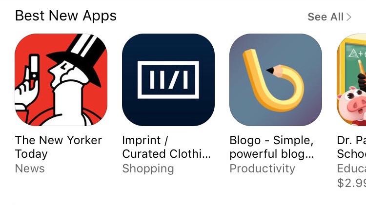
We worked very closely with Condé Nast’s team of incredibly talented designers, editors, engineers, and project managers to build an app that we’re all really proud of. And just days after it was released, Apple featured it on the front page of the App Store as one of the Best New Apps.

The app was engineered entirely in Swift for iOS 9 and above, with a focus on protocol-oriented design, reusable components, speed, and modern layout systems that will allow the app to easily adapt if it ever comes to other devices or platforms.
Our friend and frequent collaborator, Soroush Khanlou, who writes about development at khanlou.com, spearheaded much of the engineering effort alongside The New Yorker’s very own Justin Savory who built the app’s super fun and seemingly never-ending, swipeable cartoon gallery.
Whether you’re a diehard fan of the magazine or you just like reading the captions on the cartoons, we’d love for you to download the app, try it out, and let us know what you think. For the first month, everything in there is completely free, and after that you can subscribe with a quick in-app purchase.
And if you or your team need help building a new app or updating an existing one, we’d love to hear about it. You can email us at [email protected].
“The New Yorker” and “Condé Nast” are registered trademarks of Condé Nast. “App Store” is a service mark of Apple Inc.


