SwiftUI is really good. (Stop booing me, I’m right.) However, there comes a time when you may look at your app and think, “this reeks of SwiftUI.” System-provided list layouts, the same typography, the same colors as every other app.
Listen, those are fine defaults. It’s why those design choices are defaults — because they look fine and your users already understand them. But there comes a time when you want to go the extra mile. Friend of The Company™ Jordan Morgan calls the apps that do this “best in class.” I call it plussing: taking a perfectly fine starting point and extending it with some easy wins. It’s your app, plus a little extra spice. It’s like having a coffee and then adding a touch of your favorite flavoring or syrup. It’s the same base drink, but with a little something extra to make it special.
Plussing is a broad term and how you achieve it is ultimately up to you. My background is in design, so we’ll explore spacing, typography, color, and some lesser known features of system controls you can use to enhance your app in small but meaningful ways.
You can use all of these tips without any additional libraries. Just you, your Xcode project, and the open road. Let’s begin.
🔭 Spacing Systems? Far Out.
Design systems are so, so easy to use on the web. That’s Storybook’s whole thing. On native platforms — iOS especially — it’s more difficult to customize standard views. A slider, for instance, only lets you change the track color. But there are some things you can do to make your design more cohesive by employing a global set of values.
At Lickability, we typically use an exponential grid for spacing and sizing, which helps us make sure our layout remains balanced.
enum Grid {
    static let extraExtraSmall: CGFloat = 2
    static let extraSmall: CGFloat = 4
    static let small: CGFloat = 8
    static let medium: CGFloat = 16
    static let large: CGFloat = 32
    static let extraLarge: CGFloat = 64
}

struct CircleButton: View {
    var body: some View {
        Button(action: { }) {
            Image(systemName: "plus")
                .font(.system(size: Grid.large))
                .foregroundColor(.white)
                .frame(width: Grid.extraLarge, height: Grid.extraLarge)
                .background(Color.indigo.gradient)
                .clipShape(Circle())
                .shadow(color: Color.black.opacity(0.2), radius: Grid.small, x: 0, y: Grid.small)
        }
    }
}
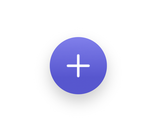
Lovely
Base 2 exponential values are nice because it makes mental math easy when I’m designing, but you can (should?) experiment with different values. I replaced the grid with a modular scale with base 2, ratio: 3 (2, 6, 18, 54, 162) and got a dramatically different visual rhythm:
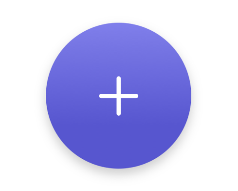
More spacious than any apartment I can afford.
🎨 Elevating Aesthetics with Color Grading
When I was a kid, I wanted to get into cinema post-production. Now, I draw rectangles and write blog posts about drawing rectangles. Things have not gone to plan. But my brief stint in cinematography made me see the value in using subtle color adjustments to set the tone of the scene — or, in this case, create a more harmonious interface.
By default, the system-provided neutral colors (like secondarySystemFill) carry a blue tint. But if your app’s accent color is, say, pink or green, you still get slightly blue background colors, secondary labels, and shape fills. The difference some manual color adjustments can make is lovely.
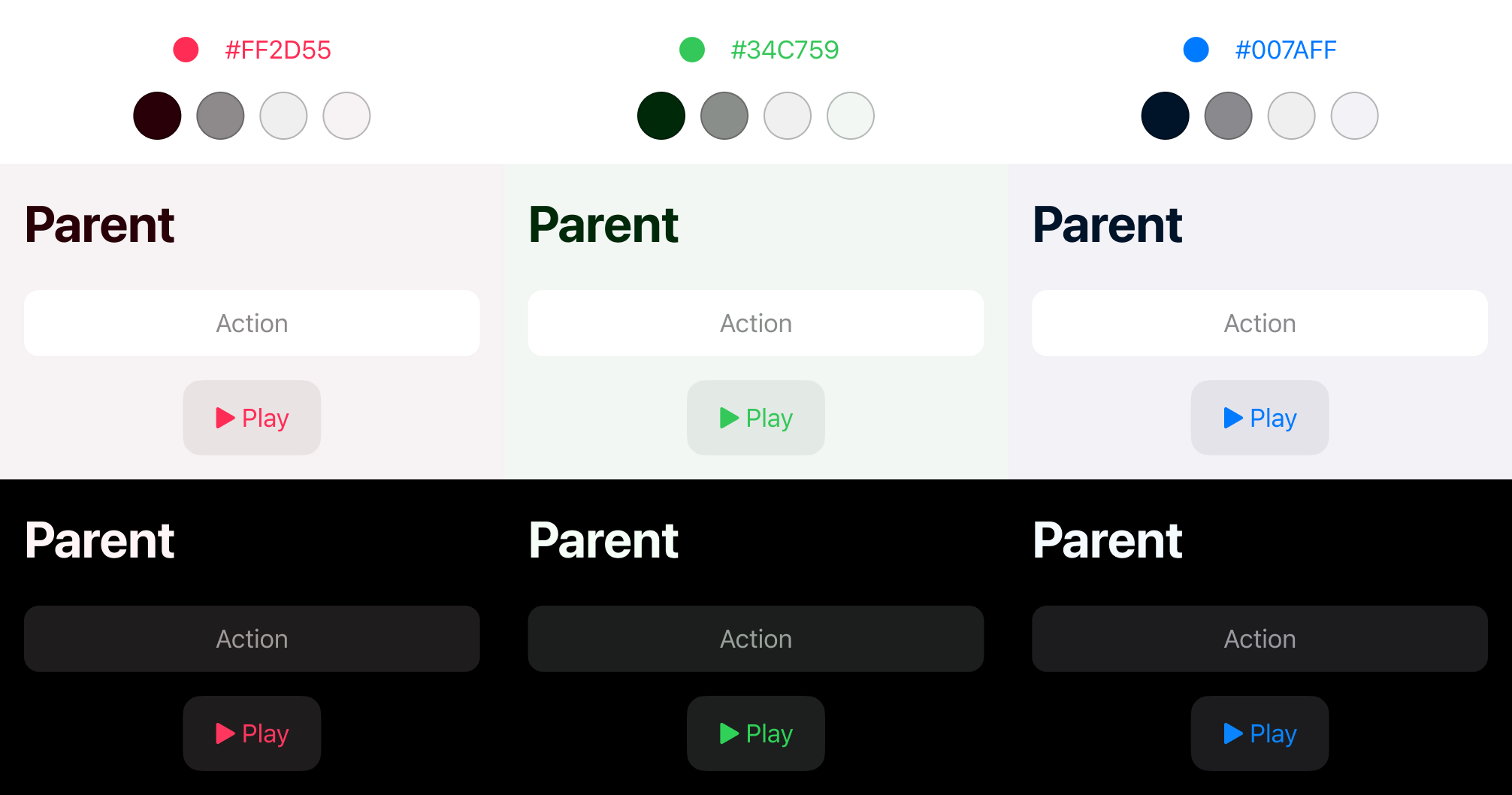
For extra credit, you can replace the primary label colors (black or white) with off-black and off-white values. I generally avoid using pure black in designs since it overpowers everything else, it limits what you can do with depth (you can’t put a shadow on pure black, for example), and reducing the contrast between pure black and pure white helps mitigate halation.
The battery savings touted by “OLED black” is greatly overstated — the difference it makes is a fraction of a percent per hour.
🔠 Typography Tweaks for Fun and Profit (and Security)
When creating views with usernames or email addresses — contexts that are susceptible to homoglyph attacks — I’ve started employing this trick to make some of the similar-looking characters more distinct.
The system font has a stylistic alternative set of characters under kStylisticAltSixOnSelector for this exact purpose. Take a look at the sample text here and notice the uppercase i, lowercase L, and the digits.
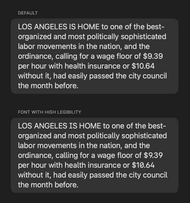
It’s not easy to use this (luckily I found this helper function), but I got a blessing from an Apple engineer in a WWDC lab that doing this is kosher:
extension UIFont {
    func fontWithFeature(key: Int, value:Int) -> UIFont {
        let originalDesc = self.fontDescriptor
        let features:[UIFontDescriptor.AttributeName: Any] = [
            UIFontDescriptor.AttributeName.featureSettings : [
                [
                    UIFontDescriptor.FeatureKey.featureIdentifier: key,
                    UIFontDescriptor.FeatureKey.typeIdentifier: value
                ]
            ]
        ]
        let newDesc = originalDesc.addingAttributes(features)
        return UIFont(descriptor: newDesc, size: 0.0)
    }

    func fontWithHighLegibility() -> UIFont {
        return self.fontWithFeature(key: kStylisticAlternativesType, value: kStylisticAltSixOnSelector)
    }
}

struct ContentView: View {
    var body: some View {
        Text("...")
            .font(Font(UIFont
                    .preferredFont(forTextStyle: .title2)
                    .fontWithHighLegibility()
            ))
    }

}
On the topic of typography, the system provides a number of different font styles, all of which afford you the nice things that the standard system font does: line heights that fit in nicely with SF Symbols, proper Dynamic Type adjustments for free, variable weights, and support for the Bold Text accessibility setting.
I’m a fan of New York (serif) for a classier look. Take a look at the Books app for how Apple balances serif titles and sans serif body text.
🫥 Empathy in Design: Handling Empty States
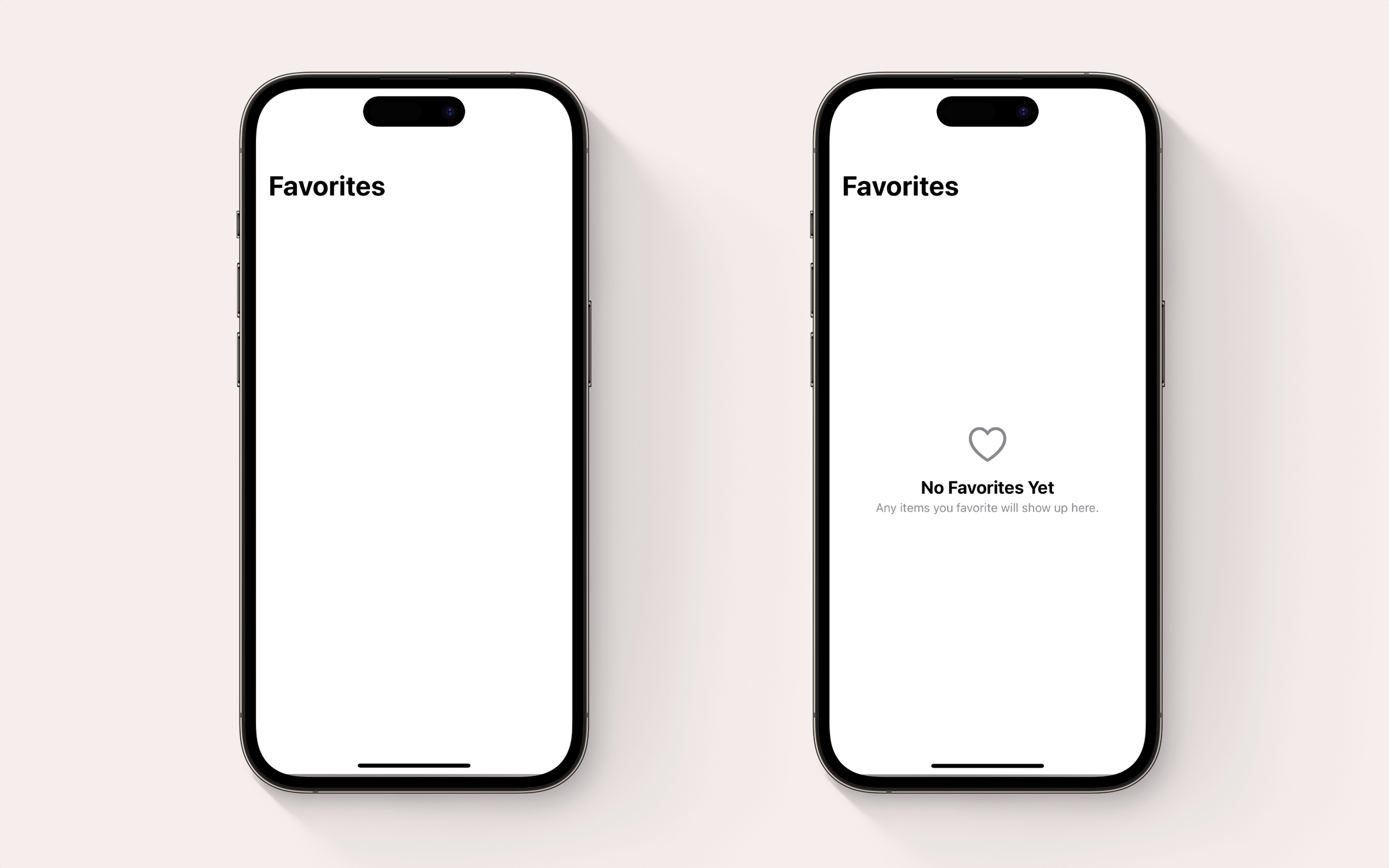 Quick, which app has finished loading content?
I wanted to title this section “Empt-athy in design” but it didn’t read well.
Honestly, this is my biggest pet peeve: when I don’t have any content in a section of an app and, instead of the app telling me that I don’t have any content, I find myself staring at a blank screen with no indication that it’s no longer loading.
If you’re targeting iOS 17 or later, this is drop-dead easy — just use ContentUnavailableView. Otherwise, I’m begging you to just slot in an empty state view. Nothing fancy, just a big SF Symbol, a headline, and some body text. Maybe a plain button or two.
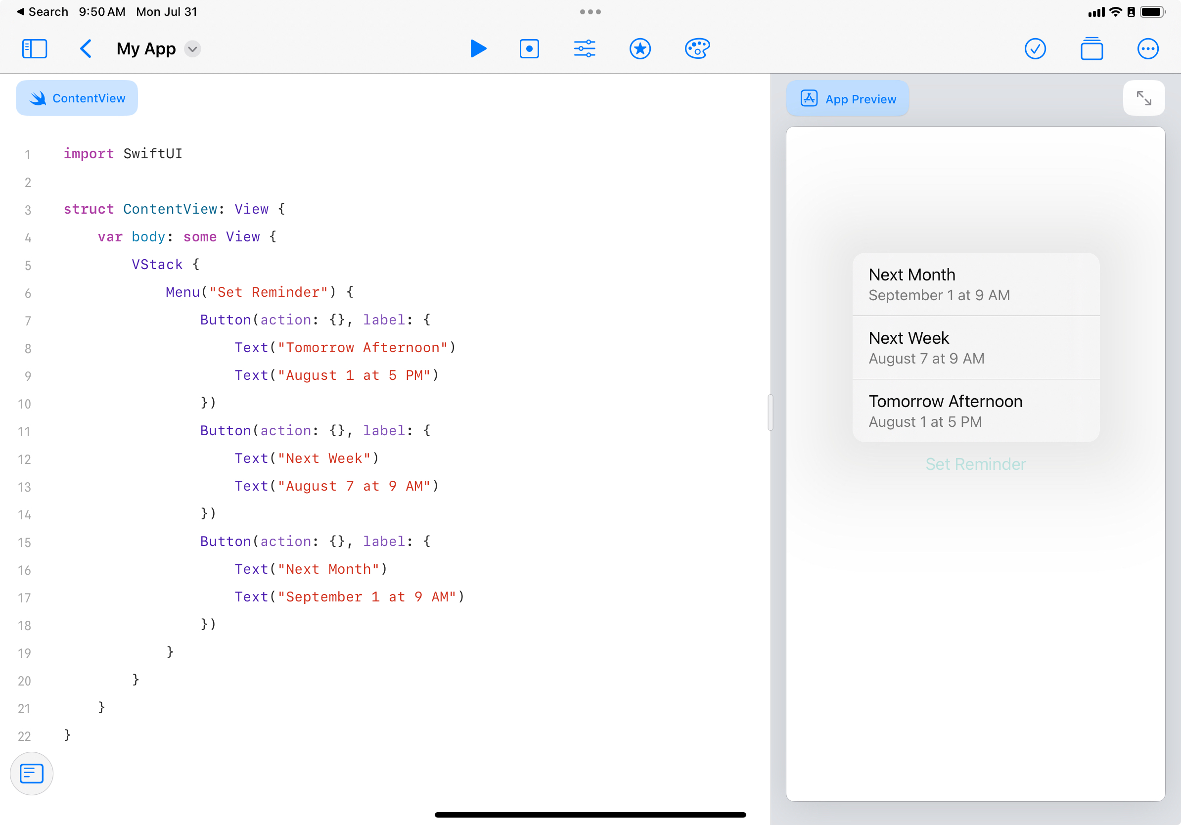
≡ Menus are Really Good, Actually
Where it makes sense, you can convert buttons to menus with a primary action. These menus work by performing the primary action on tap and opening the context menu on long press. And it’s all provided by the system!
If you’ve got a button in your navigation bar for “New Task,” you can use a menu there. The primary action would create a default task, and you can put the more niche items under the menu (”New Location-Based Task” or “New Date-Based Task”). Of course, use your best judgement here — but it’s a great little addition that not a ton of people know about.
When creating the actual menu, options should be written in a way that don’t require explanation beyond the menu label itself. But if you need to provide additional information on a menu item, you can! It’s hidden, but one of our engineers discovered that you can add a second text view in a button’s label parameter.
🔍 Details Matter and Matters Detail
Those are just a few ways that came to mind when plussing your app from a visual design and user experience standpoint. But I recognize most of you are developers, and there are so many more ways to plus beyond design. You can plus your app further by optimizing performance, integrating more system accessibility features like the rotor and dynamic type, and auditing text fields to add content hints so autofill works correctly. While you’re at it, check if you’re using the right keyboard type.
While SwiftUI provides a solid foundation, it’s up to you to give your app that extra sparkle. Your users will appreciate the unique design elements, making your app feel like a premium experience rather than just another SwiftUI app. After all, it’s the small things that count in creating a standout app. So go ahead, start plussing! If you need me, I’ll be here figuring out a better header for the empty state section.
Want expert help plussing your own app? That’s our specialty. Let’s talk!