Getting Started with UICollectionViewCompositionalLayout
A guide to building complex layouts
At WWDC 2019, Apple introduced and later documented an unbelievable API for building complex layouts with ease. UICollectionViewCompositionalLayout promised to simplify collection view layouts using a more declarative approach without the need to subclass to achieve customization—and it delivered. Our team has been making use of compositional layouts ever since, and we’d like to help you get started as well.
Back to Basics
For years, UICollectionViewFlowLayout , a UICollectionViewLayout subclass, helped us to achieve simple line-based layouts with little configuration, and with little customization required to perfectly create a common grid layout. More advanced customization often meant subclassing UICollectionViewFlowLayout, or creating your own layout by subclassing UICollectionViewLayout directly. We’ll start by reviewing how to build a grid with a flow layout, and then show you how to achieve the same design using a compositional layout while exploring the new APIs. Then, we’ll expand on our compositional layout solution while introducing some of the more powerful new features.
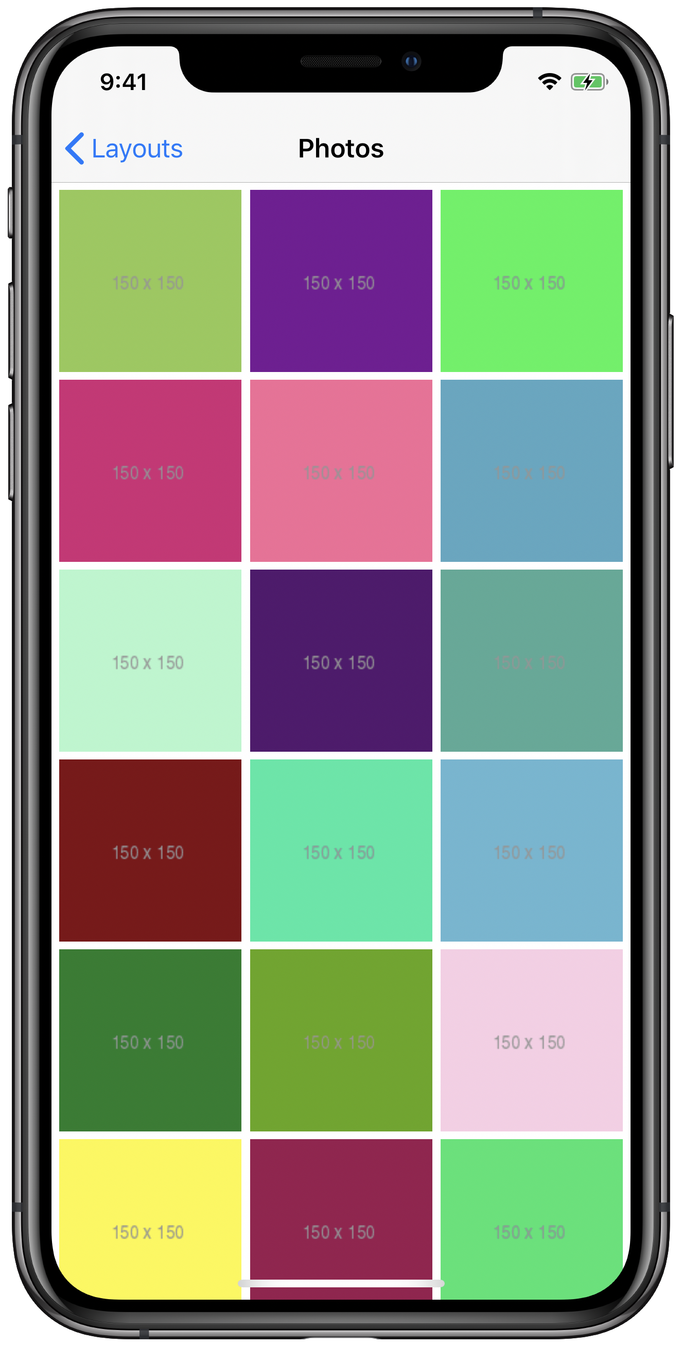
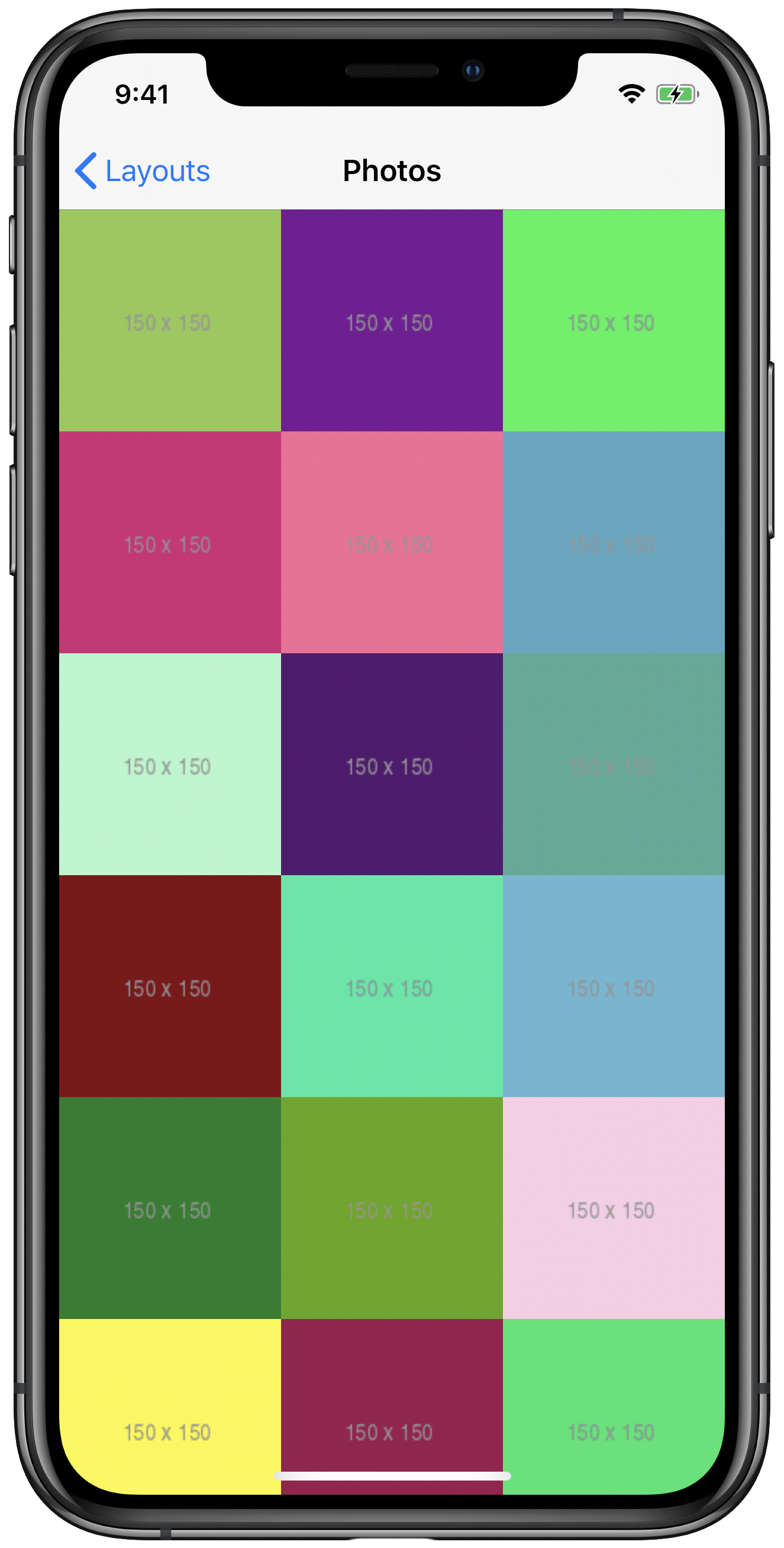
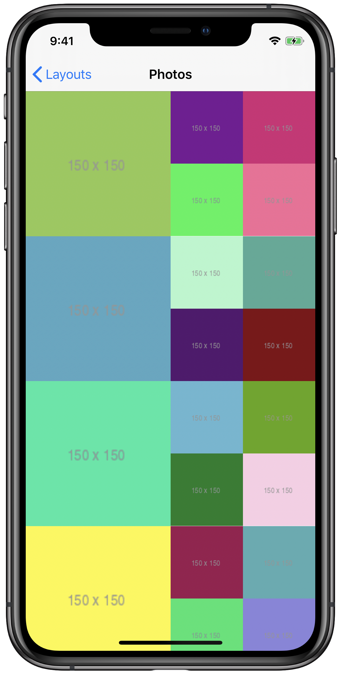
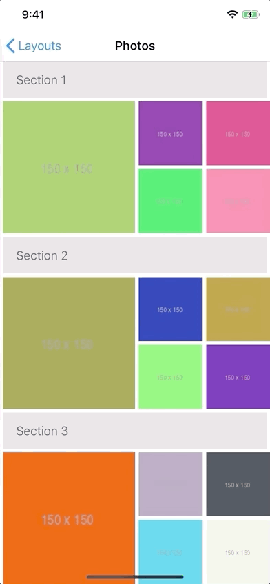
A basic grid built with UICollectionViewFlowLayout.
Our flow layout and compositional layout will use the exact same data source. It’s just a standard, everyday UICollectionViewDataSource that returns a cell for each square photo we want to display. The photos are categorized into sections, but that won’t come into play just yet.
extension PhotosDataSource: UICollectionViewDataSource {

    // MARK: - UICollectionViewDataSource

    func numberOfSections(in collectionView: UICollectionView) -> Int {
        return sections.count
    }

    func collectionView(_ collectionView: UICollectionView, numberOfItemsInSection section: Int) -> Int {
        return sections[section].items.count
    }

    func collectionView(_ collectionView: UICollectionView, cellForItemAt indexPath: IndexPath) -> UICollectionViewCell {
        guard let cell = collectionView.dequeueReusableCell(withReuseIdentifier: "PhotoCell", for: indexPath) as? PhotoCell else {
             return UICollectionViewCell()
        }

        let photo = sections[indexPath.section].items[indexPath.item]
        cell.viewModel = PhotoCell.ViewModel(identifier: photo.identifier, imageURL: photo.thumbnailURL)

        return cell
    }
}
We also need to register our cell under the reuse identifier used by our data source. In this example, our cell comes from a nib named PhotoCell.
collectionView.register(UINib(nibName: "PhotoCell", bundle: nil), forCellWithReuseIdentifier: "PhotoCell")The flow layout is fairly simple to set up. In the screenshot above, we can see 5 points of spacing between cells, both vertically and horizontally, as well as 5 point margins surrounding the layout.
let flowLayout: UICollectionViewFlowLayout = {
    let layout = UICollectionViewFlowLayout()
    layout.minimumInteritemSpacing = 5
    layout.minimumLineSpacing = 5
    layout.sectionInset = UIEdgeInsets(top: 5, left: 5, bottom: 5, right: 5)
    return layout
}()
Our cell layout is uniform. Every item is the same size, and we want exactly three items in every row. Since that size will change dynamically to fill the horizontal space on various screen sizes, we can’t simply set itemSize once upfront. Instead, we’ll implement the following UICollectionViewDelegateFlowLayout method to provide a size based on the width of the collection view’s current bounds.
extension PhotosCollectionViewController: UICollectionViewDelegateFlowLayout {

    // MARK: - UICollectionViewDelegateFlowLayout

    func collectionView(_ collectionView: UICollectionView, layout collectionViewLayout: UICollectionViewLayout, sizeForItemAt indexPath: IndexPath) -> CGSize {
        let width = collectionView.bounds.width
        let numberOfItemsPerRow: CGFloat = 3
        let spacing: CGFloat = flowLayout.minimumInteritemSpacing
        let availableWidth = width - spacing * (numberOfItemsPerRow + 1)
        let itemDimension = floor(availableWidth / numberOfItemsPerRow)
        return CGSize(width: itemDimension, height: itemDimension)
    }
}
In this implementation, we calculate availableWidth based on how much of our width will be taken up by margins and inter-item spacing (assuming we use the same value for both for simplicity) and subtracting it from the width of the collection view’s current bounds, then evenly dividing availableWidth by the number of items we want per row. If we ever wanted to change the number of items per row, we only need to change numberOfItemsPerRow and the rest of the layout will work as is.
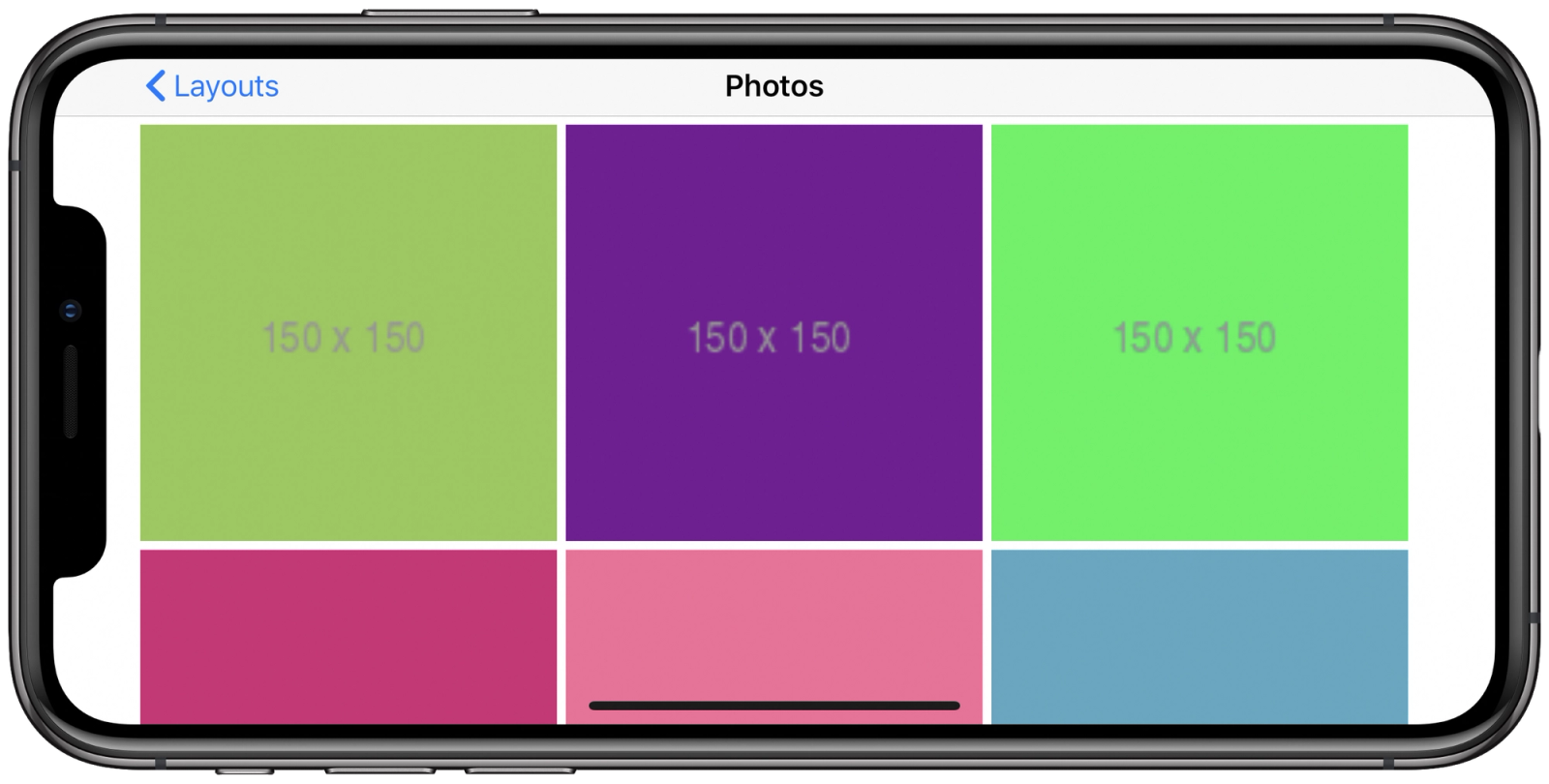
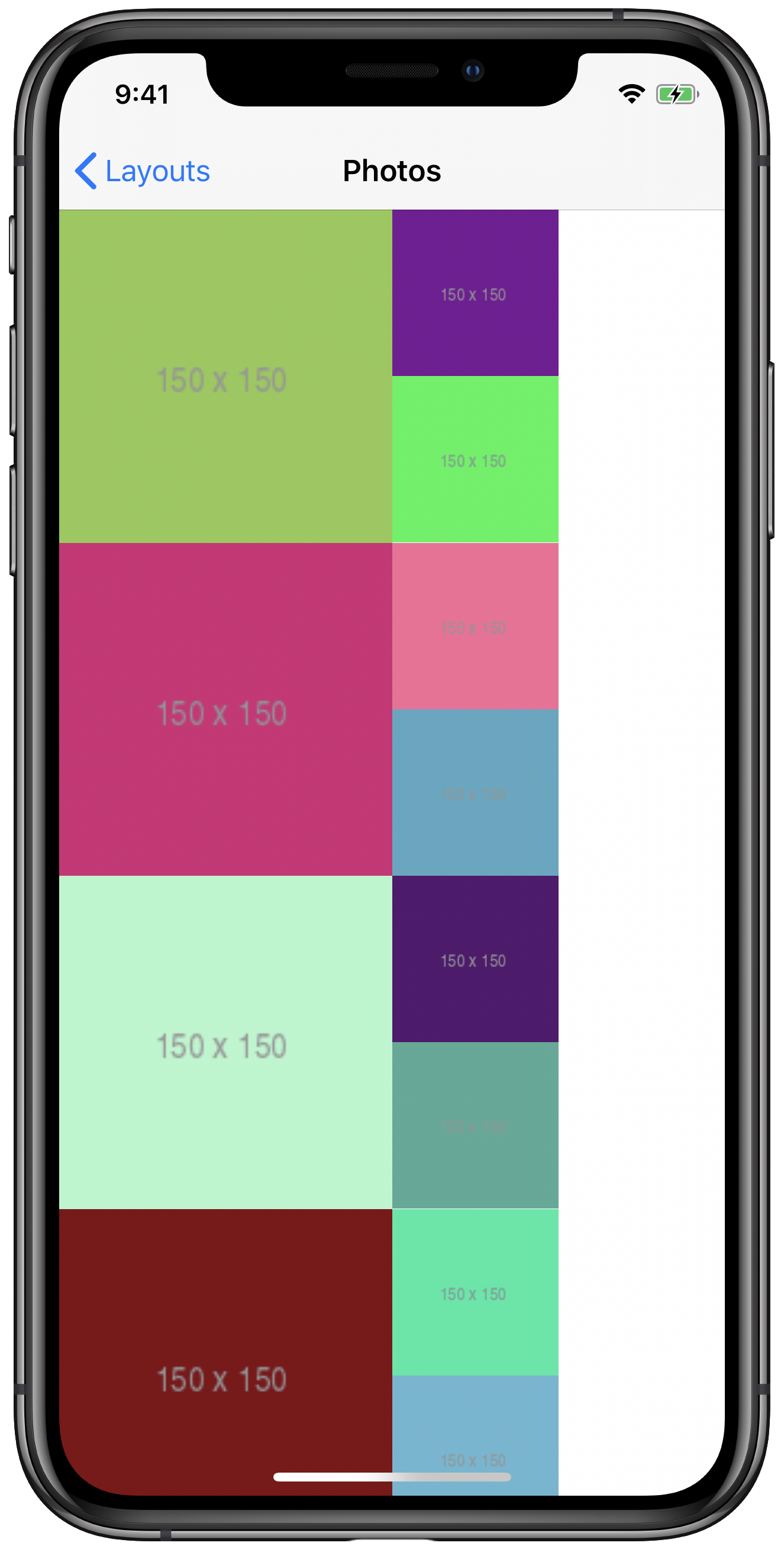
And that’s it! Well… sort of. There are a few more adjustments we’d have to make for our layout to be perfect. Right now, if we rotate to and from landscape, our layout doesn’t properly invalidate, and we end up with a different number of items per row.
Our flow layout after rotating the device :(
We can fix this in a number of different ways. We could detect when our view’s bounds change, and make the appropriate call to invalidateLayout(). We could subclass UICollectionViewFlowLayout and override shouldInvalidateLayout(forBoundsChange:). We could place some random combination of invalidateLayout() and reloadData() in various UIViewController methods, cross our fingers, and hope it doesn’t affect any animations we may want to add in the future 🤞 (we’ve all been there).
But wouldn’t it be nice to just describe our layout upfront and not deal with any of that? If only we knew how to use that shiny, new declarative API.
Understanding UICollectionViewCompositionalLayout by Example
Forget everything you know about collection view layouts! Okay, well… not so fast. But we do need to think a bit differently about traditional section- and item-based layouts. In our flow layout, a section was comprised of multiple items, laid out in horizontal lines that were stacked vertically.
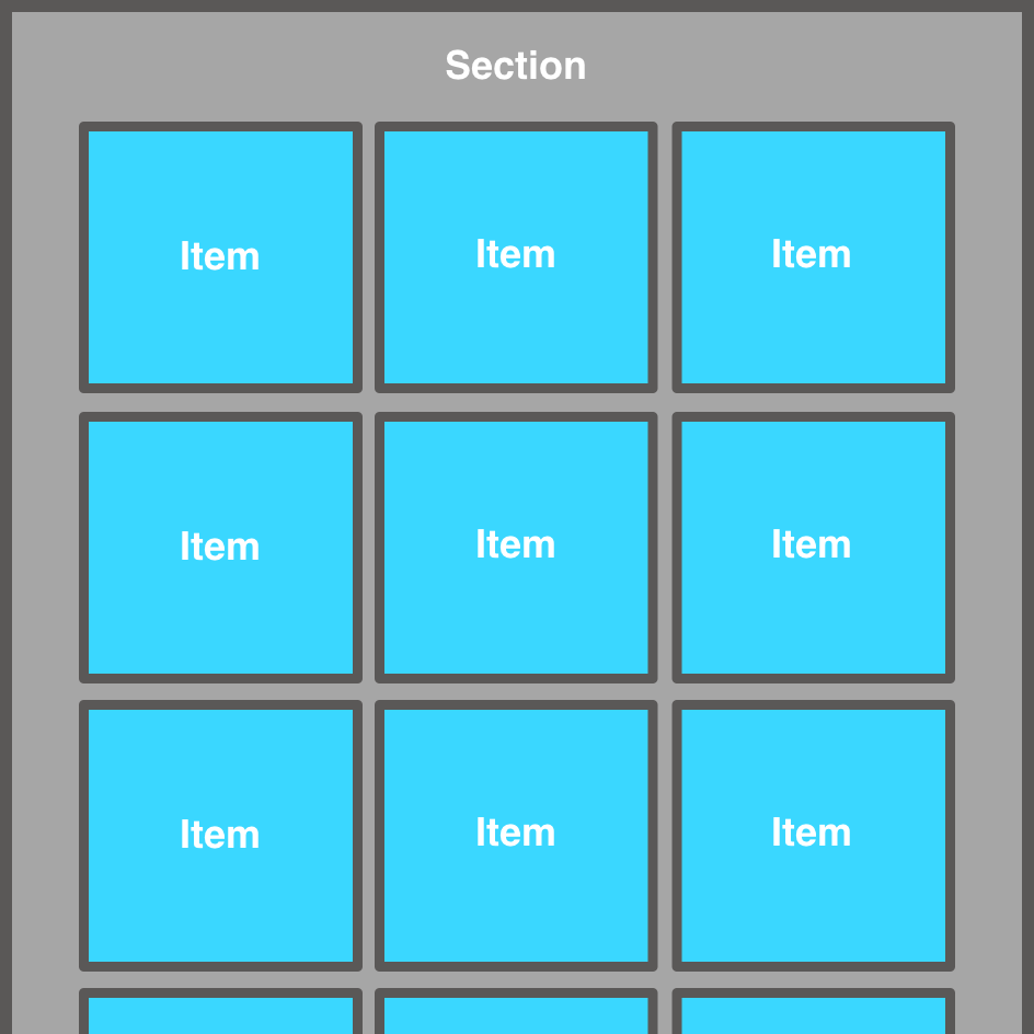
Diagram of a flow layout with items laid out in horizontal lines within a section.
UICollectionViewCompositionalLayout introduces groups, a powerful layer conceptually nestled somewhere between sections and items that we must understand to fully unlock their potential. For now, just know that a layout is comprised of sections, sections are comprised of groups, and groups are comprised of items and optionally other groups. We won’t nest groups within other groups just yet. Take a look at how our layout can be modified to incorporate groups.
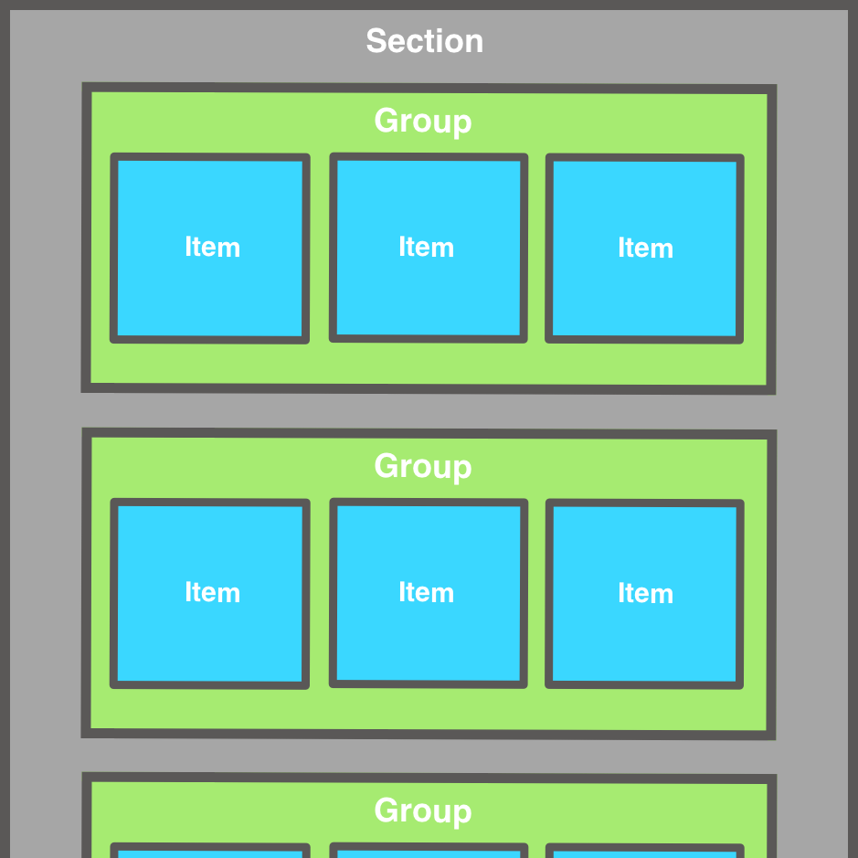
Diagram of a compositional layout with items nested in groups within a section.
Sections and items described in a compositional layout correspond 1-to-1 with the sections and items of our collection view data source. Groups, however, don’t have a data source equivalent, nor do they render content like items/cells. They’re used solely to describe the layout of our items within a section.
In the diagram above, each group represents a horizontal line of our layout. We’ll get fancier in a bit, but for now, we’ll structure our first compositional layout in this manner. Speaking of our first compositional layout, let’s get started on that now. We’ll want to create our layout using the initializer init(section:), which takes an NSCollectionLayoutSection as a parameter. Note that NSCollectionLayoutSection simply describes the layout of any section in the layout we’re creating. We’re not adding any data to the collection view here, as that’s the responsibility of the UICollectionViewDataSource.
let section = NSCollectionLayoutSection(group: group)
let layout = UICollectionViewCompositionalLayout(section: section)
Oh, but we need to declare that group. That’s right…because a layout is comprised of sections, which are comprised of groups, which are comprised of groups and items. Let’s work backwards from here.
A group is represented by a NSCollectionLayoutGroup. To create one, we need to describe its size relative to its containing section, specify whether we want it to lay items out horizontally or vertically, and describe the items it will contain. We’ll use the class function NSCollectionLayoutGroup.horizontal(layoutSize:subitems:) to do this, since we want each group to lay out its items horizontally, but first we need to understand sizing.
Sizing is accomplished by describing groups and items in relation to their respective container’s size. More specifically, the size of a group can be described relative to its containing group or section’s size, and the size of an item can be described relative to its containing group’s size. To mimic our flow layout, we want to use the full section width to lay out three items in each group. To do so, we can easily describe the width of our group using NSCollectionLayoutDimension. More specifically, we can create this using the NSCollectionLayoutDimension.fractionalWidth(_:) class method, passing 1 to indicate that we want our group width to be 1 x the containing section’s width.
let widthDimension = NSCollectionLayoutDimension.fractionalWidth(1) We also need to provide a height dimension. Effectively, we want our groups to be as tall as our items, but we haven’t yet specified anything about item size just yet. Thinking ahead, we know we want to lay out 3 items horizontally in each group, and we know that our items are square (that is, their height equals their width). In our flow layout, we divided our available width by 3 to determine the item width and height, and we can do the same with fractionalWidth(_:).
let heightDimension = NSCollectionLayoutDimension.fractionalWidth(1/3) Remember, though, that we’re defining our group size right now, not our item size. Currently, our groups just happen to be the same desired height as our items. Putting this all together, we create an NSCollectionLayoutSize with our width and height dimensions, and use that to initialize our group. We then use our group to initialize our section, and our section to initialize our layout as we saw before.
let groupSize = NSCollectionLayoutSize(widthDimension: .fractionalWidth(1), heightDimension: .fractionalWidth(1/3))
let group = NSCollectionLayoutGroup.horizontal(layoutSize: groupSize, subitems: [item])

let section = NSCollectionLayoutSection(group: group)
let layout = UICollectionViewCompositionalLayout(section: section)
It’s extremely powerful that we’re able to describe height relative to the container’s width, and vice versa. Since our list scrolls vertically, we can’t really describe our group height in terms of the section’s height, as the section’s height is dependent on the number of items in our data source, and that has nothing to do with our group size. Sometimes, you may want to specify a specific, non-container-relative width or height. You can do so using NSCollectionLayoutDimension.absolute(_:). Similarly, for self-sizing groups and items, you can use NSCollectionLayoutDimension.estimated(_:) and the actual dimension will be computed during layout.
We now need to define our layout’s items, which we used to create the NSCollectionLayoutGroup above. Items in the layout are represented by NSCollectionLayoutItem, and just like groups, they are initialized with an NSCollectionLayoutSize. Now that we know how sizing works, this should be easy. Each item is as tall as its containing group (which we’ve already sized appropriately), and we want 3 items laid out horizontally in each group, so our item width will be a third of its containing group’s width.
let itemSize = NSCollectionLayoutSize(widthDimension: .fractionalWidth(1/3), heightDimension: .fractionalHeight(1))
let item = NSCollectionLayoutItem(layoutSize: itemSize)
Our layout only uses a single NSCollectionLayoutItem because our cells are uniformly sized, but we could (and later will) create a group with multiple items. For now, we put everything we just learned together to create a complete layout:
let compositionalLayout: UICollectionViewCompositionalLayout = {
    let fraction: CGFloat = 1 / 3

    // Item
    let itemSize = NSCollectionLayoutSize(widthDimension: .fractionalWidth(fraction), heightDimension: .fractionalHeight(1))
    let item = NSCollectionLayoutItem(layoutSize: itemSize)

    // Group
    let groupSize = NSCollectionLayoutSize(widthDimension: .fractionalWidth(1), heightDimension: .fractionalWidth(fraction))
    let group = NSCollectionLayoutGroup.horizontal(layoutSize: groupSize, subitems: [item])

    // Section
    let section = NSCollectionLayoutSection(group: group)
    return UICollectionViewCompositionalLayout(section: section)
}()
And that’s it. Our entire layout is declared up front. Our sizing logic from UICollectionViewDelegateFlowLayout is no longer required, as that behavior is already captured in our layout declaration. Let’s take a look.
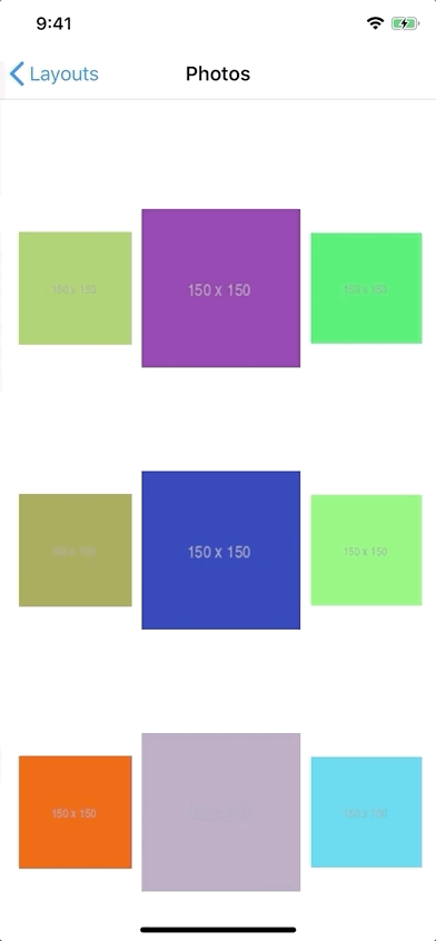
Our first attempt at a compositional layout. We’re almost there…
Ok, that’s not quite it, but we’re close. We didn’t account for margins and item spacing like we did in our flow layout. Remember that in our flow layout, we needed to mathematically determine how much total horizontal spacing our layout required to determine our item size, and we also needed to specify minimumInteritemSpacing, minimumLineSpacing, and sectionInset to get everything working perfectly. Achieving similar results in our compositional layout is quite simple by setting insets on item and section.
let inset: CGFloat = 2.5

// after item declaration…
item.contentInsets = NSDirectionalEdgeInsets(top: inset, leading: inset, bottom: inset, trailing: inset)

// after section delcaration…
section.contentInsets = NSDirectionalEdgeInsets(top: inset, leading: inset, bottom: inset, trailing: inset)
Note that we use 2.5 instead of 5 because each item gets this padding, so an item next to another item or a section edge will have a combined padding of 5. Also, we don’t have to calculate how much total horizontal space is required per row. Our .fractionalWidth(1/3) still works because our spacing is accomplished via content insets, so our item width and height, including insets, are still one third of the width of our containing group. The content (cell) is simply inset within this size.

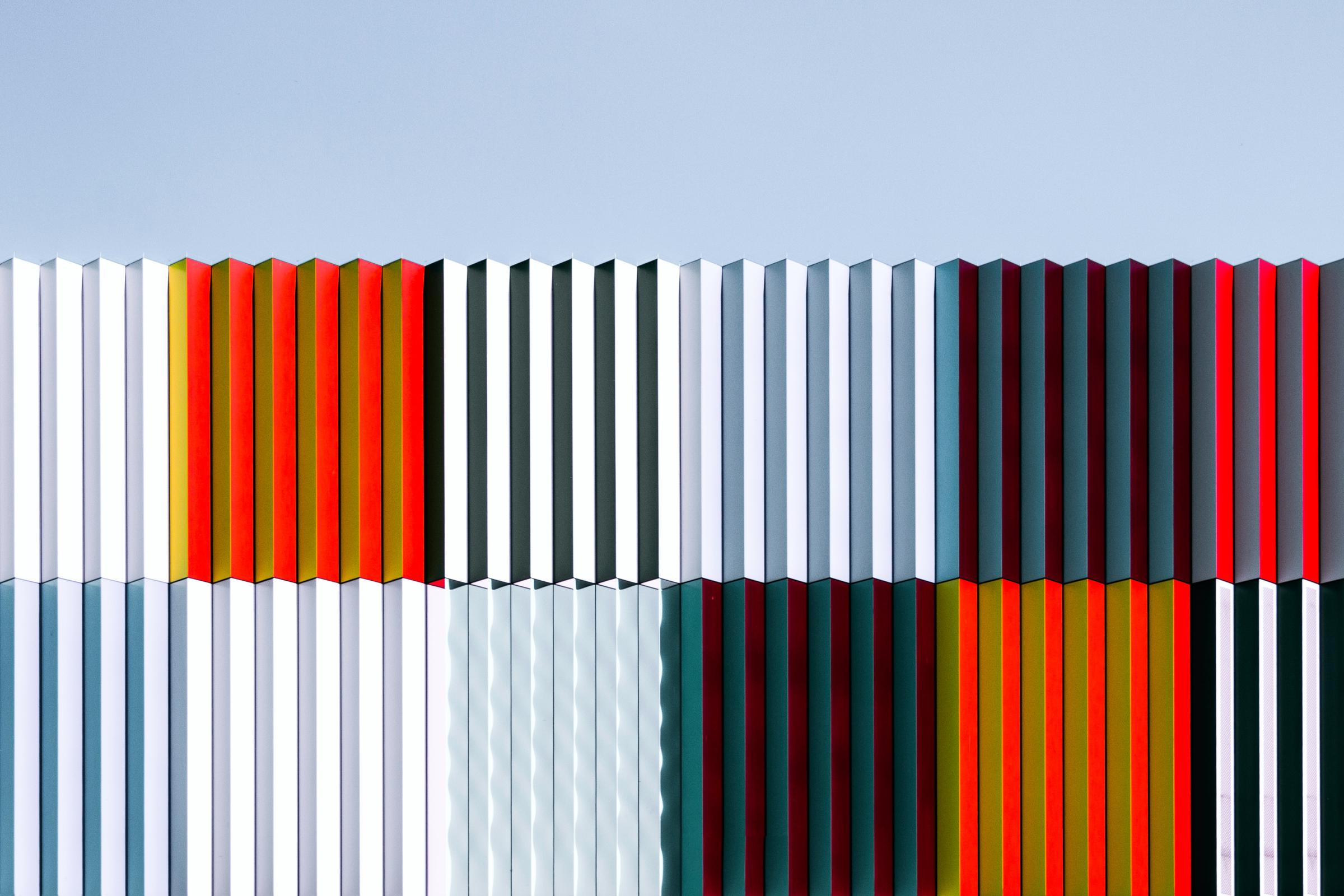
Our compositional layout now matches our flow layout!
✨ Now our layout is perfect. Not only does it properly maintain 3 columns when rotating our device back and forth, but the layout properly adjusts to respect the leading and trailing safe area margins without any additional code!
The same compositional layout in landscape, inset by the safe area.
Using UICollectionViewCompositionalLayout, we successfully matched the design of our flow layout using only a few lines of code, and we even fixed some bugs along the way. But that’s not all we can do with a compositional layout. We’re just getting started.
Supplementary Items
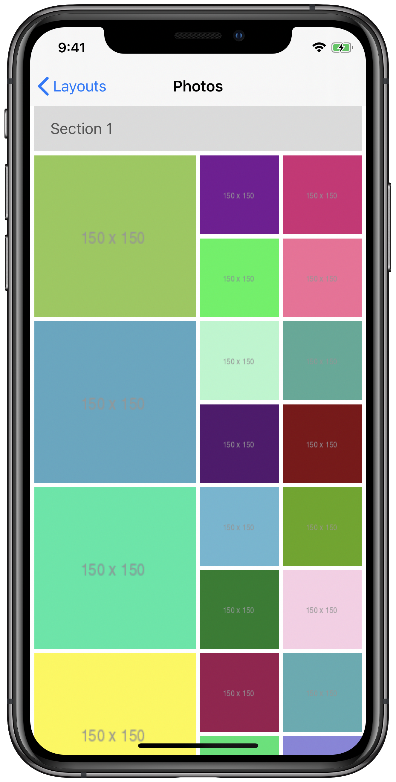
We’ve accomplished a basic layout of our cells, but if you’ve worked with collection views before, you might know that your data source is also capable of vending reusable supplementary views to create things like headers, accessory views, and the like. So how do those fit into compositional layouts? Before we get there, let’s add a method to our data source to create a view we’d like to use as a header for the sections in our collection view.
extension PhotosDataSource: UICollectionViewDataSource {

    // MARK: - UICollectionViewDataSource

    // …

    func collectionView(_ collectionView: UICollectionView, viewForSupplementaryElementOfKind kind: String, at indexPath: IndexPath) -> UICollectionReusableView {
        guard let headerView = collectionView.dequeueReusableSupplementaryView(ofKind: kind, withReuseIdentifier: "HeaderSupplementaryView", for: indexPath) as? HeaderSupplementaryView else {
            return HeaderSupplementaryView()
        }

        headerView.viewModel = HeaderSupplementaryView.ViewModel(title: "Section \(indexPath.section + 1)")

        return headerView
    }
}
Here, we’re simply returning a reusable instance of a basic header view class that we created and specifying its title as “Section” followed by the section number.
Just like we did with our PhotoCell, we’ll need to register HeaderSupplementaryView with our collection view.
collectionView.register(UINib(nibName: "HeaderSupplementaryView", bundle: nil), forSupplementaryViewOfKind: "header", withReuseIdentifier: "HeaderSupplementaryView") And now we’re ready to incorporate this into our layout. For a flow layout, you’d either set headerReferenceSize or implement collectionView(_:layout:referenceSizeForHeaderInSection:) as part of your UICollectionViewDelegateFlowLayout conformance. It’s just as simple to accomplish in a compositional layout.
First we need to create the layout-equivalent of our supplementary view, that is, the component that describes the header in our layout declaration. Look no further than NSCollectionLayoutBoundarySupplementaryItem. We’ll simply create an instance and set it on our NSCollectionLayoutSection. Sizing works the same way as our items and groups, using NSCollectionLayoutSize. Then, we just need specify the element kind under which we registered, and .top or .bottom for the supplementary view’s alignment (note that we’d choose .bottom if we wanted this to be a section footer).
let headerItemSize = NSCollectionLayoutSize(widthDimension: .fractionalWidth(1), heightDimension: .estimated(100))
let headerItem = NSCollectionLayoutBoundarySupplementaryItem(layoutSize: headerItemSize, elementKind: "header", alignment: .top)
section.boundarySupplementaryItems = [headerItem]
With these three lines of code, our layout now supports headers!
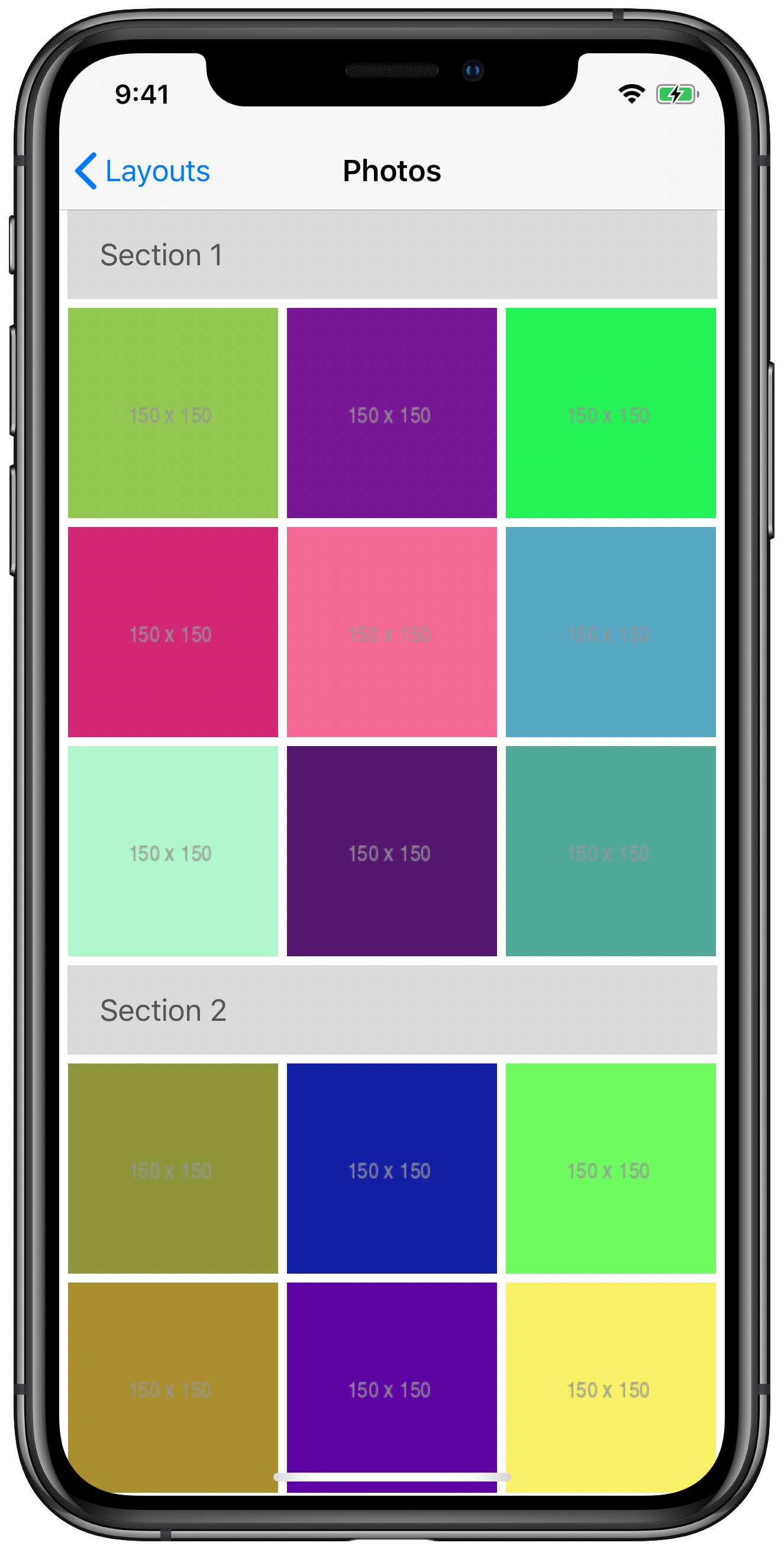
Compositional layout with supplementary header items.
It’s just as easy to make these headers and footers “float” as you scroll by setting pinToVisibleBounds to true.
So what else can we display with supplementary items? Well… pretty much anything you want. NSCollectionLayoutBoundarySupplementaryItem is actually a subclass of NSCollectionLayoutSupplementaryItem. Using this class directly, we can easily control the sizing and positioning of supplementary views by attaching them to items and groups. A common example is displaying a badge on specific items, as demonstrated in the docs. Let’s use a similar approach and add a banner to the bottom of specific items. We’ll have the banner read “NEW” and it will extend beyond our item’s visible bounds.
First, just like we did for our section header items, we need to provide a reusable view from our data source. We’ll modify our data source method to check the element kind, and return a configured instance of the appropriate view.
func collectionView(_ collectionView: UICollectionView, viewForSupplementaryElementOfKind kind: String, at indexPath: IndexPath) -> UICollectionReusableView {
    switch kind {
    case "header":
        guard let headerView = collectionView.dequeueReusableSupplementaryView(ofKind: kind, withReuseIdentifier: "HeaderSupplementaryView", for: indexPath) as? HeaderSupplementaryView else {
            return HeaderSupplementaryView()
        }

        headerView.viewModel = HeaderSupplementaryView.ViewModel(title: "Section \(indexPath.section + 1)")
        return headerView

    case "new-banner":
        let bannerView = collectionView.dequeueReusableSupplementaryView(ofKind: kind, withReuseIdentifier: "NewBannerSupplementaryView", for: indexPath)
        bannerView.isHidden = indexPath.row % 5 != 0 // show on every 5th item
        return bannerView

    default:
        assertionFailure("Unexpected element kind: \(kind).")
        return UICollectionReusableView()
    }
}
Our banner is backed by a simple nib-based view, NewBannerSupplementaryView, that displays the “NEW” label and sets a background color and border. This data source method must return a non-optional UICollectionReusableView, so even though we don’t want one on every item, we must provide one. The docs state:
If you do not want a supplementary view in a particular case, your layout object should not create the attributes for that view. Alternatively, you can hide views by setting theisHiddenproperty of the corresponding attributes totrueor set thealphaproperty of the attributes to0.
Since we’re not in the business of subclassing UICollectionViewLayout anymore, we’re not controlling the creation of attributes, so we use the isHidden approach here. For demonstration purposes, we set our data source up to show this supplementary item on every 5th cell.
Again, we have to register our nib under the reuse identifier and element kind we just used.
collectionView.register(UINib(nibName: "NewBannerSupplementaryView", bundle: nil), forSupplementaryViewOfKind: "new-banner", withReuseIdentifier: "NewBannerSupplementaryView") And that brings us to the layout updates. We’ll be creating an NSCollectionLayoutSupplementaryItem with the initializer init(layoutSize:elementKind:containerAnchor:).
layoutSizeis anNSCollectionLayoutSize, nothing new. But it’s worth mentioning that when using fractional width and height, the values are relative to the associated item or group you will be attaching the supplementary item to. We want our banner to be slightly wider than the item it’s attached to, so we’ll use a fractional width of1.1. We can simply fix the height to a value that looks good, in this case30, but could also use.estimatedjust as easily and let Auto Layout do its thing.- Similar to our header,
elementKindneeds to match the string we used in our data source and nib registration. In this case, that’s"new-banner". - Lastly, we have
containerAnchor, which is of typeNSCollectionLayoutAnchor. It’s initialized with a set of edges (NSDirectionalRectEdge), and optionally a fixed or fractional offset from that edge. It determines where on our item or group to attach the supplementary item. We are going to attach it to the bottom, with a y-offset of10so that it extends below our item as well.
We want a larger inset on all of our components so our banner has some additional room to extend beyond our items’ bounds, so we’ll replace 2.5 with 8. The following shows the supplementary item and item declaration. Note that the item declaration now makes use of supplementaryItem. The group and section declarations remain the same as before, but without the header supplementary items.
let inset: CGFloat = 8

// Supplementary Item
let layoutSize = NSCollectionLayoutSize(widthDimension: .fractionalWidth(1.1), heightDimension: .absolute(30))
let containerAnchor = NSCollectionLayoutAnchor(edges: [.bottom], absoluteOffset: CGPoint(x: 0, y: 10))
let supplementaryItem = NSCollectionLayoutSupplementaryItem(layoutSize: layoutSize, elementKind: "new-banner", containerAnchor: containerAnchor)

// Item
let itemSize = NSCollectionLayoutSize(widthDimension: .fractionalWidth(fraction), heightDimension: .fractionalHeight(1))
let item = NSCollectionLayoutItem(layoutSize: itemSize, supplementaryItems: [supplementaryItem])
item.contentInsets = NSDirectionalEdgeInsets(top: inset, leading: inset, bottom: inset, trailing: inset)
And the results?
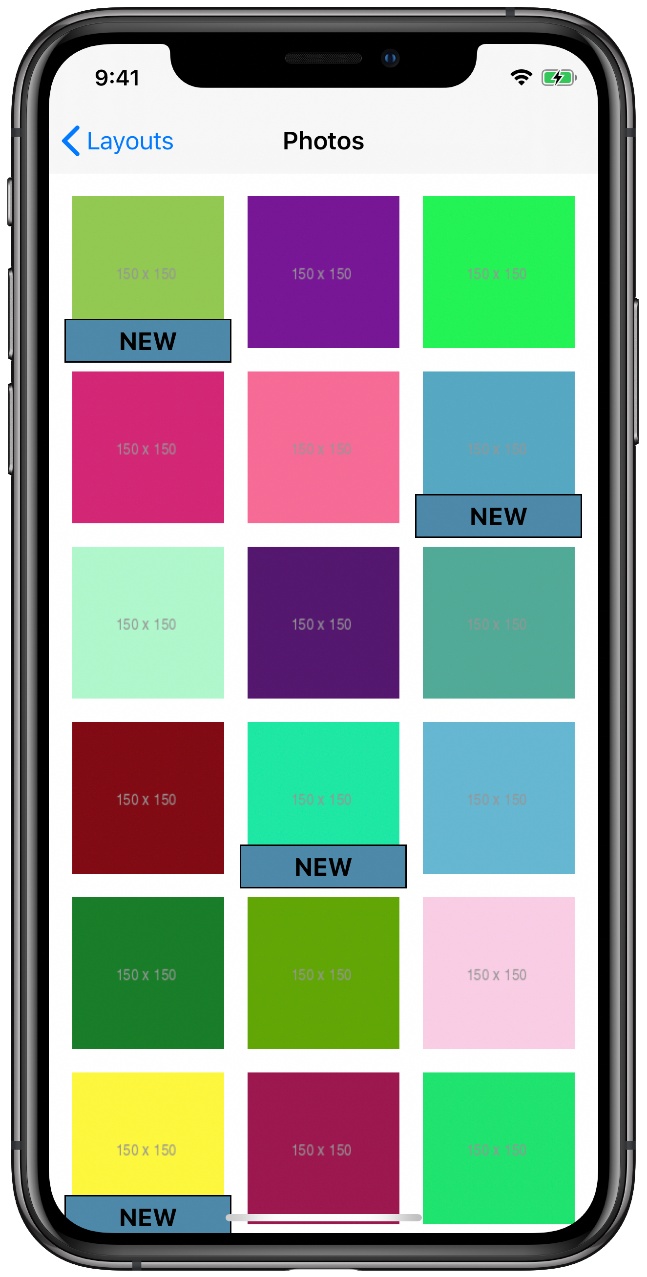
Compositional layout with item-based supplementary items.
We’ve now seen how to add various kinds of supplementary items to our compositional layout, but the customization doesn’t stop there.
Decoration Items
In addition to supplementary items, we can customize our section layout with decoration items. This will allow us to easily add backgrounds to our sections. The background view we’ll create is quite simple (a gray rectangle with a corner radius), so we’ll do it in code.
/// A basic supplementary view used for section backgrounds.
final class BackgroundSupplementaryView: UICollectionReusableView {

    override init(frame: CGRect) {
        super.init(frame: frame)

        layer.cornerRadius = 8
        backgroundColor = UIColor(white: 0.85, alpha: 1)
    }
}
Perhaps surprisingly, we don’t need to update our data source or register this view on the collection view. We’ll handle registration directly on the layout. And speaking of the layout, in order to accommodate the background view, we’ll want to inset our section a bit more to display more of the new background, so instead of using our uniform 2.5 for all of our spacing like we were before, let’s specify a new value for our section contentInsets.
let sectionInset: CGFloat = 16
section.contentInsets = NSDirectionalEdgeInsets(top: sectionInset, leading: sectionInset, bottom: sectionInset, trailing: sectionInset)
In our layout declaration, we simply create a new decoration item for our background using NSCollectionLayoutDecorationItem.background(elementKind:), inset it a bit, and set it on our section.
let backgroundItem = NSCollectionLayoutDecorationItem.background(elementKind: "background")
let backgroundInset: CGFloat = 8
backgroundItem.contentInsets = NSDirectionalEdgeInsets(top: backgroundInset, leading: backgroundInset, bottom: backgroundInset, trailing: backgroundInset)
section.decorationItems = [backgroundItem]
We then register it on the layout itself after we create it.
let layout = UICollectionViewCompositionalLayout(section: section)
layout.register(BackgroundSupplementaryView.self, forDecorationViewOfKind: "background")
Now our background decoration view is ready.
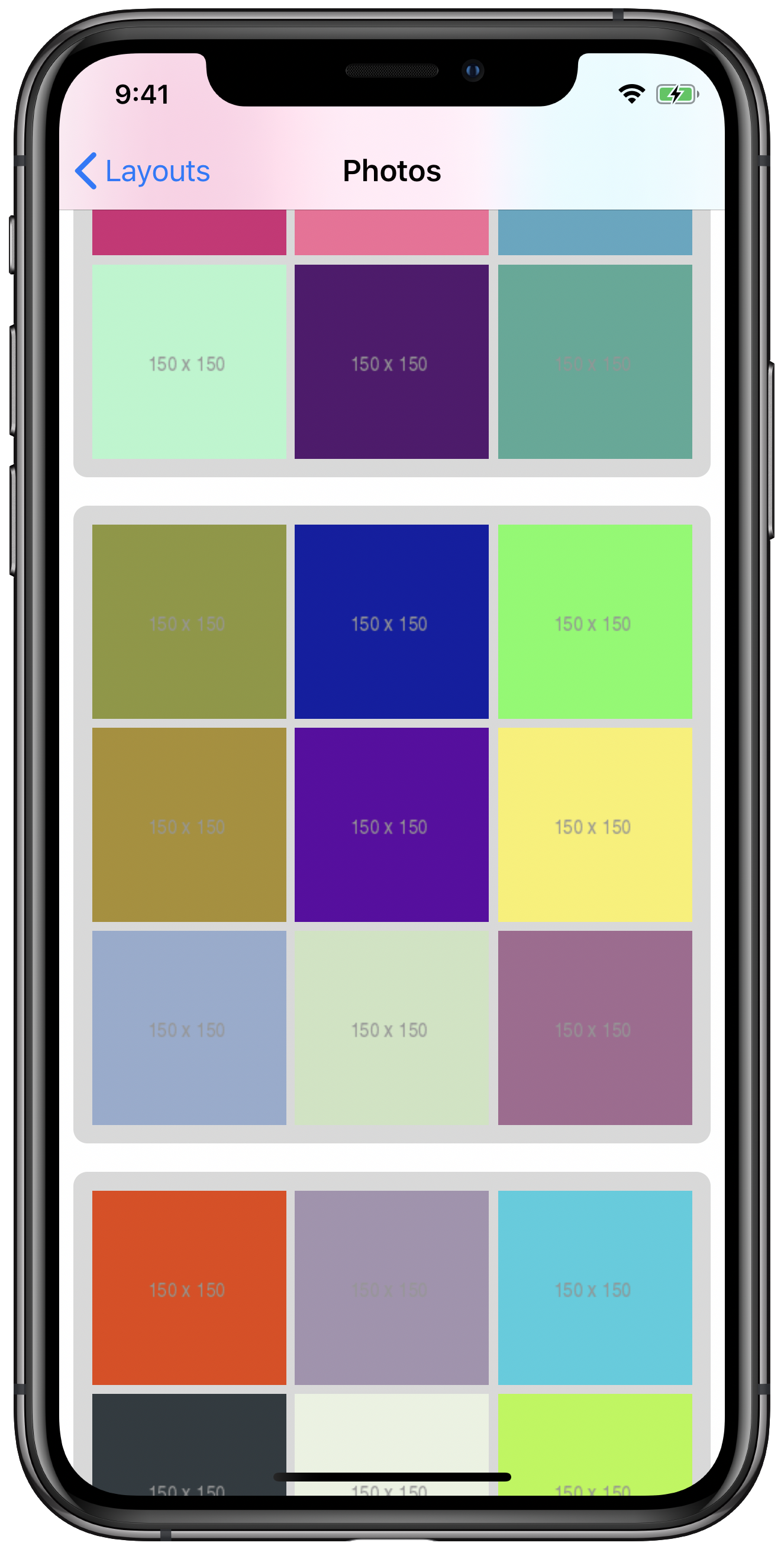
Compositional layout with background decoration items.
And that’s all there is to it!
Section Provider
We’ve now successfully customized our layout using supplementary and decoration views, which opens a world of possibilities. But so far, our sections have been uniform. After all, we describe each section the same way, with a single NSCollectionLayoutSection, which is fairly limiting. Thus far, we’ve only used init(section:) to create our UICollectionViewCompositionalLayout, so we need to explore another API.
To provide a different layout on a section-by-section basis of a compositional layout, we need to create a UICollectionViewCompositionalLayoutSectionProvider. A section provider is simply a closure that is passed a section index and environment information, and returns an NSCollectionLayoutSection. Instead of init(section:) we need to use UICollectionViewCompositionalLayout’s init(sectionProvider:).
First, we’ll very lightly refactor our initial layout declaration with headers to use this initializer. We simply put all of the item, group, and section setup into the section provider closure.
let compositionalLayout = UICollectionViewCompositionalLayout(sectionProvider: { (sectionIndex, environment) -> NSCollectionLayoutSection? in
    let fraction: CGFloat = 1 / 3
    let inset: CGFloat = 2.5

    // Item
    let itemSize = NSCollectionLayoutSize(widthDimension: .fractionalWidth(fraction), heightDimension: .fractionalHeight(1))
    let item = NSCollectionLayoutItem(layoutSize: itemSize)
    item.contentInsets = NSDirectionalEdgeInsets(top: inset, leading: inset, bottom: inset, trailing: inset)

    // Group
    let groupSize = NSCollectionLayoutSize(widthDimension: .fractionalWidth(1), heightDimension: .fractionalWidth(fraction))
    let group = NSCollectionLayoutGroup.horizontal(layoutSize: groupSize, subitems: [item])

    // Section
    let section = NSCollectionLayoutSection(group: group)
    section.contentInsets = NSDirectionalEdgeInsets(top: inset, leading: inset, bottom: inset, trailing: inset)

    // Supplementary Item
    let headerItemSize = NSCollectionLayoutSize(widthDimension: .fractionalWidth(1), heightDimension: .estimated(100))
    let headerItem = NSCollectionLayoutBoundarySupplementaryItem(layoutSize: headerItemSize, elementKind: "header", alignment: .top)
    section.boundarySupplementaryItems = [headerItem]

    return section
})
Things will look identical to how they did before, but now we’re ready to customize each section based on the section index and environment. To illustrate this, we’ll make a simple change to incorporate the section index. We’ll simply add the section index to the current number of items in each row (3). So for example, the first section (index 0) will have 3 items in each row, the second section will have 4 items in each row, the third section will have 5 items in each row, etc. We only need to change the declaration of fraction.
let itemsPerRow = sectionIndex + 3
let fraction: CGFloat = 1 / CGFloat(itemsPerRow)
And let’s see how it looks.
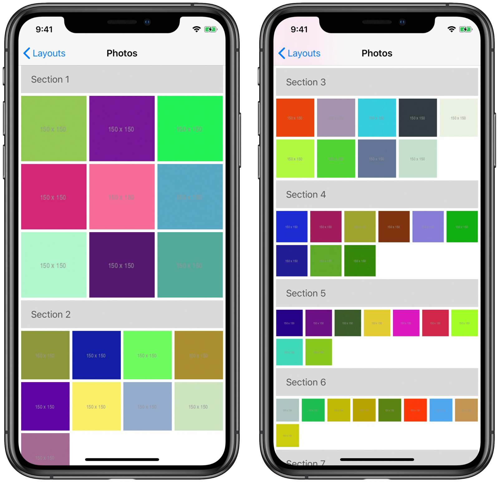
Compositional layout with an increasing number of items per row in each section.
Note that we’re using the same items and groups in each section, just with slightly tweaked metrics, but you could very well use entirely different item and group layouts on a section-by-section basis if your design calls for it.
We can also use the environment parameter of the section provider to customize our layout. The environment is an NSCollectionLayoutEnvironment, and provides us more context about the container that we can use to make decisions about how we want to layout our items, groups, and sections. The container property on the environment gives us information about the content size and insets of the layout. We also have access to traitCollection, which allows us to easily make use of the layout’s size class and the screen’s scale factor. We’ll use the trait collection’s horizontalSizeClass to determine the number of items to display in each row. For horizontally-regular environments, like full-screen iPad layouts, we’ll display double the number of items per row. For horizontally-compact environments, we’ll keep it at 3. All we need to do is change our itemsPerRow.
let itemsPerRow = environment.traitCollection.horizontalSizeClass == .compact ? 3 : 6
let fraction: CGFloat = 1 / CGFloat(itemsPerRow)
And just like that, our layout scales nicely for different environments!
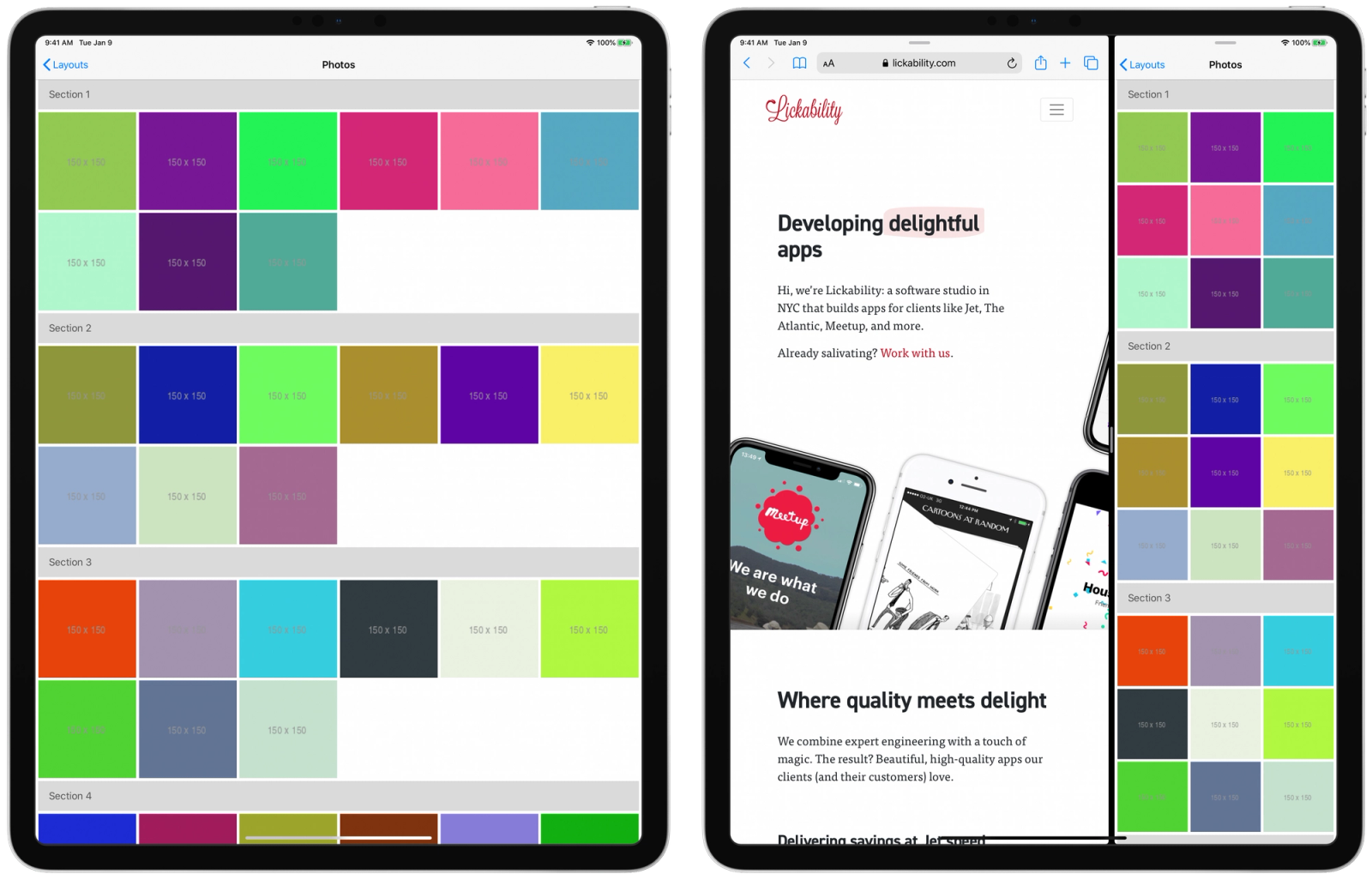
Compositional layouts in different horizontal size classes.
Nested Groups
Once you’ve gotten used to building layouts using UICollectionViewCompositionalLayout, you’ll likely find it much easier to accomplish the things you used to do with UICollectionViewFlowLayout, often with much less code. So far we’ve played with a few bells and whistles that flow layouts don’t support right out of the box. It’s now time to break away from a uniform, flow-like layout and build something that would’ve previously required subclassing UICollectionViewLayout.
When creating NSCollectionLayoutGroups, we’ve previously only supplied one item to the subitems parameter. This is because all of our items within our horizontal groups were uniform in size and insets. However, our layouts can consist of any number of unique NSCollectionLayoutItems we’d like. But as we previously alluded to, we can also nest groups within our groups. If you haven’t figured it out already, groups are just a special kind of item that allow the nesting of other items. In fact, NSCollectionLayoutGroup is a subclass of NSCollectionLayoutItem, so it’s not just a coincidence that we can modify size, spacing, and insets the same way.
Let’s try to build a more complicated layout using multiple items and nested groups. It’ll look like the following.
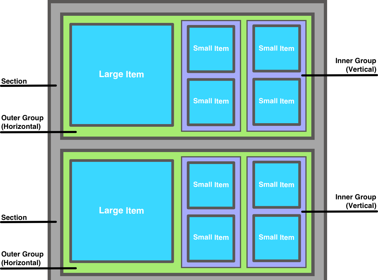
Diagram of a compositional layout with multiple items and nested groups.
At this point, we know all of the major parts that compose a compositional layout, so we’ll work forward instead of backwards, starting with the items. In our diagram, items fall into two categories in terms of sizing relative to their containing group:
- The larger items take up half the width of their containing group, and the full height.
- The smaller items take up the full width of their containing group, and the full width.
We already know how to use NSCollectionLayoutSize to specify fractional widths and height, so let’s define these items.
let largeItemSize = NSCollectionLayoutSize(widthDimension: .fractionalWidth(0.5), heightDimension: .fractionalHeight(1))
let largeItem = NSCollectionLayoutItem(layoutSize: largeItemSize)

let smallItemSize = NSCollectionLayoutSize(widthDimension: .fractionalWidth(1), heightDimension: .fractionalHeight(0.5))
let smallItem = NSCollectionLayoutItem(layoutSize: smallItemSize)
Now we move onto the groups. Let’s start with the nested group first. Unlike the previous groups we’ve used, the nested groups lay items out vertically. Well, good news! NSCollectionLayoutGroup.vertical(layoutSize:subitems:) works exactly like its horizontal counterpart. Since we’ve already specified that we want the large item to take up half the width of the containing group, we have half of the width left for our nested groups. We want two of them, side-by-side, so we’ll make each of them take up a quarter of the containing group’s width, but use the full height. This vertical group only contains one type of item, the smallItem that we defined above.
let verticalGroupSize = NSCollectionLayoutSize(widthDimension: .fractionalWidth(0.25), heightDimension: .fractionalHeight(1))
let verticalGroup = NSCollectionLayoutGroup.vertical(layoutSize: verticalGroupSize, subitems: [smallItem])
Finally, we need to declare our outer group. This group contains a large item next to two nested groups, laid out horizontally. The group itself takes up the full width of its containing section, but its height is a bit trickier. Again, we know the large item takes up half the width of its containing group (which is the outer group). Since it’s a square, we want its height to match. Much like we did with our first compositional layout, we’ll define this group’s height relative to its container’s width. More specifically, its height is equal to half of its width. So… not that tricky.
let outerGroupSize = NSCollectionLayoutSize(widthDimension: .fractionalWidth(1), heightDimension: .fractionalWidth(0.5))
let outerGroup = NSCollectionLayoutGroup.horizontal(layoutSize: outerGroupSize, subitems: [largeItem, nestedGroup, nestedGroup])
Finally, we’ll use this outer group to create our section, and create the the compositional layout from our section:
let section = NSCollectionLayoutSection(group: outerGroup)
return UICollectionViewCompositionalLayout(section: section)
So how’s it look?
Compositional layout with multiple items and nested groups.
Hey, not bad! Everything is exactly where we expect it to be.
You may have noticed that we specified three items in subitems for our outerGroup declaration:
NSCollectionLayoutGroup.horizontal(layoutSize: outerGroupSize, subitems: [largeItem, nestedGroup, nestedGroup])This does match what we see on screen, but we didn’t have to repeat items in our subitems array in our first compositional layout that had three items laid out horizontally, so what gives?
When using NSCollectionLayoutGroup.horizontal(layoutSize:subitem:) and NSCollectionLayoutGroup.vertical(layoutSize:subitem:), the subitems that you provide will repeat, in order, in the respective direction until the next subitem wouldn’t fit. So if our group specified only [largeItem, nestedGroup] for its subitems, the next horizontal item after a large item and a vertical nested group would be the large item again. And since we’ve already eaten up 75% of the horizontal space in the group, we wouldn’t be able to fit another 50%-width item. So it’s necessary for us to specify all three items/groups in this order, otherwise we’d end up with this:
Compositional layout with only two items specified per outer group: largeItem and nestedGroup. Empty horizontal space fills the rest of each outer group.
Before we call this layout complete, let’s spruce it up with the same insets and headers that we used before. The completed layout is as follows:
let compositionalLayout: UICollectionViewCompositionalLayout = {
    let inset: CGFloat = 2.5

    // Items
    let largeItemSize = NSCollectionLayoutSize(widthDimension: .fractionalWidth(0.5), heightDimension: .fractionalHeight(1))
    let largeItem = NSCollectionLayoutItem(layoutSize: largeItemSize)
    largeItem.contentInsets = NSDirectionalEdgeInsets(top: inset, leading: inset, bottom: inset, trailing: inset)

    let smallItemSize = NSCollectionLayoutSize(widthDimension: .fractionalWidth(1), heightDimension: .fractionalHeight(0.5))
    let smallItem = NSCollectionLayoutItem(layoutSize: smallItemSize)
    smallItem.contentInsets = NSDirectionalEdgeInsets(top: inset, leading: inset, bottom: inset, trailing: inset)

    // Nested Group
    let nestedGroupSize = NSCollectionLayoutSize(widthDimension: .fractionalWidth(0.25), heightDimension: .fractionalHeight(1))
    let nestedGroup = NSCollectionLayoutGroup.vertical(layoutSize: nestedGroupSize, subitems: [smallItem])

    // Outer Group
    let outerGroupSize = NSCollectionLayoutSize(widthDimension: .fractionalWidth(1), heightDimension: .fractionalWidth(0.5))
    let outerGroup = NSCollectionLayoutGroup.horizontal(layoutSize: outerGroupSize, subitems: [largeItem, nestedGroup, nestedGroup])

    // Section
    let section = NSCollectionLayoutSection(group: outerGroup)
    section.contentInsets = NSDirectionalEdgeInsets(top: inset, leading: inset, bottom: inset, trailing: inset)

    // Supplementary Item
    let headerItemSize = NSCollectionLayoutSize(widthDimension: .fractionalWidth(1), heightDimension: .estimated(100))
    let headerItem = NSCollectionLayoutBoundarySupplementaryItem(layoutSize: headerItemSize, elementKind: "header", alignment: .top)
    section.boundarySupplementaryItems = [headerItem]

    return UICollectionViewCompositionalLayout(section: section)
}()
And the result?
Compositional layout with nested groups with insets and section headers applied.
*chef’s kiss*
Orthogonal Scrolling
Now for the main event. The most amazing feature of compositional layouts.
Have you ever had to build a vertically scrolling table view or collection view where some of the rows also scroll horizontally? You know, a gallery of sorts. Take the App Store for example:

App Store: A gallery-style horizontally scrolling list within a vertically scrolling list.
We refer to this behavior as “orthogonal scrolling”. That is, part of our layout scrolls along the opposite axis of the scrolling container. In this example, part of the layout scrolls horizontally in a vertically scrolling container.
How would you build this? I can’t tell you how many times I’ve nested horizontally scrolling flow-layout collection views inside of vertically scrolling table views. Scroll performance and view hierarchy architecture be damned!
What if I told you that you can achieve this behavior, allowing sections of your collection view to scroll horizontally within a vertically scrolling list without incurring a massive performance hit. What If I told you that you wouldn’t need to embed collection views inside of other cells? What if I told you that you could achieve this with One. Line. Of. Code.? Okay, okay. I’m exaggerating. OR AM I?
In one 👏 line 👏 of 👏 code 👏, we can set the orthogonalScrollingBehavior on a section to achieve exactly what we want.
section.orthogonalScrollingBehavior = .groupPaging That’s it. Applying this to the layout we created in the last section produces the following results:
Compositional layout with orthogonal scrolling behavior applied.
🤯
We used the groupPaging behavior, which allows for swiping to scroll to, and immediately rest on, the next or previous group in the section. If we wanted to scroll continuously without paging, we could use continuous. There are several more options to choose from, and chances are, you’ll be able to achieve the exact behavior you’re looking for, with One. Line. Of. Okay, you get it.
Bonus Round
We’ve kissed UICollectionViewFlowLayout goodbye. We’ve built layouts that previously would’ve required subclassing UICollectionViewLayout. We’re going to take a look at one final API that doesn’t get quite as much attention, but is definitely capable of unlocking more customization that might keep you from reaching for that old UICollectionViewLayout subclassing approach.
NSCollectionLayoutSection has a visibleItemsInvalidationHandler property, documented as follows:
A closure called before each layout cycle to allow modification of the items in the section immediately before they are displayed.
Well, how could we use that? However you want, really. Play with it! Experiment! Animate your items!
Previously, I was no stranger to subclassing UICollectionViewLayout and overriding layoutAttributesForElement(in:) to do fun, fancy things, like scale cells so that they’re larger as they approach the center of the screen. No more.
Let’s start with a slightly modified version of our first layout again. We’ll ditch the item insets, add some additional spacing at the top of each section, and use continuousorthogonalScrollingBehavior.
let compositionalLayout: UICollectionViewCompositionalLayout = {
    let fraction: CGFloat = 1.0 / 3.0

    // Item
    let itemSize = NSCollectionLayoutSize(widthDimension: .fractionalWidth(1), heightDimension: .fractionalHeight(1))
    let item = NSCollectionLayoutItem(layoutSize: itemSize)

    // Group
    let groupSize = NSCollectionLayoutSize(widthDimension: .fractionalWidth(fraction), heightDimension: .fractionalWidth(fraction))
    let group = NSCollectionLayoutGroup.horizontal(layoutSize: groupSize, subitems: [item])

    // Section
    let section = NSCollectionLayoutSection(group: group)
    section.contentInsets = NSDirectionalEdgeInsets(top: 100, leading: 2.5, bottom: 0, trailing: 2.5)
    section.orthogonalScrollingBehavior = .continuous

    return UICollectionViewCompositionalLayout(section: section)
}()
Now, let’s play around with visibleItemsInvalidationHandler. This closure passes an array of the visible items, represented by NSCollectionLayoutVisibleItem, the current scrollOffset, and the layout environment, like we saw earlier in our section provider. We’ll use this information to calculate the horizontal distance of each visible item from the center of the container. Then we’ll scale each visible item, so that when they’re in the center, they’re larger than their normal size, and when they’re closer to the edges of the screen, they’re smaller.
section.visibleItemsInvalidationHandler = { (items, offset, environment) in
    items.forEach { item in
        let distanceFromCenter = abs((item.frame.midX - offset.x) - environment.container.contentSize.width / 2.0)
        let minScale: CGFloat = 0.7
        let maxScale: CGFloat = 1.1
        let scale = max(maxScale - (distanceFromCenter / environment.container.contentSize.width), minScale)
        item.transform = CGAffineTransform(scaleX: scale, y: scale)
    }
}
So with just a little bit of math, we achieve… whatever this is!
There’s a lot of power packed into this API, and like the other APIs we’ve explored, it can help to eliminate your need to write your own UICollectionViewLayout subclass.
Conclusion
We’ve come a long way since UICollectionView’s introduction in 2012. Apple and third-party developers have continued to push the envelope with increasingly complex layouts in their apps that look and work beautifully. Emulating these complex layouts over the years proved to be frustrating, and not for the feint of heart. It takes a lot of hard work to assess these complications, and completely rethink the tools we use to build our user interfaces. While it might not be quite as fundamentally impactful as Swift UI in the longterm, UICollectionViewCompositionalLayout is an amazing, feature packed API that addresses the needs of modern app developers.
Please consider this my love letter to Apple. I’m just… so impressed. 💌